Search Tweaking System:
Internally built software for Left Travel

The Search Tweaking System (STS), was a sophisticated but complicated tool built by our team in Bangladesh in order for our Maple Ridge PPC team to control exactly what accommodation listings from our partners (Airbnb, Booking.com, VRBO) are shown to specific audiences by our Left Travel sites. This tool helped my PPC team experiment with different audience segments in order to see what combinations would increase conversion rates.

As the lead product designer, I was asked to take on a redesign of the STS in order to make it easier to navigate, more usable and less complicated.

Project scope & details:

Note:

Due to the confidential nature of the STS tool and a lack of easy access to it, I am providing snapshots from the tool when I worked on it, with Ratio sets blacked out in order to hide private information. However, I have kept some examples to demonstrate how it works, and all of the Ratio sets in my redesign are shown because they are mock examples only.

How it worked:

The main purpose of the STS was to set Ratios of accommodating listing (eg: 30% Airbnb, 40% Booking.com, 30% HomeAway). But in order to set a Ratio, a PPC team member would base the Ratio on several other factors:

Structure of the STS

The were several sections to the STS overall, but I was focused on one main section of the tool: the Ratio sets section.

There were three different sections of Ratio sets and one for the Ratios themselves. Each different section focused on viewing or creating specific combinations of brands, locations, property types, devices and Ratio sets. Some sections contained more detailed data sets, or allowed editing, where some didn’t.

Here are some screenshots of the different sections of the old STS that I took at the time. Confidential information is blacked out minus some examples.


My process

In order to be able to design a better experience for my team, I first needed to fully understand and immerse myself in the STS. This was no simple feat, and in order to do this, I completed:

So I did that for a couple of weeks and finally understood how it worked. And what I found what it was just as confusing to use as I had been told!

Problems and pain points

The STS was built by engineers without any UX input. Inherently, it was a complex and sophisticated tool that was very powerful in helping the Left Travel team manage audiences and property listings. However, it was also a very difficult and confusing tool to use, and my PPC team members were quite apprehensive to use it because any errors made could result in loss of revenue for the company. Furthermore, because it was so complex and risky to use, only the most senior two team members were allowed to use it, and even they were afraid!

Apart from being generally clumsy and difficult to navigate, it had some key usability features that were lacking:

Improvements & additions

Simple improvements

Many of the problems I found with the system would be simple enough changes, but I knew that they would make a dramatic improvement. In my report on the STS and in my redesign, I asked for the following changes to be made. These included:

Requested features by PPC team

Since we were redesigning the STS, the PPC team requested some feature improvements they wanted to see added:


Streamlining & complete restructuring

As I was planning the redesign, and I knew the relatively simple changes I wanted to make, as well as had the team’s input on requested changes, now was the task of tackling the clumsiness of the existing UI and trying to make it much more streamlined and user friendly.

I verified with the engineers that there was actually no need to have 4 different Ratio pages, all showing slightly different Ratio sets, so I decided to eliminate so much complexity by streamlining the 4 Ratio pages into one, simplified interface.

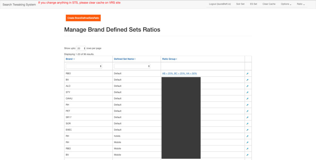
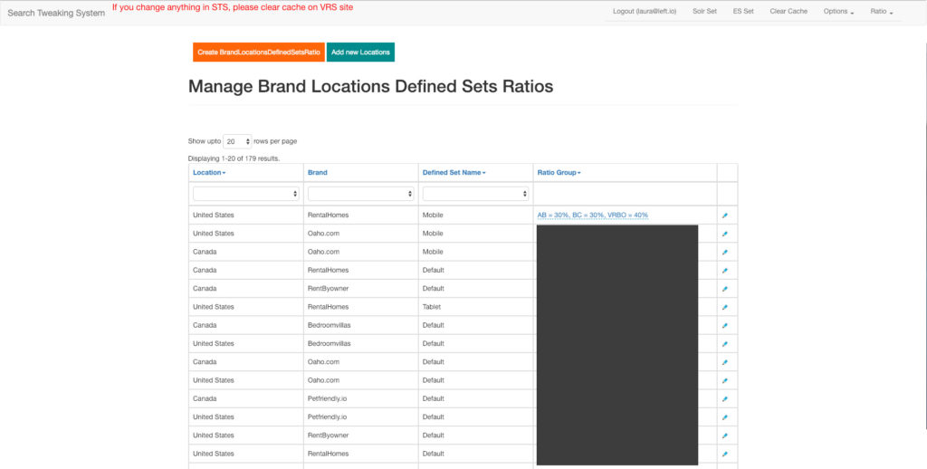
The new Ratio sets page contains all of the same information and abilities to view and edit Ratios, but is much more concise, clear and easy to navigate.

I implemented the above simple, requested and major changes into this interface. I also added a left sidebar menu for future pages that the team wanted to tackle, as well as pages to manage individual dimensions (These pages aren’t included in this project scope).

The UI is visually clean, with a simple call to action to add a new ratio. Part of the scalability that was required for potential new partners was that I added the ratio percentages in a side scroll. This would also be beneficial for different screen sizes.

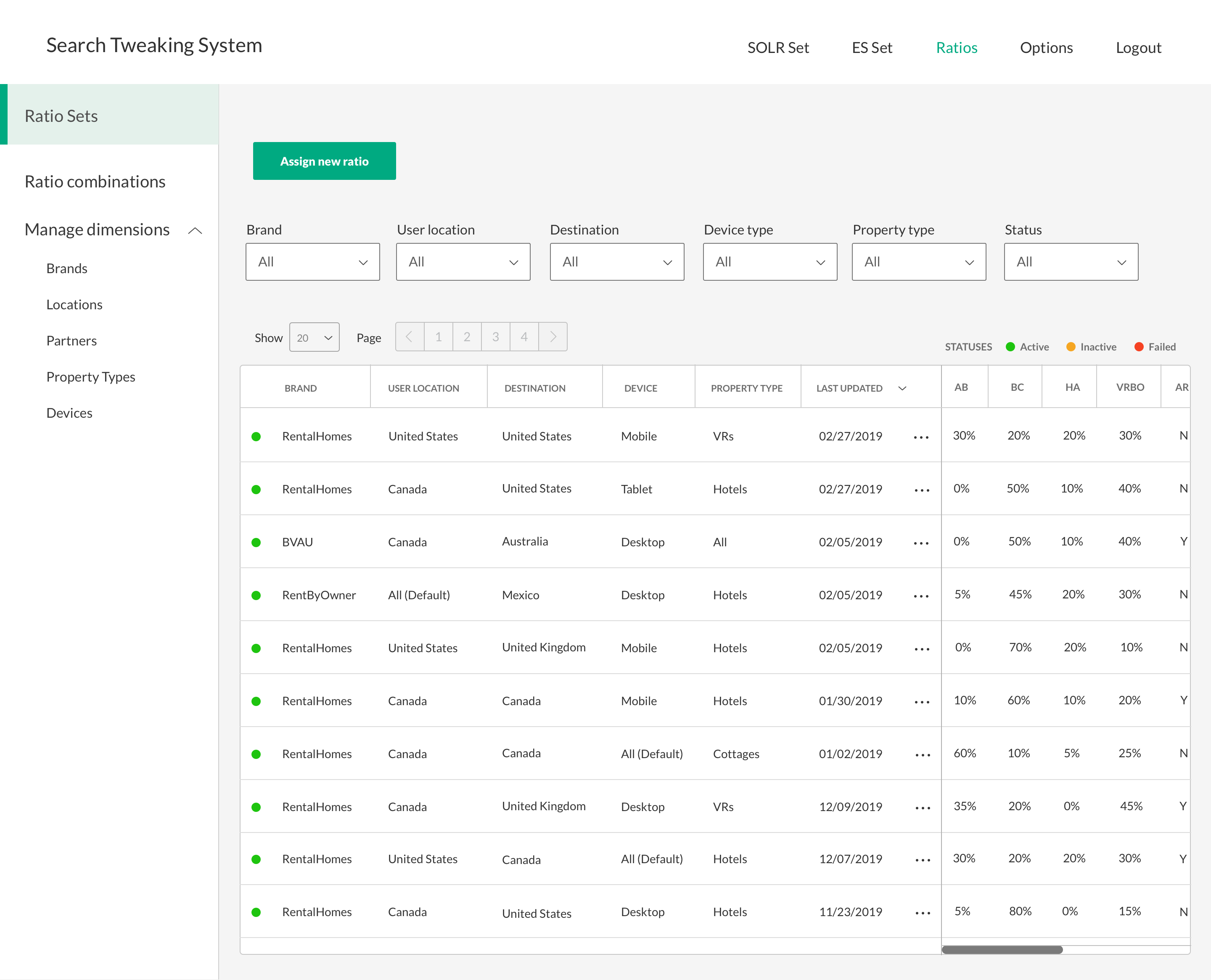
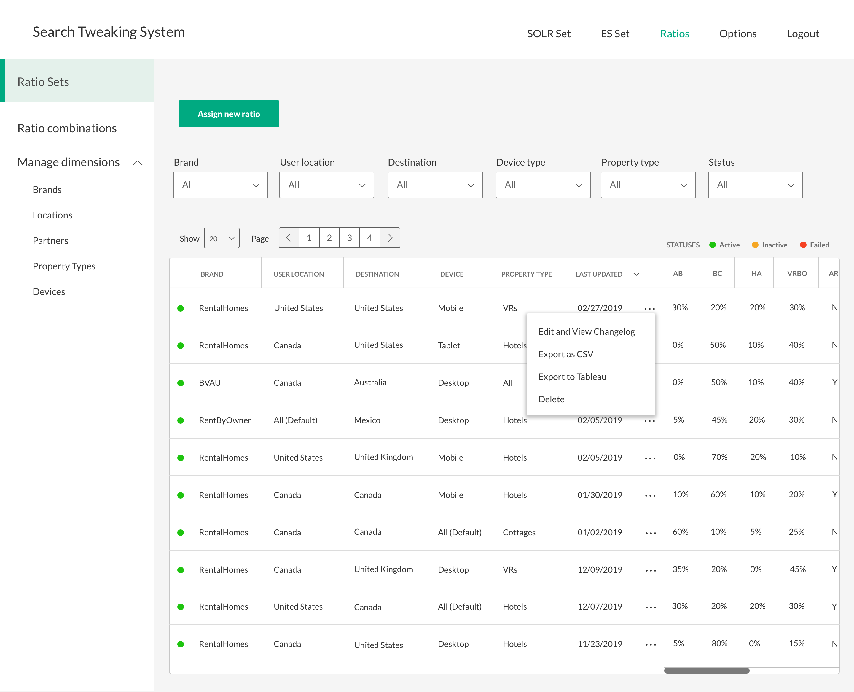
I added ellipses to each row to export data, view/edit changelog and delete the sets.

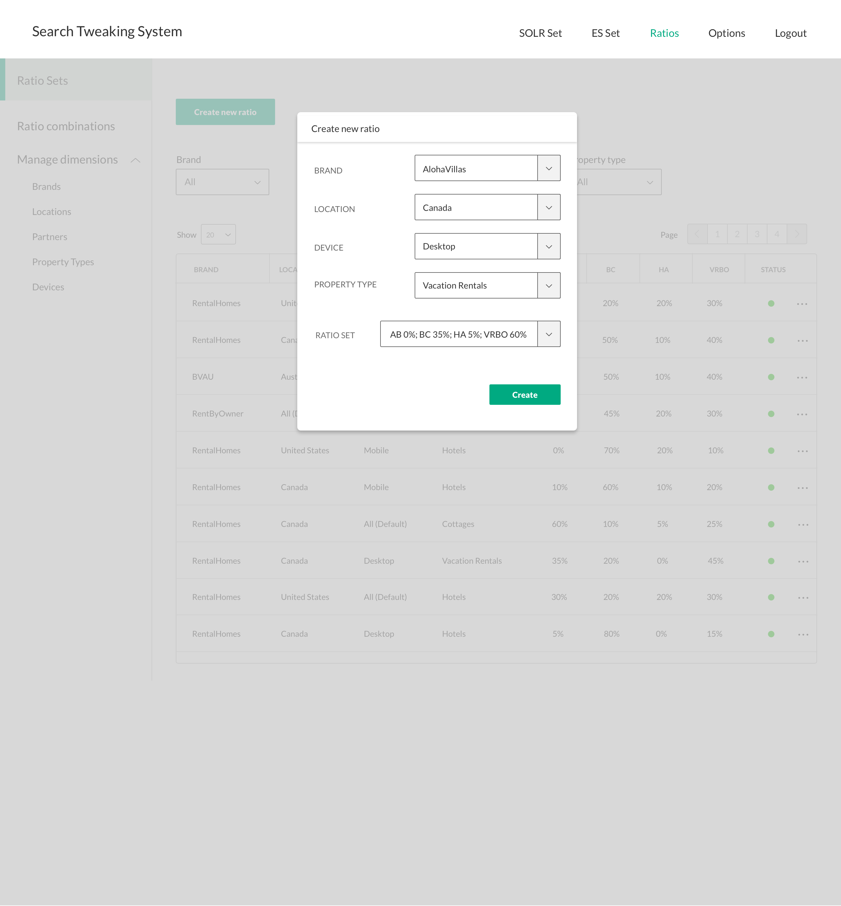
The old STS required leaving any of the Ratio pages in order to create new Ratio sets, so I designed a lightbox to make this user flow more simplistic. When a new Ratio is created, it would be added to the top of the list and feedback for confirmation would be added.

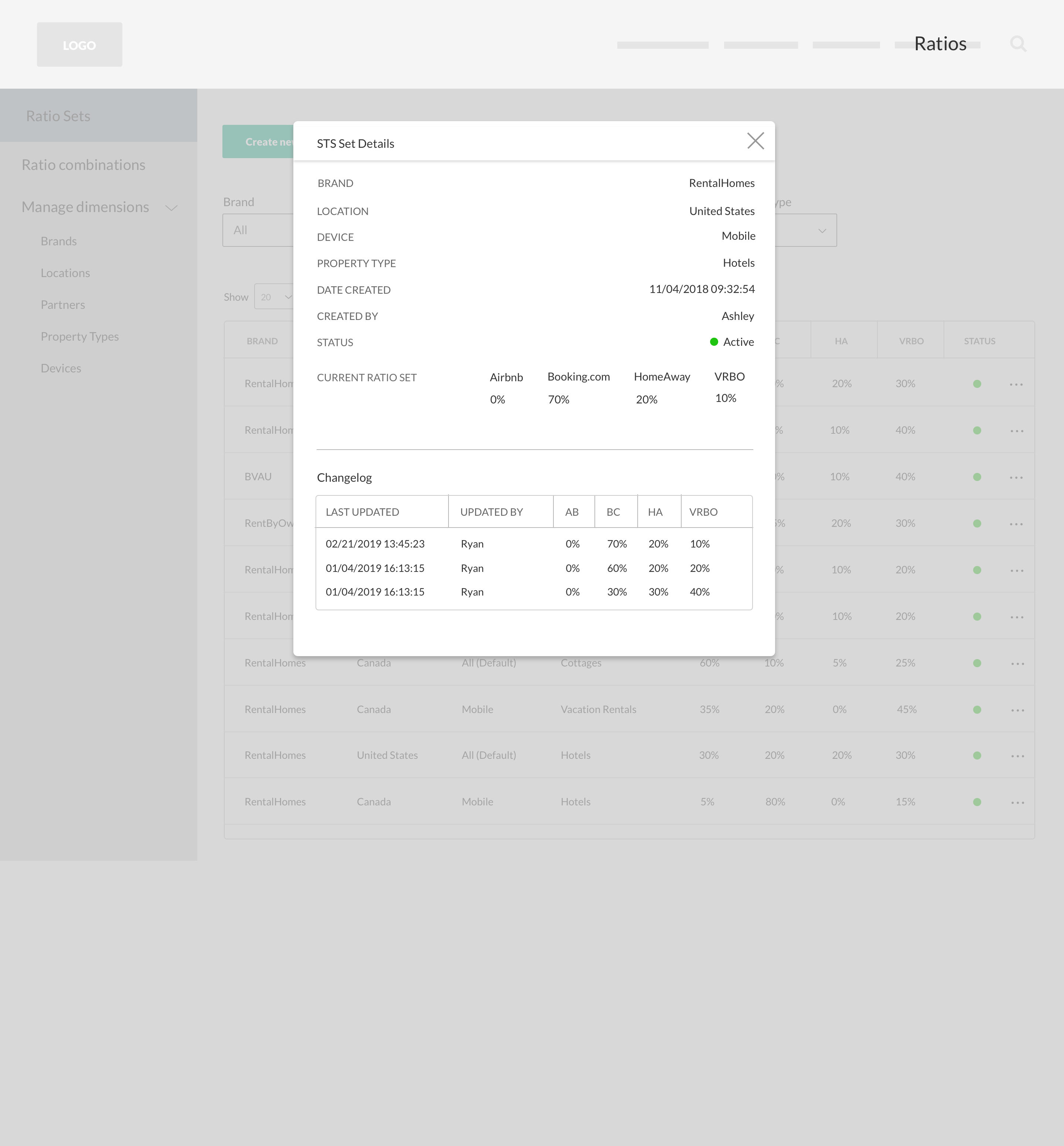
The changelog is also a lightbox and displays not only the historical changes to the set, but also all of its details and when it was first created.


Conclusion

I wanted to design what would be the most user friendly version of the STS, and in this case, I was told that the engineers were anticipating changes and to focus more on presenting the changes I felt were necessary for v1, and then working with the dev team after.

Throughout the process, I checked in with my two PPC team members Ashley and Ryan, as well as my product manager Brent in order to ensure I was on the right track. I wrote a detailed report on my analysis of the existing STS, created a clickable prototype in InVision in order to present and test my proposed STS.

After only one iteration of some minor changes, my team was very happy with the proposed changes and felt that it would make the STS much more user friendly, less complicated and so safe to use that all PPC team members could use it!

Ashley and Ryan were only days from traveling to Bangladesh for several weeks to see the dev team, so while I would have usually presented my proposed redesign to the team over Zoom, Ashley and Ryan presented it to them in person, using InVision and sending them my written report and rationale. The engineers were able to implement all of the changes, ultimately making the lives of my PPC team a little easier!

Redesigning the STS was a great experience and one that had a positive effect on Left Travel’s potential revenue. I loved the process of it as it involved strategic & creative problem solving, and helping people navigate complex data systems!