OVERVIEW
Onset is a tech company that builds and sells data loggers hardware and remote monitoring software for climate and environmental monitoring, water quality, agricultural research and even museum artifact preservation.
This ImageX Media project was a multi-phase migration of a complex B2B website, including managing two brands – InTemp and Hobo – under a single site while maintaining clear pathways for both.
Discovery & design project timespan: September 2021 – May 2022
Website launch: November, 2022
MY ROLE
Senior UX & UI Designer, ImageX Media
My role on the Onset project was to deliver the UI design for a component-based design system, as I was the sole visual designer on the project redesign. I also played a UX role to help ensure that the interactivity of complex aspects of Onset’s website, such as product pages, and multi-step product configurations were designed and built with strong usability best practices.
Deliverables: High fidelity page designs in desktop and mobile, Bootstrap UI Kit & Component list
Curious about how it looked before? Visit Onset via the Wayback Machine (search sometime between September 2021 and May 2022).
Each ImageX project kicks off with a Discovery phase. In the case of Onset, discovery was lengthy and robust, as the project was a large undertaking.
As the lead UI designer on the project, I guided the client through collaborative sessions to gain a holistic understanding of their brand goals for the project.
After a relatively short branding discussion, I learned that the client wasn’t married to their current brand, and while the logo needed to remain the same, I had a great deal of flexibility to explore new colours, fonts, imagery and graphic elements. This is pretty rare in agency UI design, so it was definitely an exciting prospect!
Immediately after our branding discussion, I walked us through a session on visual inspiration. Ahead of Discovery, they had all taken a survey, where among other questions, they provided competitive and inspirational websites that they both liked and didn’t like. Along with their examples, I did some visual research and brought some relevant websites to discovery to show both visual inspiration as well as examples of product websites that showcase both hardware and software, such as Square and Arlo.
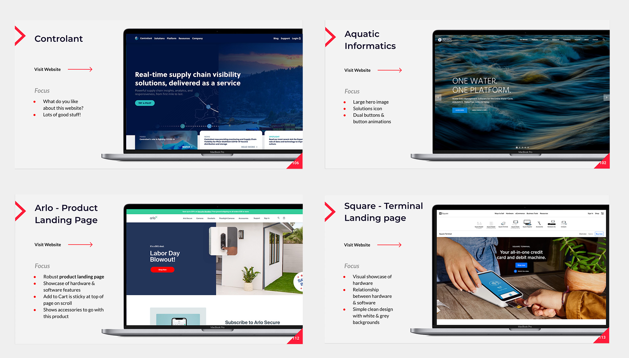
From this exercise, I learned not only about their direct competitors and how that could help me throughout the design process, but I also learned through showcasing smart home product websites, what kind of features would and wouldn’t work for their particular products.
I presented Square as a potential example for showing visual thumbnails for top products, but soon learned it wouldn’t work for the Hobo line of products. The reason for this is because while payment terminals like Square have strong visual affordance, their products are much more obscure, niche and require a different approach.
On the flip-side, the Arlo example gave them a good reference for seeing how we could potentially structure and design their robust, complex product landing pages. It was from this and a couple other similar examples that we came to give them a sticky anchor menu, including an Add to Cart CTA.
In the next Discovery session, I came prepared with two distinct Moodboards, based on the previous session and what I learned about their business goals, user goals and what came to light during our visual inspiration and branding phase.
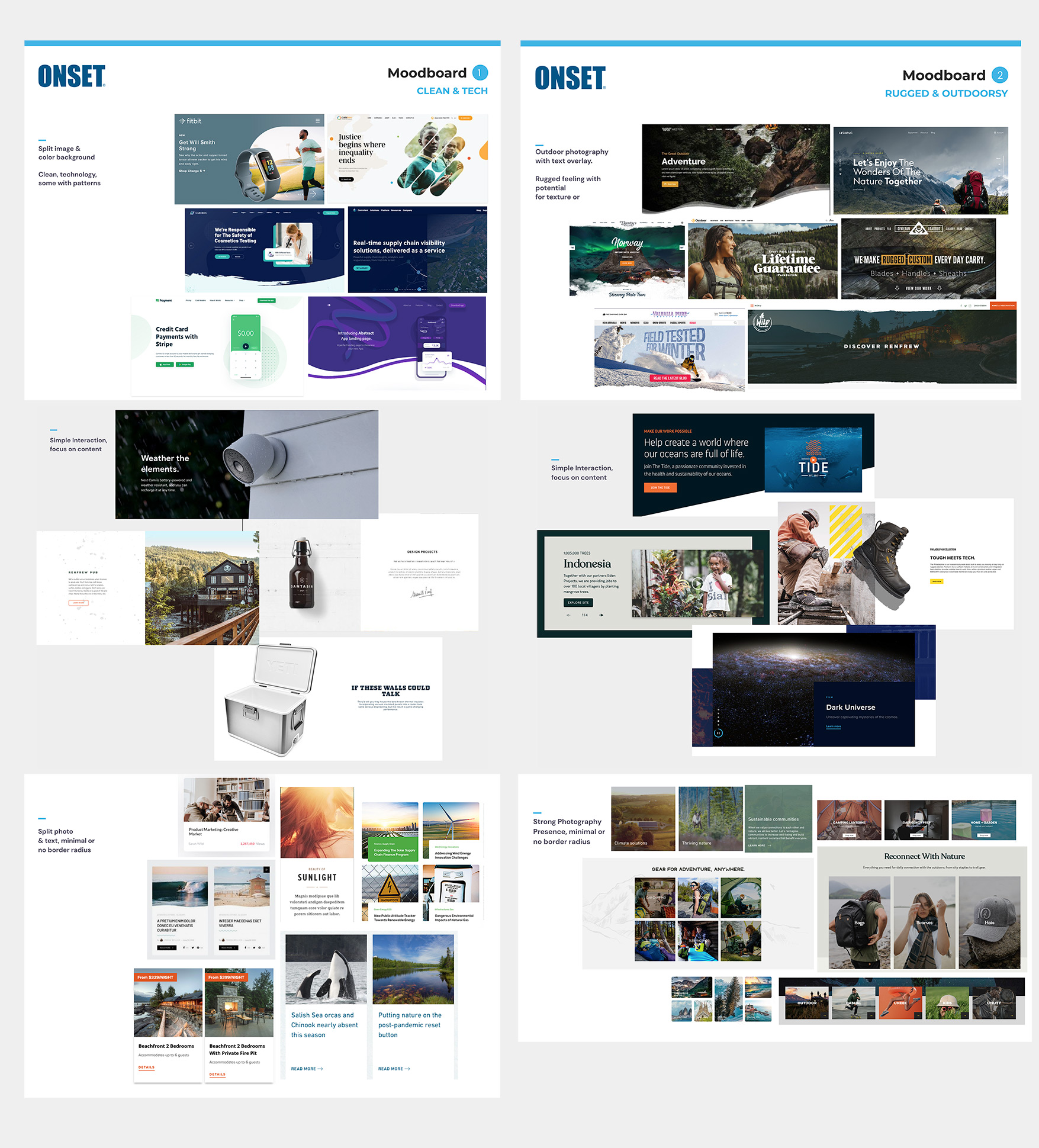
MOODBOARD 1: CLEAN & TECH
In the first Moodboard option, my aim was to bring to the table examples that showcased the tech space. Knowing that Onset is a tech company with sophisticated and complex hardware & software solutions, my aim with the first Moodboard was to bring to the table examples in tech, such as in the smart home product space, and also products in the environmental and sustainability spaces.
Aesthetics in this space were generally focused around clean, solid lines and colour, ample white space, and often with geometric shapes and graphic elements.
In this example, I found component styles that all had similar aesthetics, such as feature cards with clean, white areas for text, clean hover effects and where there was a distinct split between image and text area.
MOODBOARD 2: RUGGED & OUTDOORSY
The second Moodboard option was much more focused on the physical spaces where Onset products live: outdoors.
Visual examples are from leading rugged and outdoorsy product and tech companies, such MEC, Tentree, as well as some examples in outdoor travel. The similarities between the examples in Moodboard 2 is a strong focus on photography.
The strong photographic element is carried through to the component examples, with text overlaid on images, as opposed to clean separations between images and text line in example 1. There are gritty textures and cuts between images and background, as well as more grid-like, or even mosaic layouts for images.
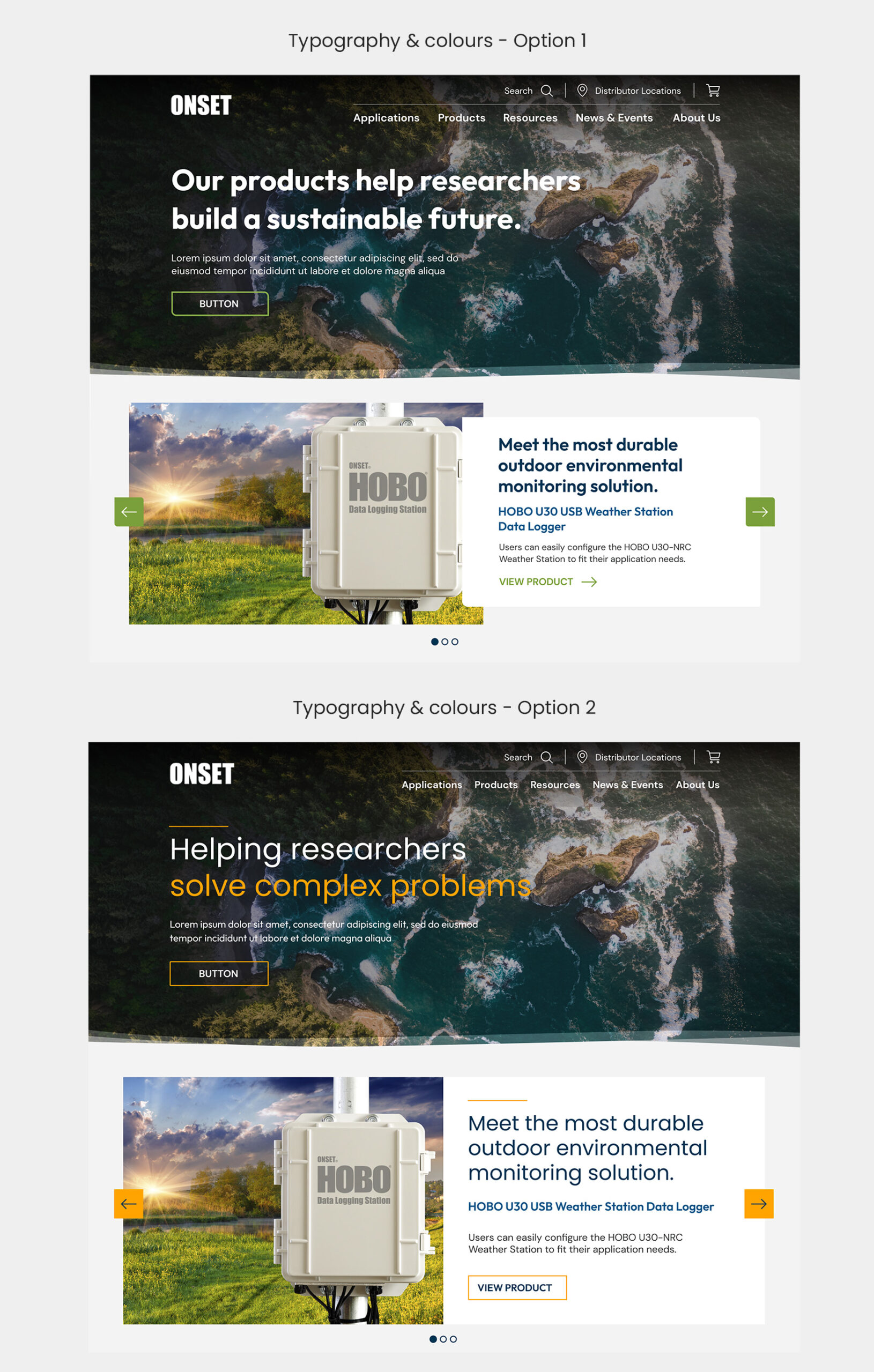
CLIENT CONSENSUS ON MOODBOARDS & DESIGN DIRECTION
In the end, client favoured Moodboard One overall, but liked specific elements from example two. We moved forward with this aesthetic:
At ImageX, UX/UI Designers play a crucial role in a design phase throughout a project. Our focus is on a few key deliverables to client and developers:
For Onset, I collaborated closely with our UX Researcher Vanessa, who took on the IA, tree testing and wireframe designs. I used her wireframes to design the high fidelity designs for Onset.
Let’s talk about the Homepage and Application Landing page.
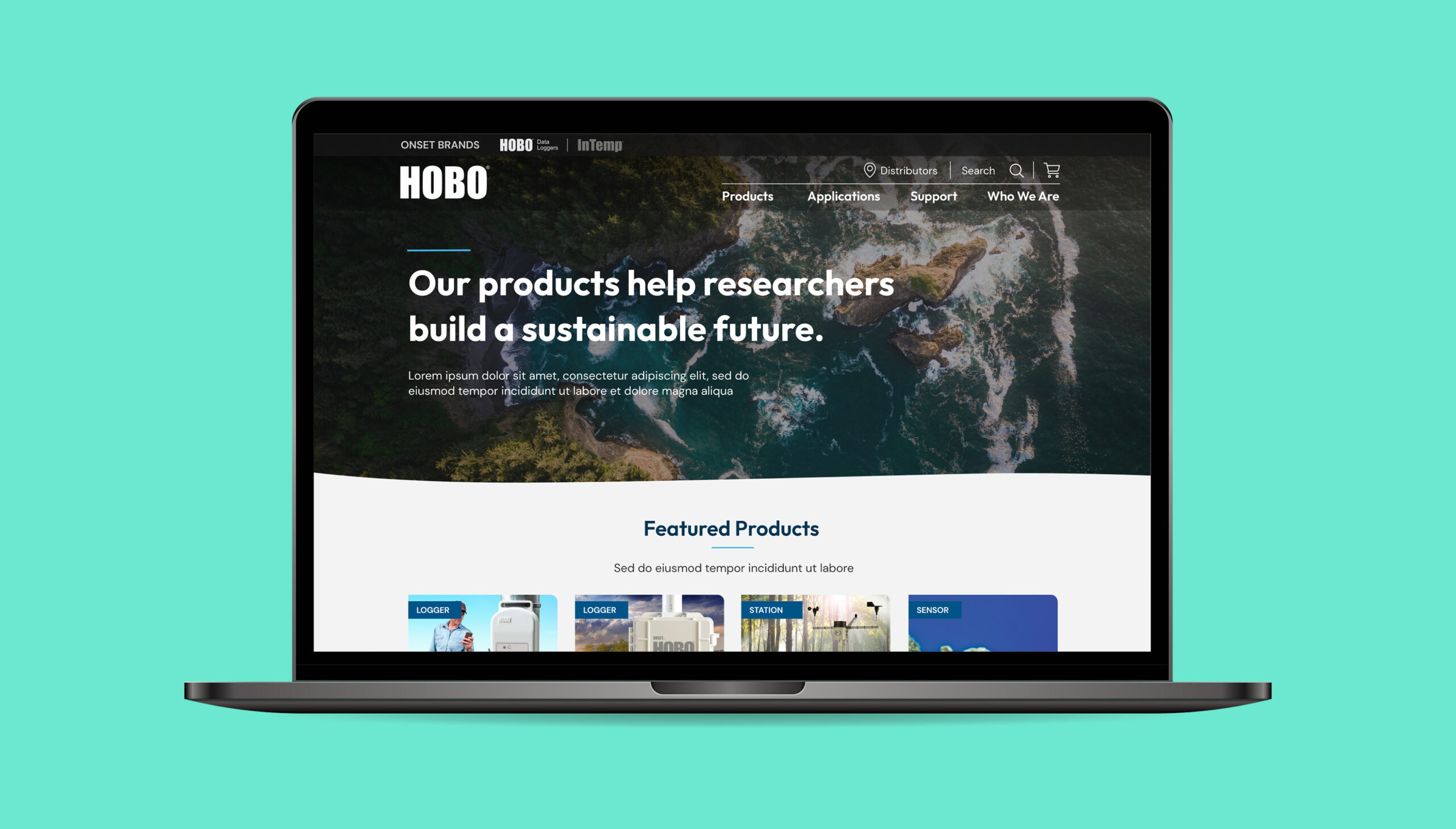
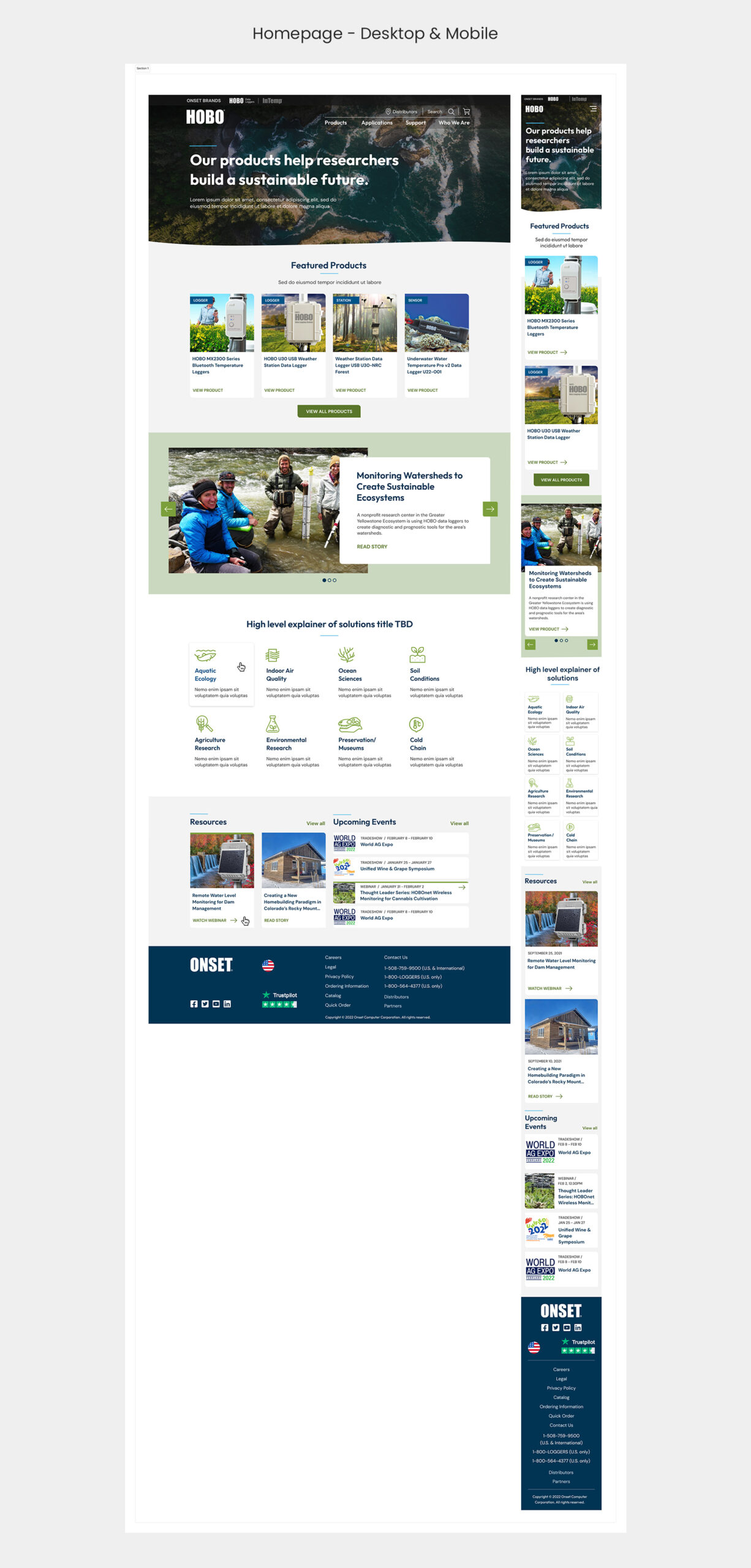
HOMEPAGE
Vanessa had had wireframe demos and sign-off for the Homepage and a handful of other pages, so that’s where we started.
I used the Homepage to solidify the look and feel for the overall website UI, providing two versions. The version below is the one they went with:
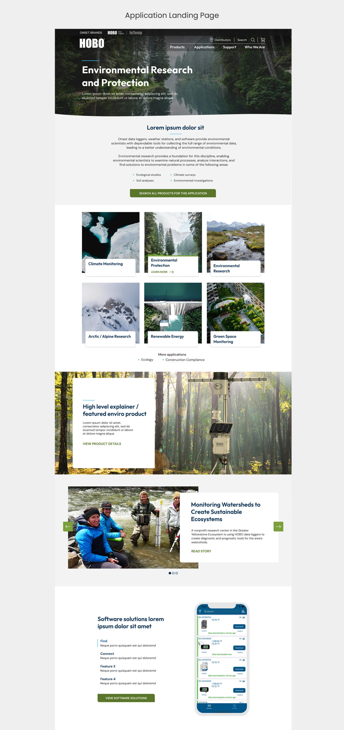
APPLICATION LANDING PAGE
The Application Landing page had to be templated so that each application could be structured similarly, but look visually different. (In their case, “applications” were things like Environmental Research and Protection, Water Resource Management, or Agricultural Monitoring).
We needed to not only show products, but educate the user about Hobo products in relation to the particular application, as well as provide more context in the form of explainers and use cases.
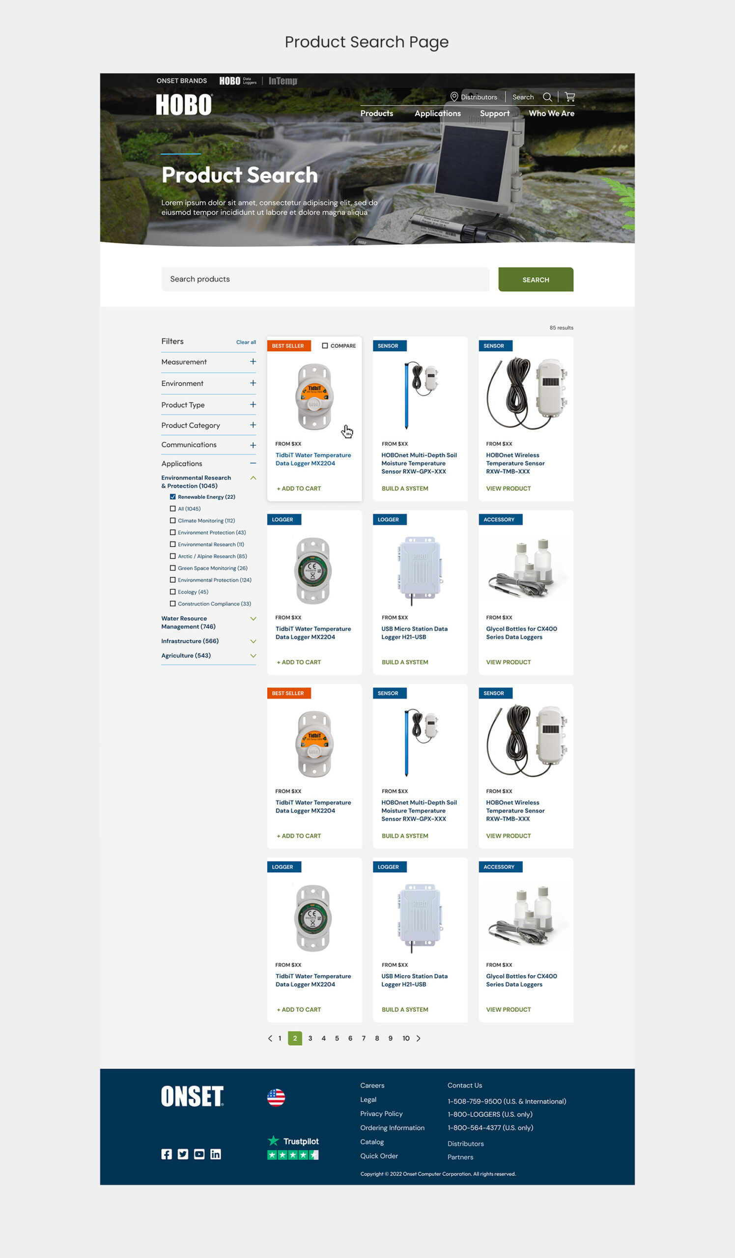
PRODUCT SEARCH PAGE
Challenge 1: Filters
Challenge 2: Product cards
PRODUCT SEARCH PAGE SOLUTIONS
Solution 1: Filters
Solution 2: Product cards
Visit the old Onset product page via Wayback Machine (Snapshot from January 22, 2022).
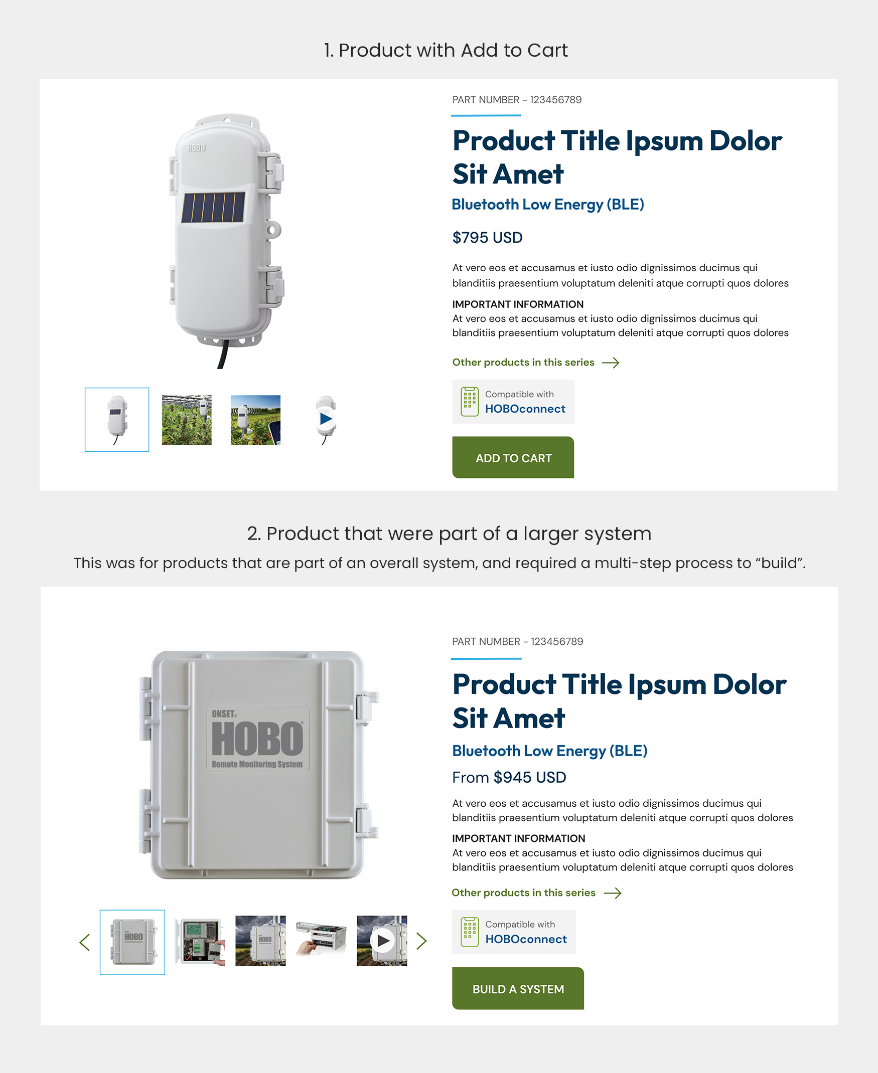
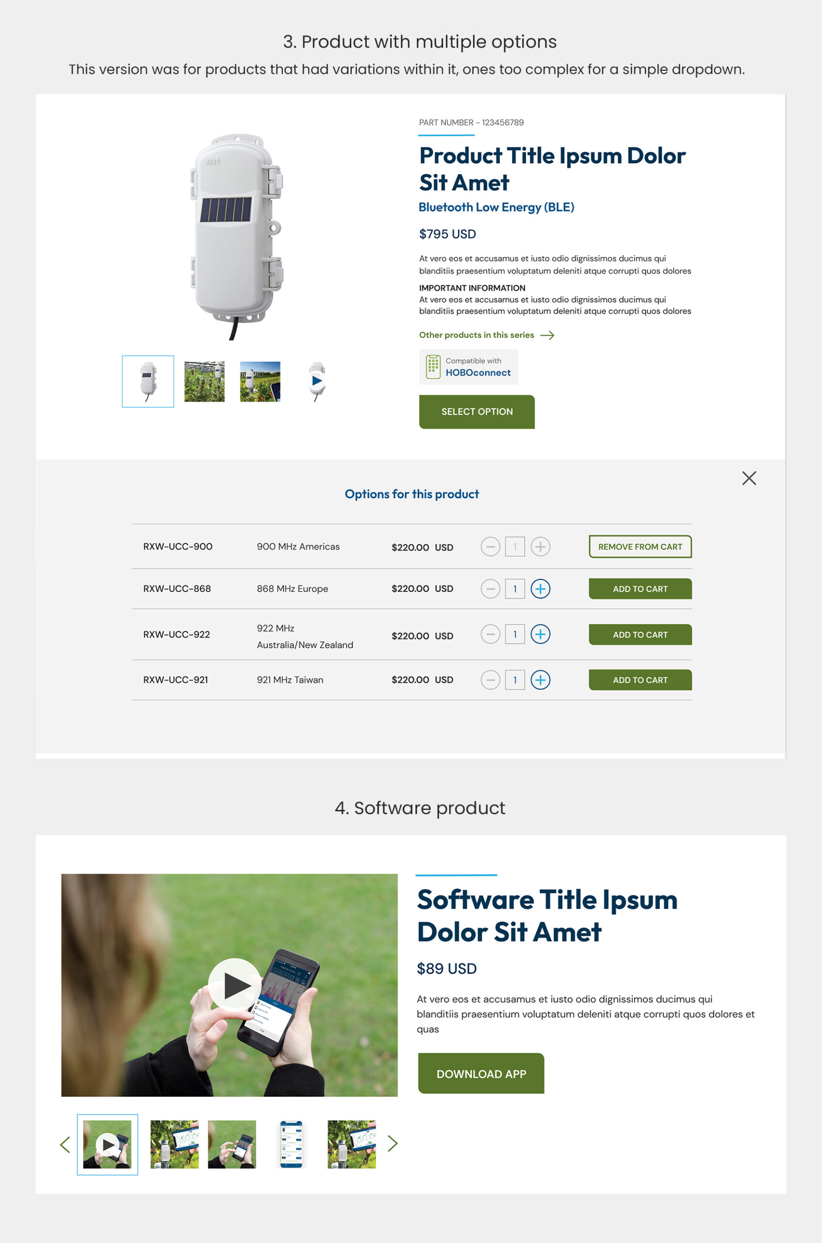
The Product landing pages were perhaps the most challenging of this project. Onset’s line of Hobo products are so numerous, so varied and so complex that we needed to design multiple product landing page types, each with unique variations. But on the same token, we needed to template these unique variations because of budgetary constraints.
Challenge: Restructuring a massive amount of content
Solution: Sticky Anchor Menu, content hierarchy and blocks
View an old Onset product landing page via Wayback Machine (Snapshot from January 22, 2022).
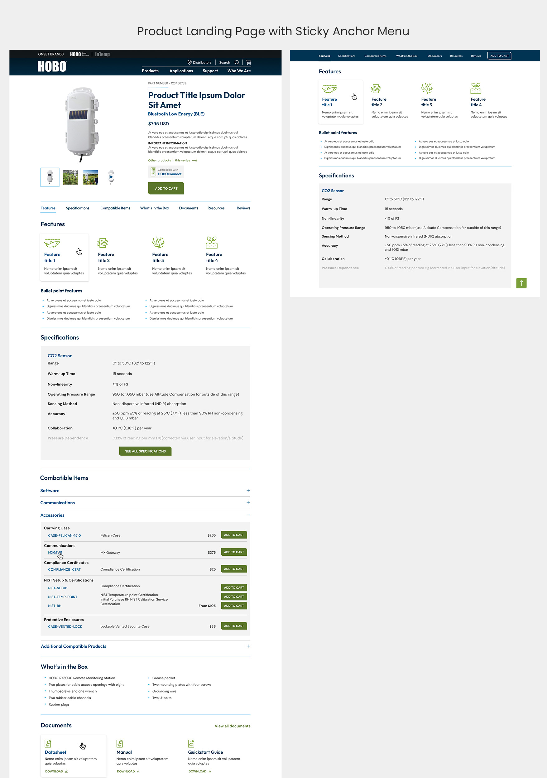
Another challenge of the Product Landing Pages was to design for 4 different potential user journeys.
Each type required design for different actions and user paths. Add to Cart automatically fills your cart, Build a System takes the user into a multi-step configurator, Select an Option opens a block below with options, and Download App takes the user onto a journey to sign up.
Onset = Hobo + InTemp
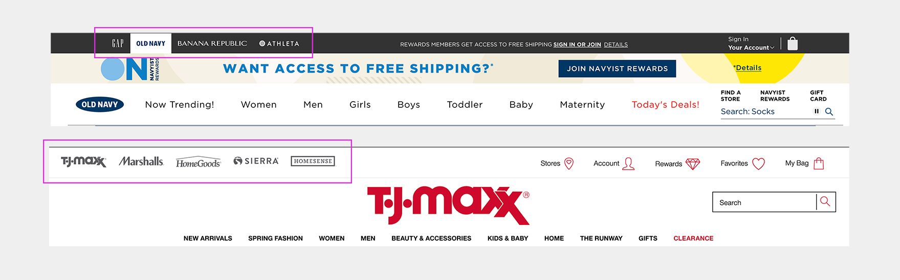
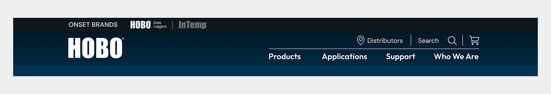
Onset is a parent company to two distinct lines of products: Hobo and InTemp. For the purposes of the project, we were focused on Hobo almost exclusively, however we needed to solve for how to display the parent-child/sibling relationship between the brands. Initially, we launched into design with Onset as the overarching brand, and Hobo and InTemp as two products offered under the Onset umbrella, much like iPhone and Macbook are to Apple. However, as we proceeded with design, the clients struggled internally with their desire to bring Hobo to the forefront. While Onset was the company name, the name Hobo carried weight in the data logging research space, and they felt it would be a mistake to carry forward with Onset as the primary brand.
This led the client down a path of trying to solution this issue themselves. They felt strongly that Hobo should be front and centre, with InTemp also showing in the main navigation, so users could quickly go over to that website (which at the time was separate). They didn’t ask for help with this issue, but as time went on, we on the ImageX team wanted to see if they wanted our input and recommendations, as we felt that their solution would be confusing to users.
This is what the client came up with before we offered to help:

We as a team politely chimed in, asking if they wanted us to do some visual research, find some examples of similar parent/child brand dynamics and present it back to them, and they agreed. It was Marta, the Business Analyst on the project that came up with the best idea in the end. She proposed examples where there are sibling brands under one bigger parent brand, such as how TJ Maxx is the parent company to Marshalls and Homesense, or how The Gap Inc. is parent to The Gap, Old Navy and Banana Republic. After some back and forth, this is the example that we felt was the strongest. I presented these options to them, along with an example with their own content, and they agreed to move forward with it.
The Onset project was a lengthy one with a huge scope. Initially, it was quoted at being much smaller, at only 10 wireframes and 10 high fidelity pages, plus UI Kit / Component library. Scope creep definitely happened, and we took it one demo at a time, seeing what we realistically needed to deliver. This happens with many projects of course, as the delivery team only gets to know what it actually needed in discovery and beyond. But the clients were gracious and recognized the need to re-evaluate the original scope.
I was eager to work on this project as soon as I learned I had been assigned to it, and I’m very proud of the outcome of design and my role on the project.