Left Travel
OVERVIEW
Left Travel was a company, owned by Left Technologies Inc. (Now TravelAI), that created and managed 14 meta-travel accommodation websites, including RentByOwner.com and Stays.io.
These accommodation websites partnered with and listed all Airbnb, Booking.com and VRBO listings.
The marketing team that I was part of worked out of Maple Ridge, BC, and the development team were in Bangladesh.
MY ROLE
Lead Product Designer, Left Travel
In 2018-2019, I spent my time at Left Technologies as lead product designer, where I worked closely with the marketing team and Product Manager to make continuous improvements to RentByOwner, Stays.io and other Left Travel meta-travel sites in 2 week sprints.
Deliverables and software: Wireframes and/or high fidelity UI designs for desktop, mobile and app in Sketch and InVision. A/B Testing in SiteSpect, communications with developers in JIRA; sprint and backlog grooming in Zeplin.
Continuous improvements to platforms
Much of my work on the Left Travel platforms involved making UI changes based on A/B testing, competitor analyses, user surveys and reviews feedback.
I also worked to improve the overall usability, modernize the UI and apply some UI best practices to existing designs.
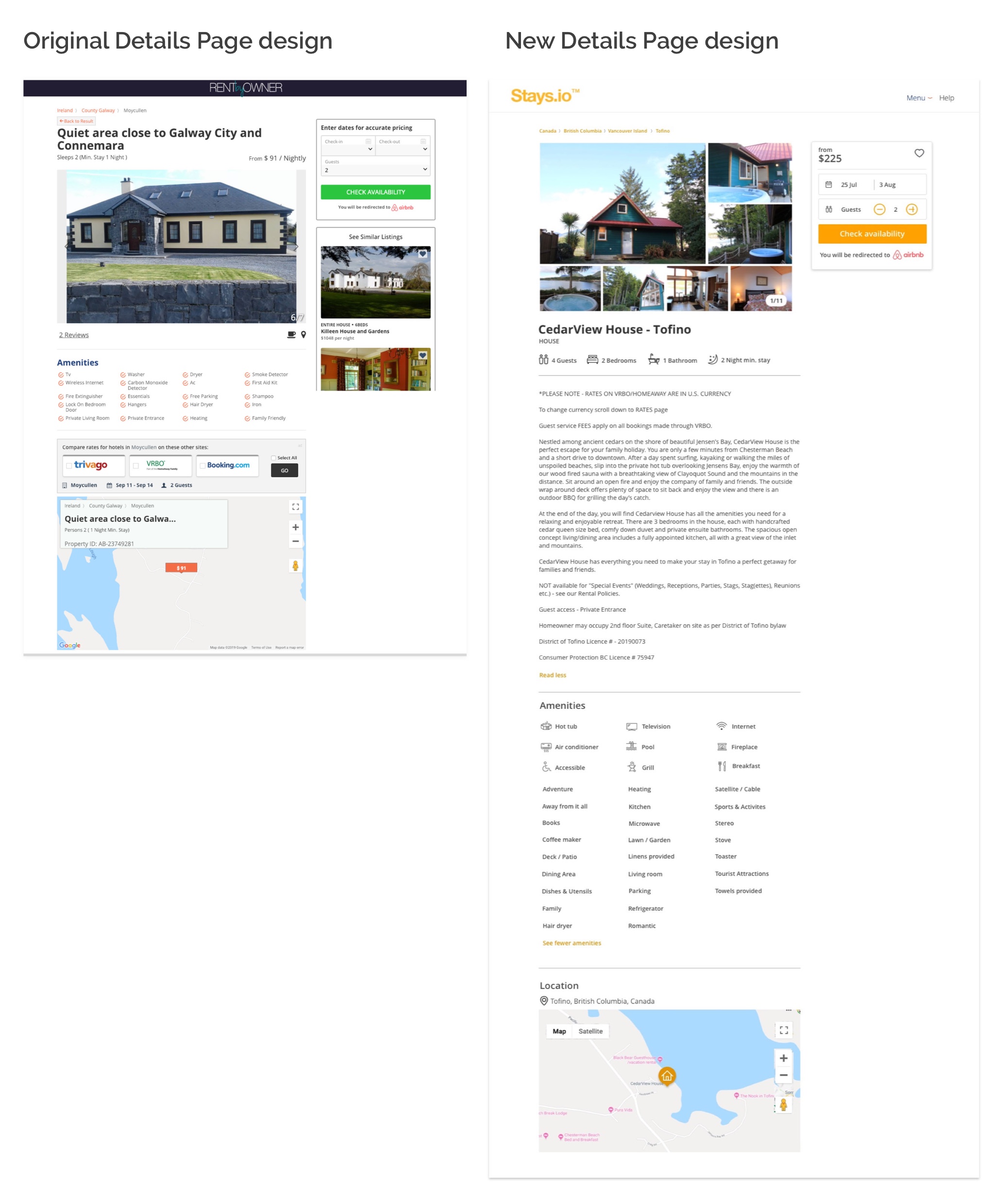
In the example below, I moved elements around, applied a different style to the image gallery and modernized the look and feel. In the original design, we hadn’t received an API for the property descriptions, but once Airbnb shared it with our team, we were able to add the full description.

UI Improvements & Best Practices
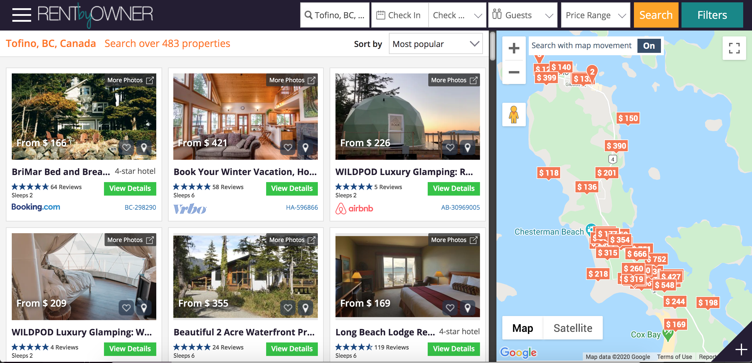
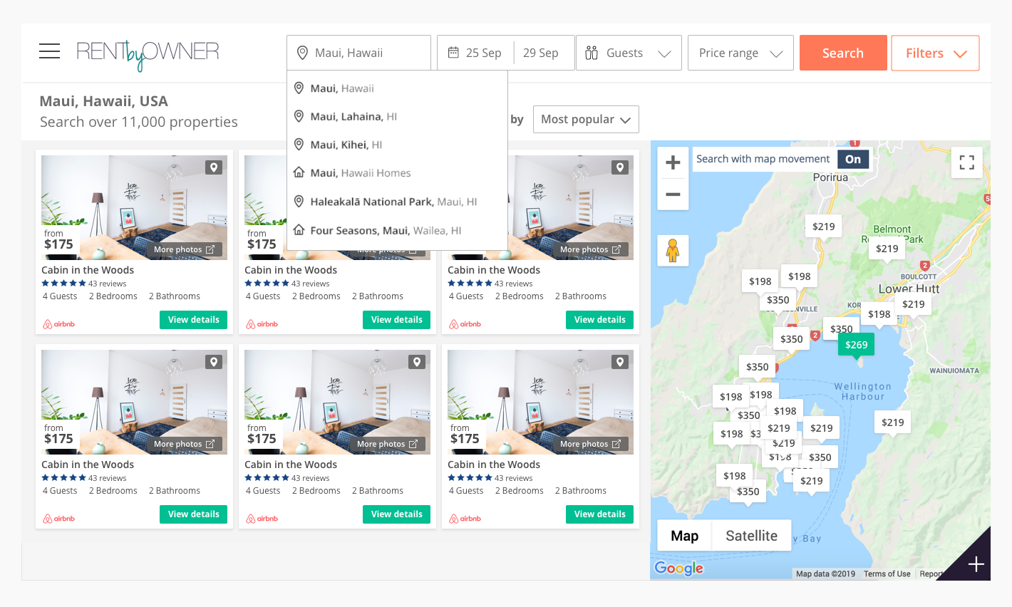
The original Left Travel websites, such as RentByOwner, were launched in about 2012 and the UI hadn’t been updated since then. I wanted to modernize and clean up UI elements to create better interactive pieces. I did so by implementing:
- A cleaner layout with a streamlined, modern colour scheme
- Legible listing cards with better accessibility and larger font sizes
- Optimized predictive search dropdown
- New icon set
- Improved search & date picker fields, filters, and map interactions.
BEFORE

AFTER

A/B Testing
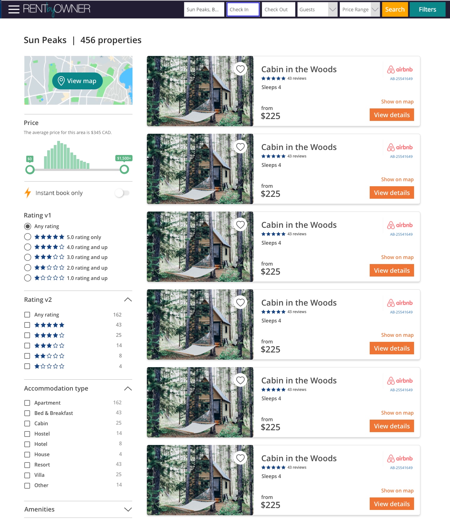
Left Travel platforms typically emulated Airbnb and VRBO with a listings/map hybrid layout (as of their layouts in 2018). One of our A/B tests was to see if a layout more like competitors Agoda and Kayak would resonate more with users. This layout held a 1-up listing card, with a sidebar for map and filters.
This layout ended up “winning” over our other layout, and ended up with higher conversions.
