OVERVIEW
Careforth provides professional support and coaching for families who are caring for their loved ones, in select US states. One of the ways they offer support is through the site we worked on, Careforth Learn: essentially a web-based library of tools and information. Careforth Learn was based on the now defunct VelaLearn, and was a Drupal migration from D7 to 10 with UX and UI design enhancements to match their current brand.
Discovery & design project timespan: May 2023 – August 2023
Deliverables: UI Design of priority pages, UI Kit and Component list in Figma.
MY ROLE
Senior UX & UI Designer, ImageX Media
My role on the Careforth Learn project was to help the client navigate the migration of their existing caregiver resources (from the VelaLearn website), with an updated information architecture, UX guidance, and with the look and feel of their new Careforth brand.
Other members on the team: Senior Project Manager, Senior Business Analyst, and a Lead Drupal Dev to guide the migration and dev team.
We kicked off with a Discovery Phase, as we always do at ImageX. As the lead UX & UI designer on the project, I ventured to understand how Careforth Learn (then Seniorlink / VelaLearn) fit into the umbrella of the Careforth parent organization, and how it would also be differentiated to prevent confusion.
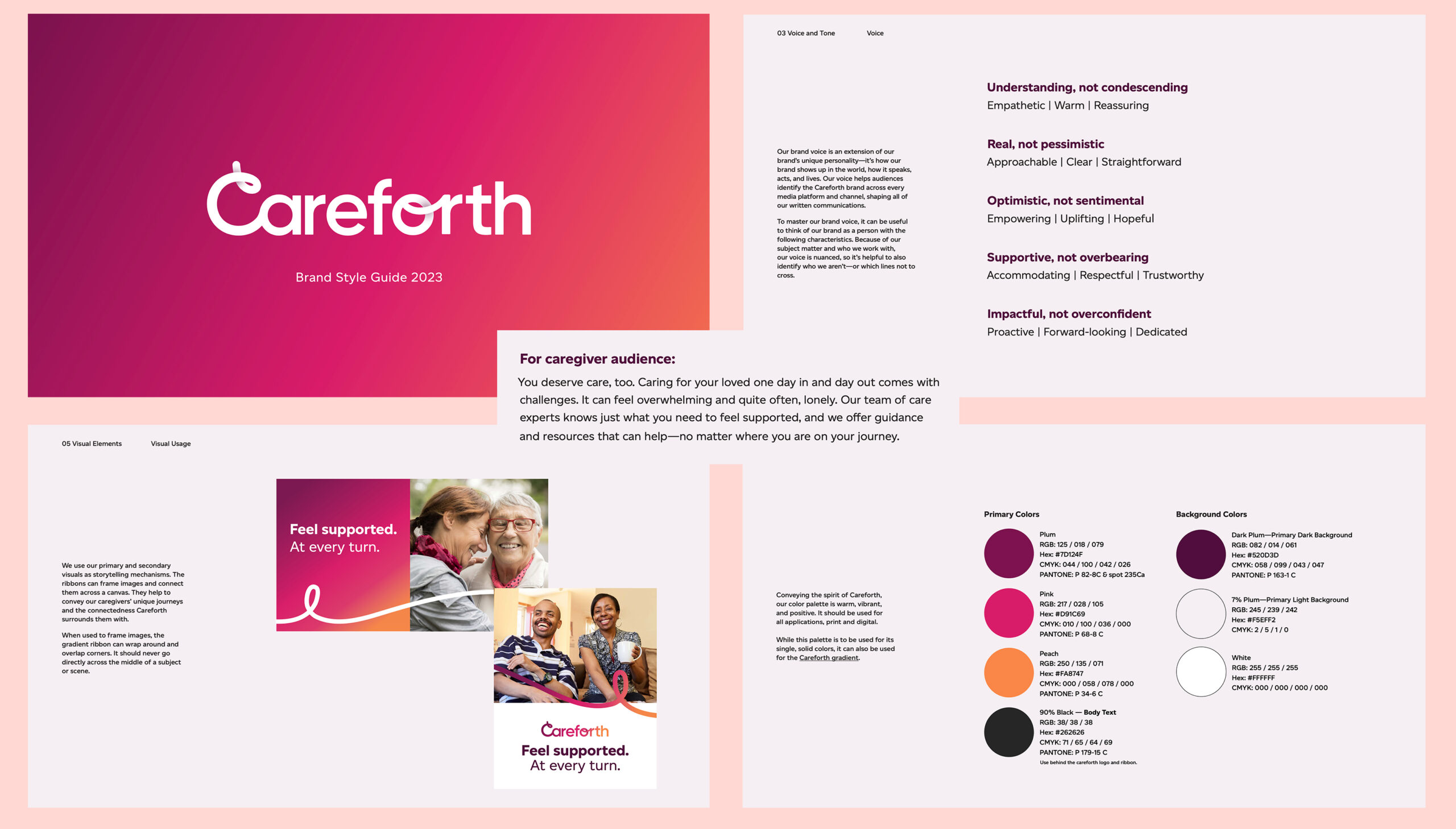
The entire organization was in the process of rebranding to Careforth from the previous Seniorlink and VelaLearn brands. They were undertaking this rebranding alongside asking us to migrate their site from Drupal 7 to 10, so it made sense to redesign under the new brand.
At the onset, I was unaware of the rebranding as they hadn’t shared this information with us, so I ventured into design discovery without knowing if we were going to be using the existing VelaLearn brand, or if I was going to have creative liberty to provide a new look and feel.
However, we learned of the rebrand in time for the Design phase of the project, and I received a detailed brand guideline to work from.
As part of Discovery, I guided the clients through a couple of live “sketching” workshops. In doing so, I was aiming to find out what they liked about their current state, what they didn’t like, and what we could do moving forward to improve the experience for users, while ensuring their own goals were met.
Using Figjam, I design out some rough wireframes with lots of stickies where I ask questions for discussion, take notes and may even build wireframes on the spot based on our discussion. I also take full page screenshots of their current designs, so that we can discuss what should carry over, what can be omitted, and what could be useful to add.
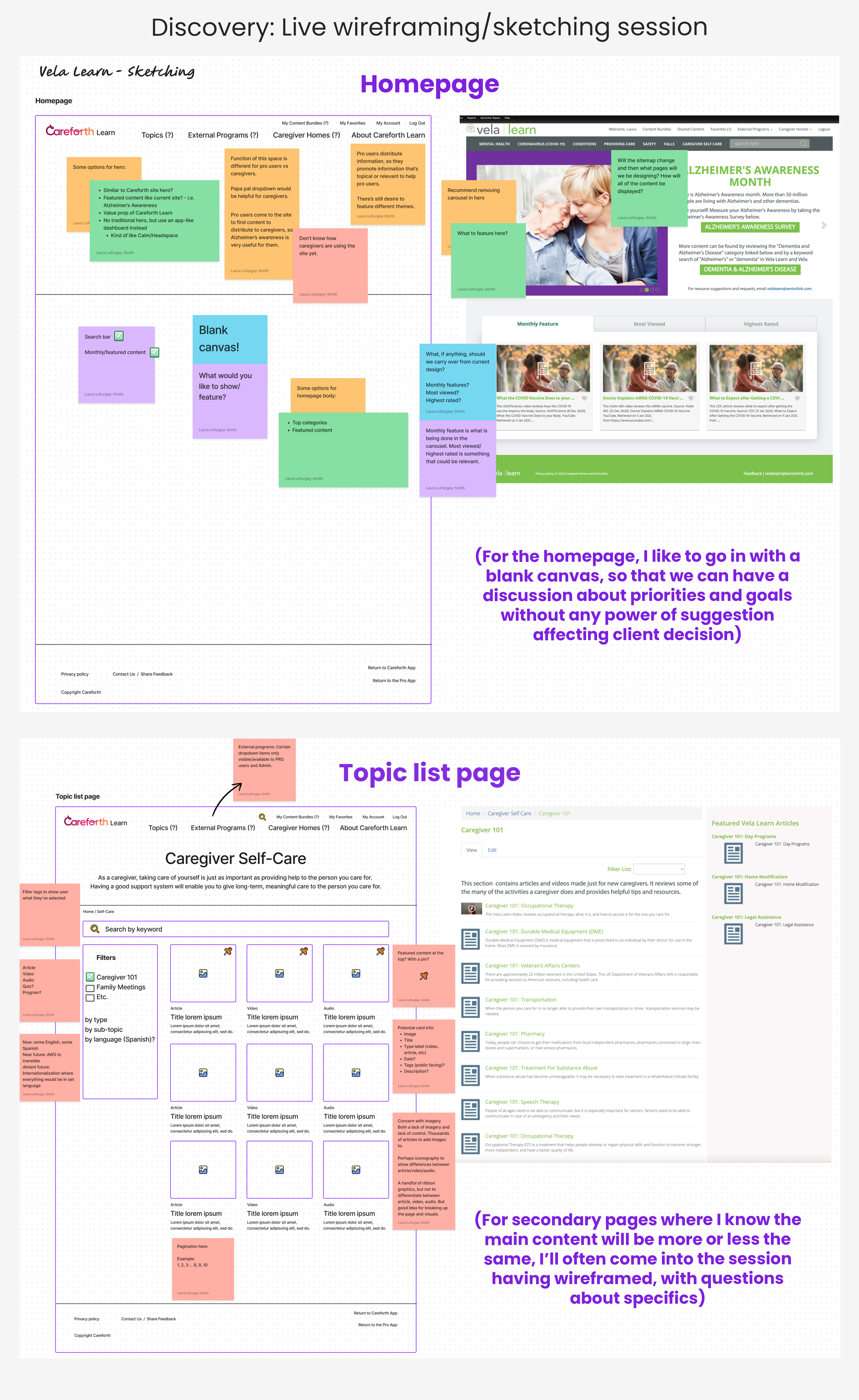
The sketching phase was incredibly valuable and answered a lot of questions not only for design but also for BA and dev.
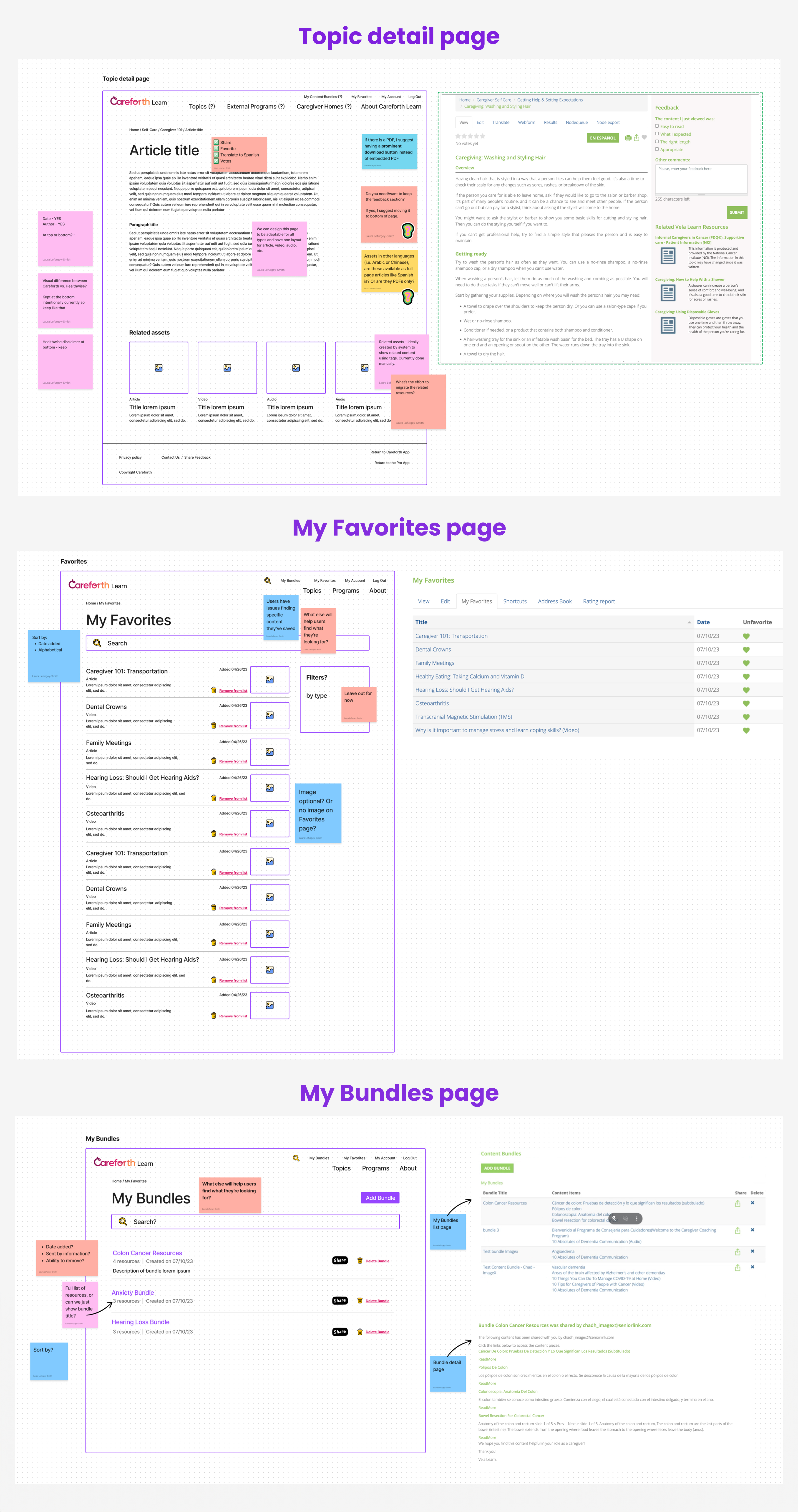
The “My Bundles” experience on the current website was quite convoluted and involved the user to take many confusing steps in order to create one. It was meant to be a way for admins to create a curated list of resources for a specific caregiver. For instance, a caregiver whose elderly parent was dealing not only with dementia, but other health concerns. Our Lead Dev managed to find a way to simplify the experience for all parties by creating deep links for a Bundle. This solution also allowed me to simplify the experience from a UX perspective.
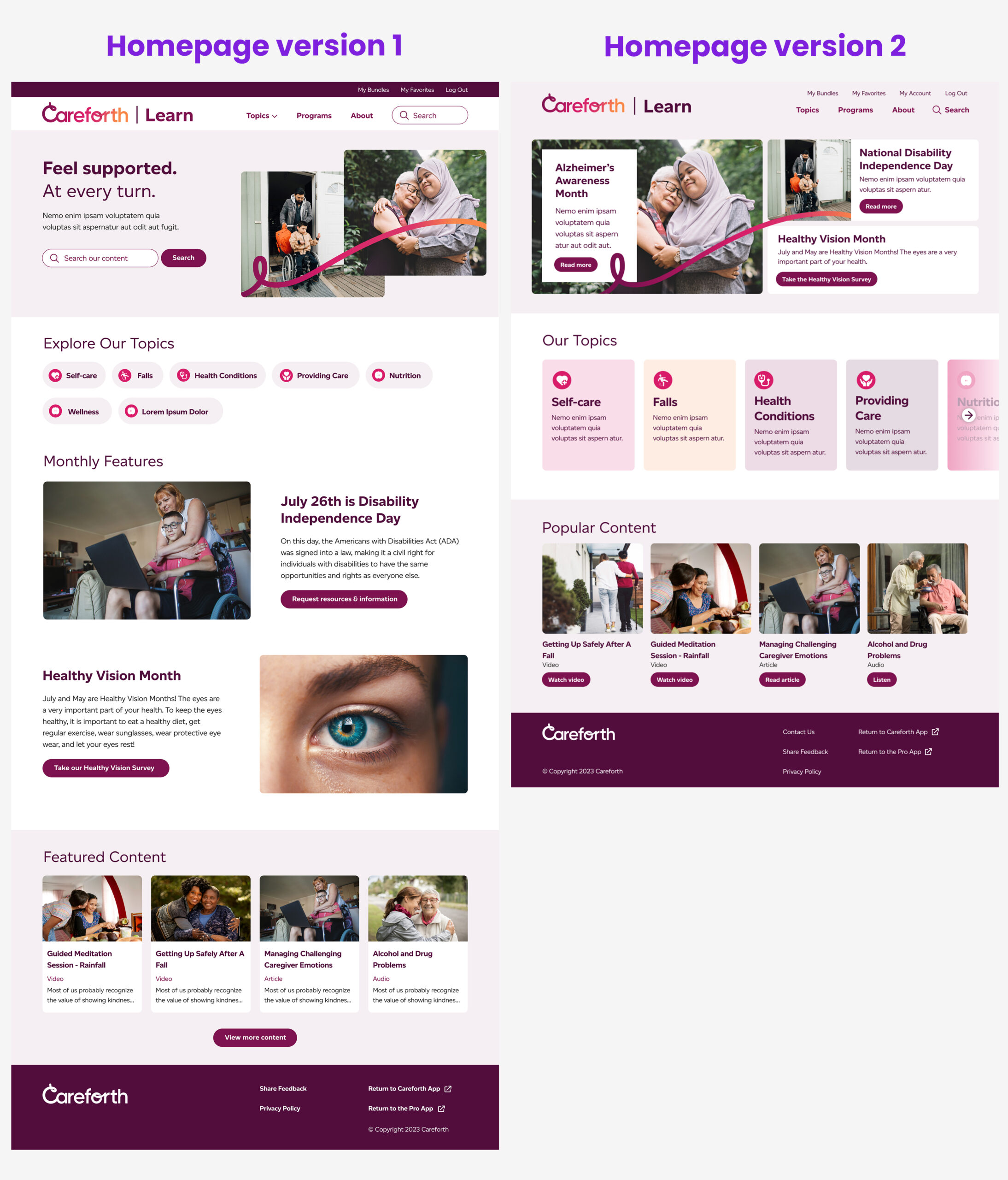
When undertaking a website redesign, I often like to provide two versions of the homepage to demonstrate to client. I like to do this as a step beyond discovery, to really solidify the visual direction of the UI. The reason for this is two-fold:
1. It allows for some variation in look, feel and style of elements. This way I can get a better feel for what resonates (and doesn’t resonate) with the client, and it ends up strengthening the overall design for the rest of the website.
2. It allows for discussion about content hierarchy and placement. Even if we’re not discussing two different versions of the homepage from a content perspective, presenting two versions of the homepage allows me to show different ways of laying out content. Perhaps in a different order, or perhaps with different style of components.
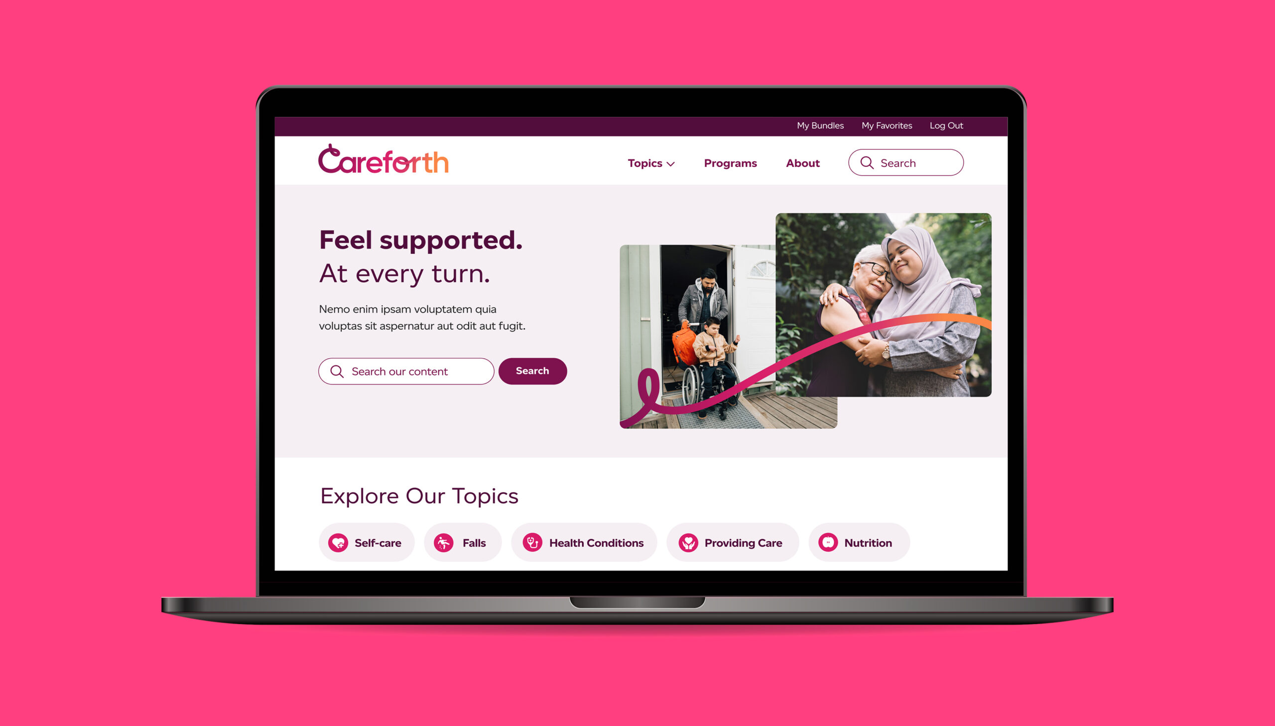
HOMEPAGE VERSION 1 – The chosen one
In Discovery, we learned that a primary goal for them was to allow a way for users to search and explore content. Version 1 of the homepage reflects this goal by having a prominent search field as the main action inside the hero, as well as showcasing “pill” tags directly below of the main resource topics.
The client still wanted to be able to show featured content, such as “Dementia Awareness Month”, so below the pill tags, I use what we at ImageX call ping pong blocks to show this.
HOMEPAGE VERSION 2
We encouraged the client to move away from having a hero carousel, and they agreed to explore alternative options of showcasing their featured content. So in the second homepage version, I show featured content in a bit of a unique style of hero. (I intentionally included a prominent search as part of both versions of the navigation to address this important goal).
Version 2 also showcases resource topics with individual, colourful cards with a fade-out effect to denote side scroll.
From our Discovery findings, we knew what pages were priority. It isn’t a huge website, but there were some important considerations and challenges to solve for, like the Bundles page that I mentioned previously.
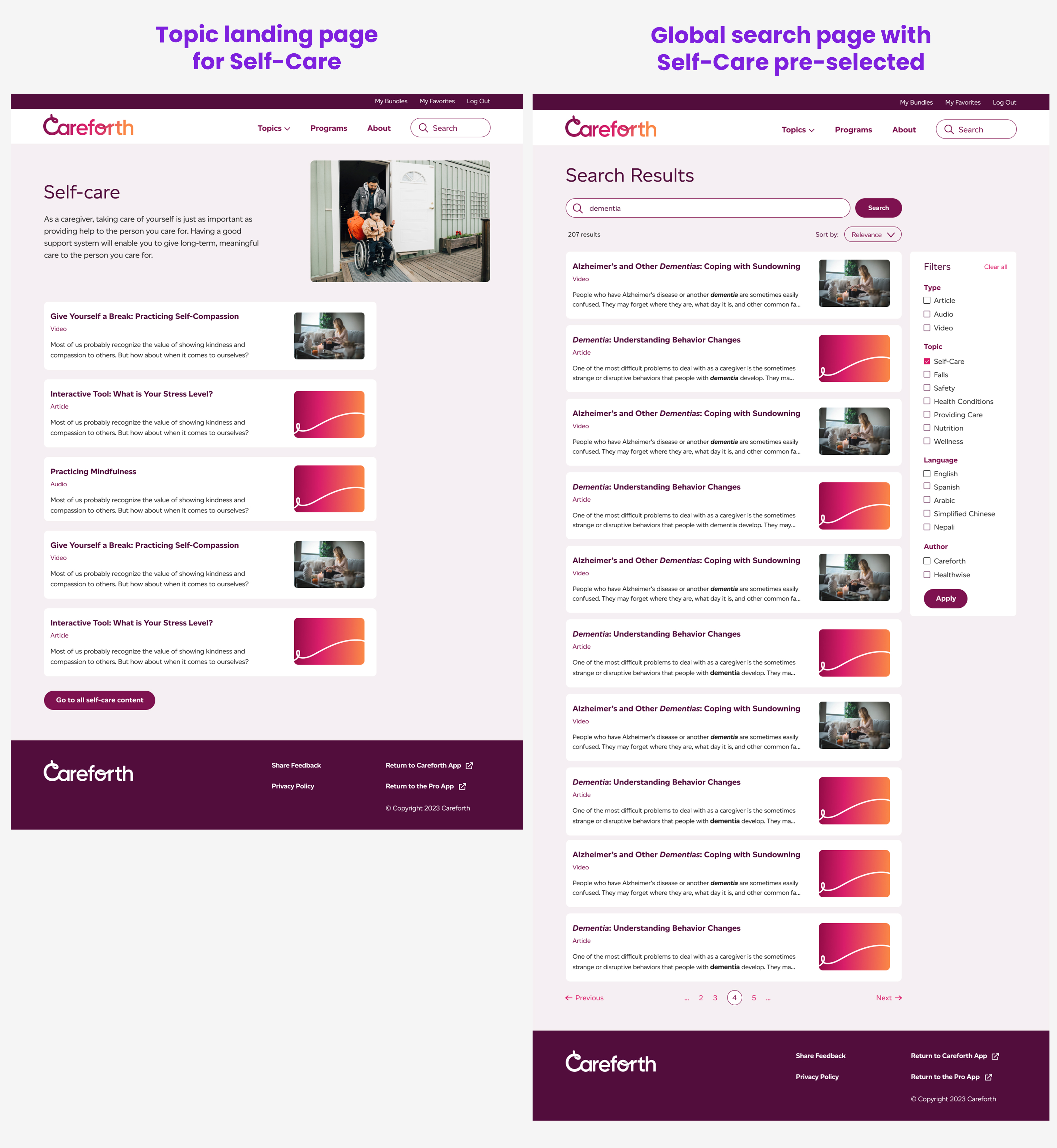
Another challenge was what to do with all of the different topic pages (i.e. the list of resources for Falls, Self-Care, etc.), and how to display those in a budget-friendly way. We suggested having a search page, where filters for Falls or Self-Care would be pre-selected when a user lands on it. This search page could be versatile for each topic, but also used as a global search page. They felt strongly that each topic deserved a dedicated page with at least title, description, image and newest or featured resources.
We suggested that we could have a basic landing page for each topic, and include a CTA after a list of ~5 topics, that then takes the user to the global search page with a pre-selected filter.
They agreed on this compromise so that is the direction we went with.
Of course, along with the above mentioned pages, I also delivered:
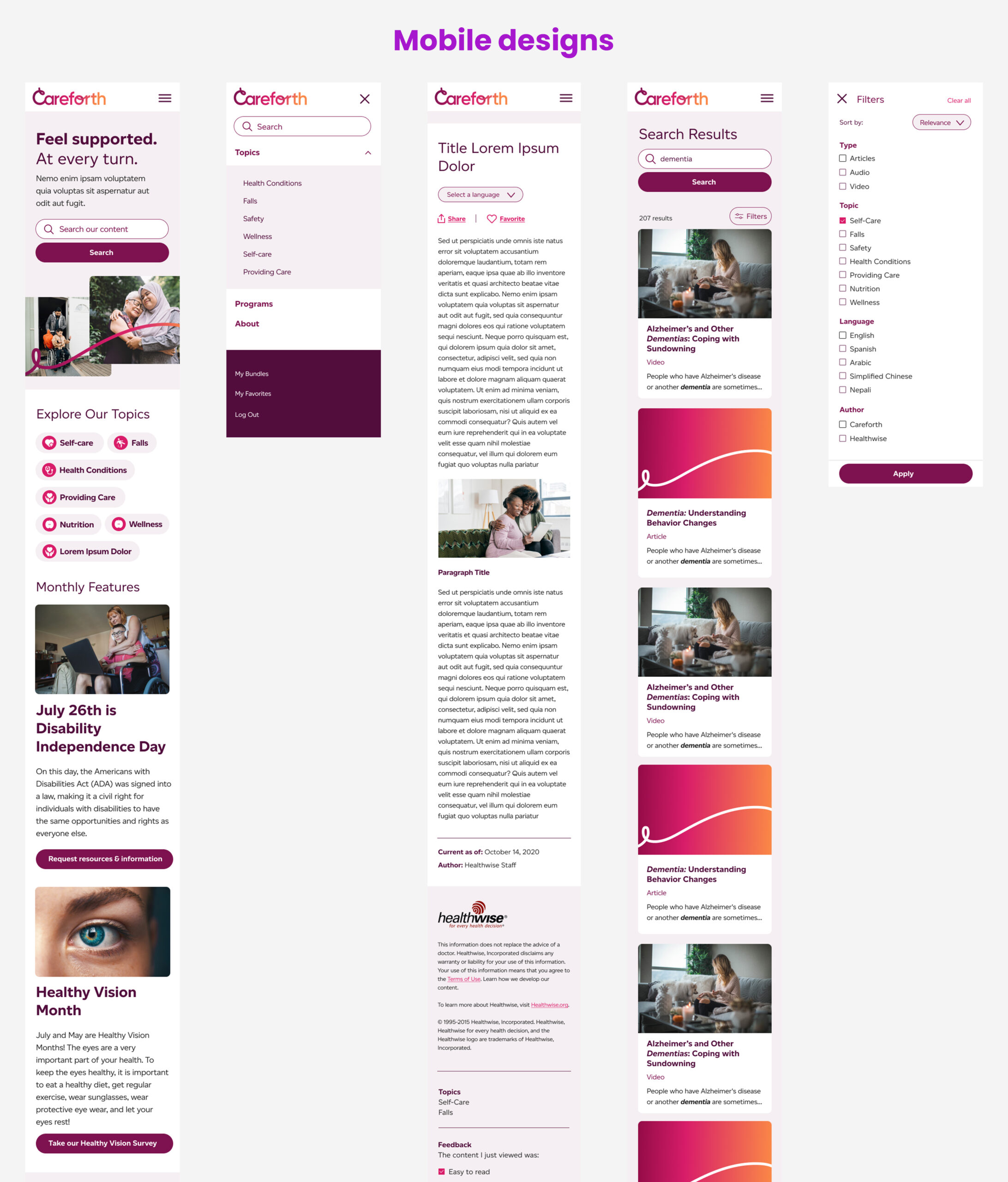
Here are some samples of mobile, UI Kit and components that I delivered.