
YMCA Projects
OVERVIEW
ImageX Media has a strong relationship with YMCA organizations, both in USA and Canada, and has worked with dozens of Y’s across North America. Since I began with ImageX in March 2021, I have been the lead UX & UI Designer on six YMCA project redesigns. Two recent YMCA projects I cannot discuss as they aren’t yet launched, but here are four I can, and when I worked on them:
- YMCA Calgary – April – June 2021
- YMCA of the Virginia Peninsulas – May – August 2021
- YMCA of Greater Hartford – December 2021 – March 2022
- YMCA of Northern Alberta – February – May 2022
MY ROLE
Senior UX & UI Designer, ImageX Media
On each YMCA project where I was the UX/UI designer, I aimed to provide a website UI that was both compliant to the overarching YMCA brand and template, while also striving to help each YMCA differentiate themselves within these constraints. It is always a fine line where I must adhere to certain standards, but also want to provide each YMCA with a unique experience.
Deliverables: ~10 high fidelity page designs (a mix of desktop and mobile), UI Kit and Component list.
"Sharing some kudos for Laura after getting some brilliant client feedback after showing some early moodboards today. The client was really thrilled and felt we had done an excellent job to reflect the discovery feedback. The client's response was 'it is so good I can almost touch it!'"
- Project Manager at ImageX for YMCA of Northern Alberta
The same Discovery for each Y, to find out what's different
Each YMCA project kicks off with Discovery. The Discovery sessions are typically the same for each one, and it allows us to learn what’s unique and different about each Y.
At the time of the YMCA projects I mentioned above, we as their Drupal development agency adhered to a YMCA platform called Open Y Carnation. The layout, components and look and feel were pretty much just skins of each other. Most YMCAs are happy with this setup, as they are coming from outdated, older websites and are happy for a change. Some Ys are less pleased with this arrangement, and it’s our job to navigate how best we can adhere to the constraints of the system, but push the boundaries in a way that we can provide them a unique UI.
What we typically know about YMCAs, and like to discuss and confirm in Discovery, is that parents of young children are usually the primary audience. Mobile usage is high (this is because parents, particularly moms, are busy with their kids and look for schedules on their phones. As a mom of a toddler, I understand this now!). YMCAs also offer discounted rates to youth and seniors, with a huge variety of programs and services.
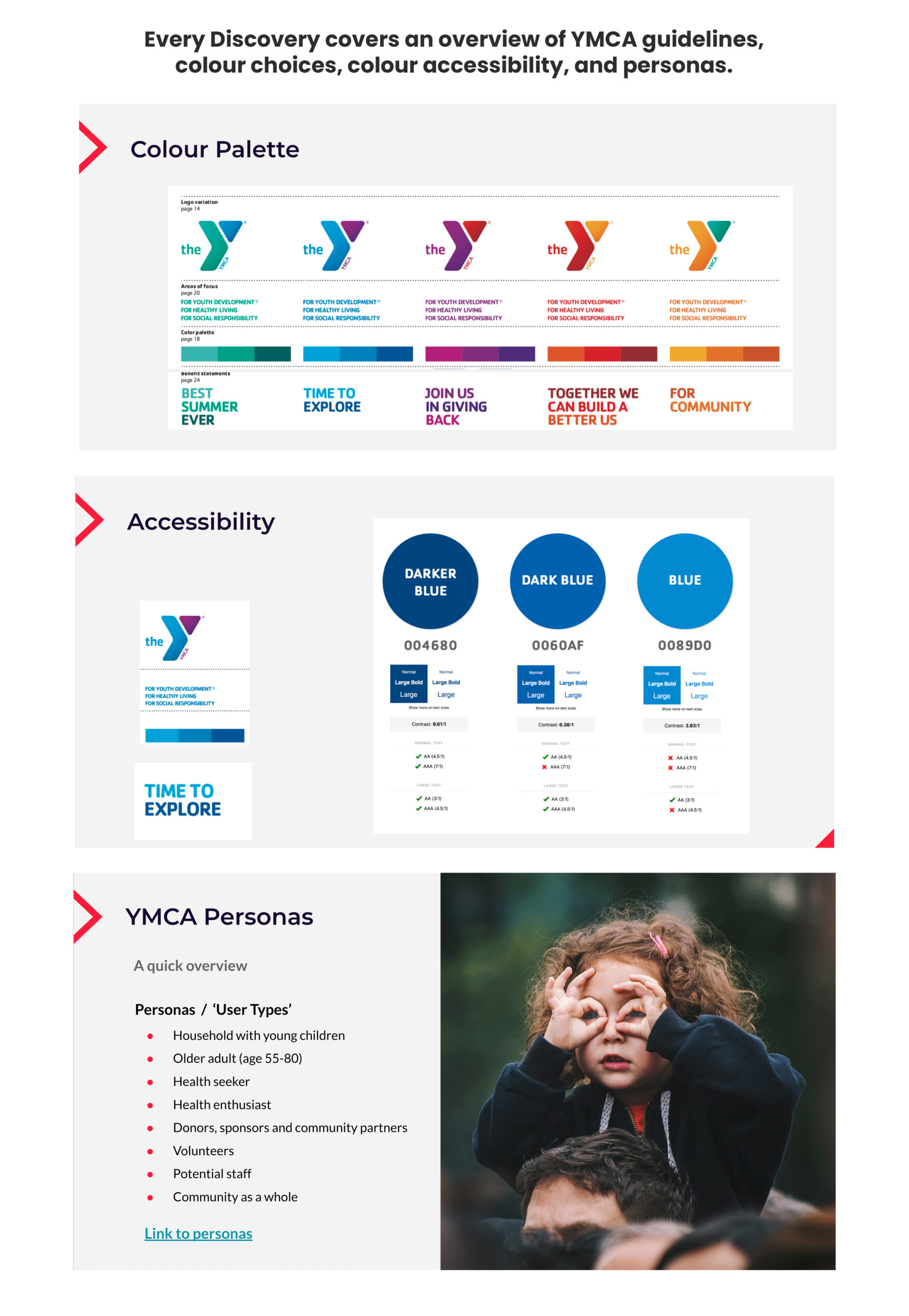
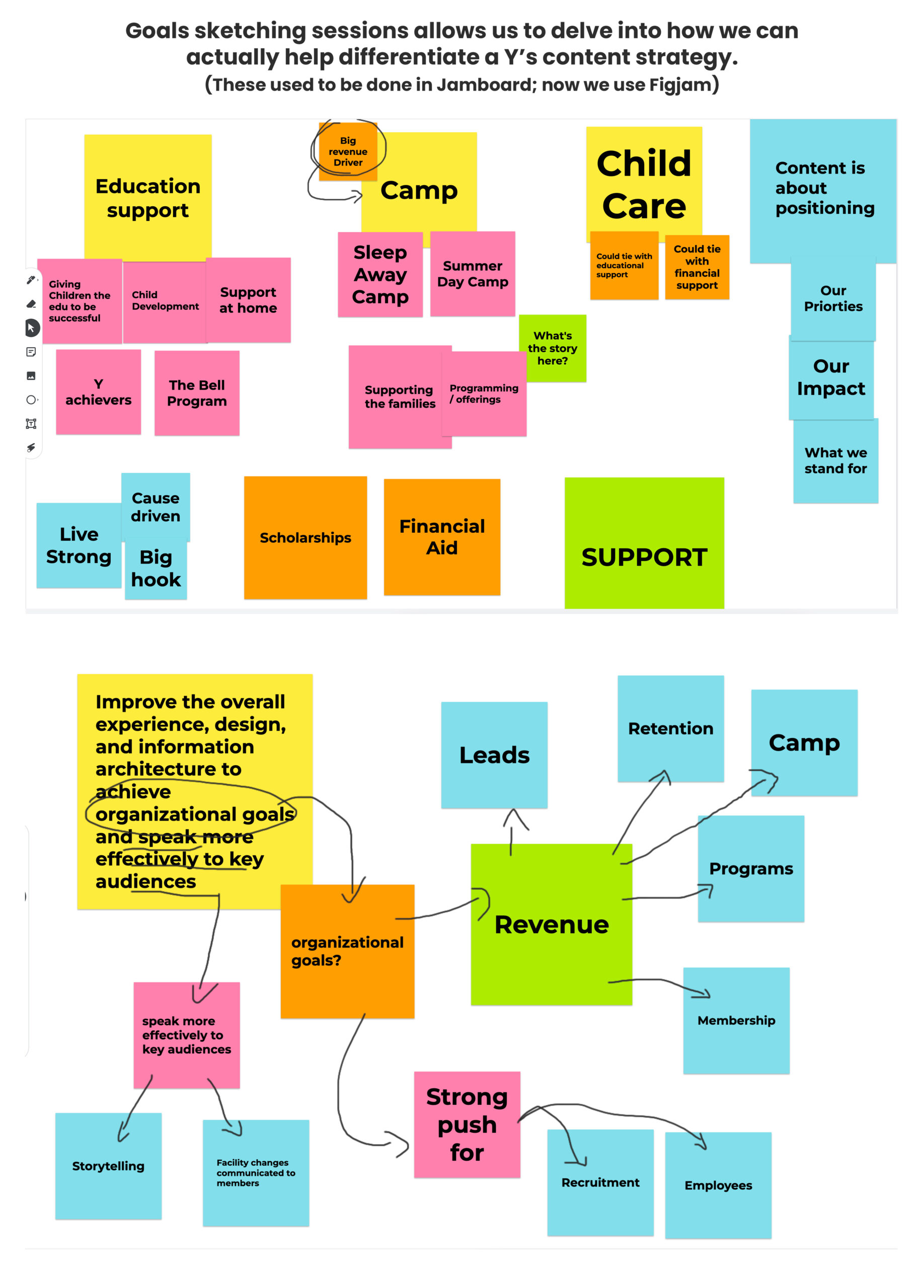
Heading into design with unique discovery challenges
Challenge 1: YMCA of Northern Alberta had an organizational structure to solve for.
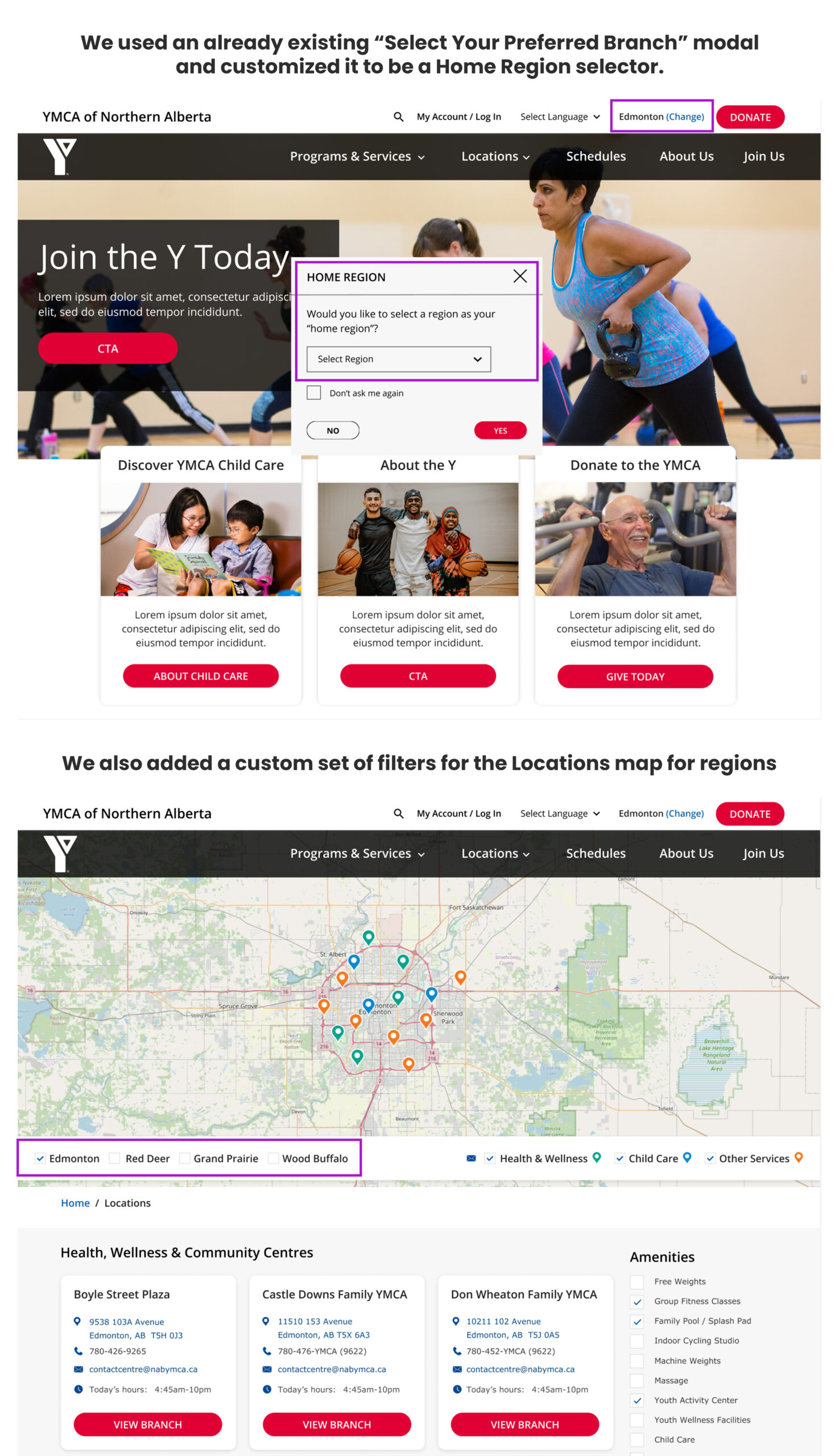
What was unique about this particular YMCA was their regions. Instead of different branches within a city (like YMCA Calgary, for instance), YMCA of Northern Alberta has multiple branches within the city of Edmonton, but they also had multiple regions north of Edmonton that posed a challenge for how to structure their Locations.
The regions offered completely different services from each other, and one user from Edmonton would likely not need to know anything about the branches and services offered in a northern region, hundreds of kilometres away.
Solution: Adding a custom “regions” section to the Locations map, and using an existing “preferred branch” modal to select a preferred region.
Challenge 2: YMCA of Greater Hartford wanted to push the out-of-box look & feel.
YMCA of Greater Hartford greatly disliked the out-of-box look & feel of the templated Carnation system and wanted to see if they could push the boundaries of the YMCA brand to emulate some more modern, non-Carnation YMCAs.
Greater Hartford was clear with us from day one that they really wanted to emulate some YMCAs that were outside the templated system, and we learned more details about what they were looking for in Discovery.
They loved the YMCA of Greater Houston and the YMCA of Greater Boston as examples. They loved how modern, sleek and monochromatic they were, as well as how the images were full width, large and prominent. The only issue was: these YMCAs weren’t built using the same Open Y Carnation theme.
Solution: So my goal was to see just how far we could push the Carnation theme, getting as close to the look & feel of Houston and Boston, all without straying too far away from the Y brand and potentially getting Greater Hartford into trouble.
Challenge accepted!
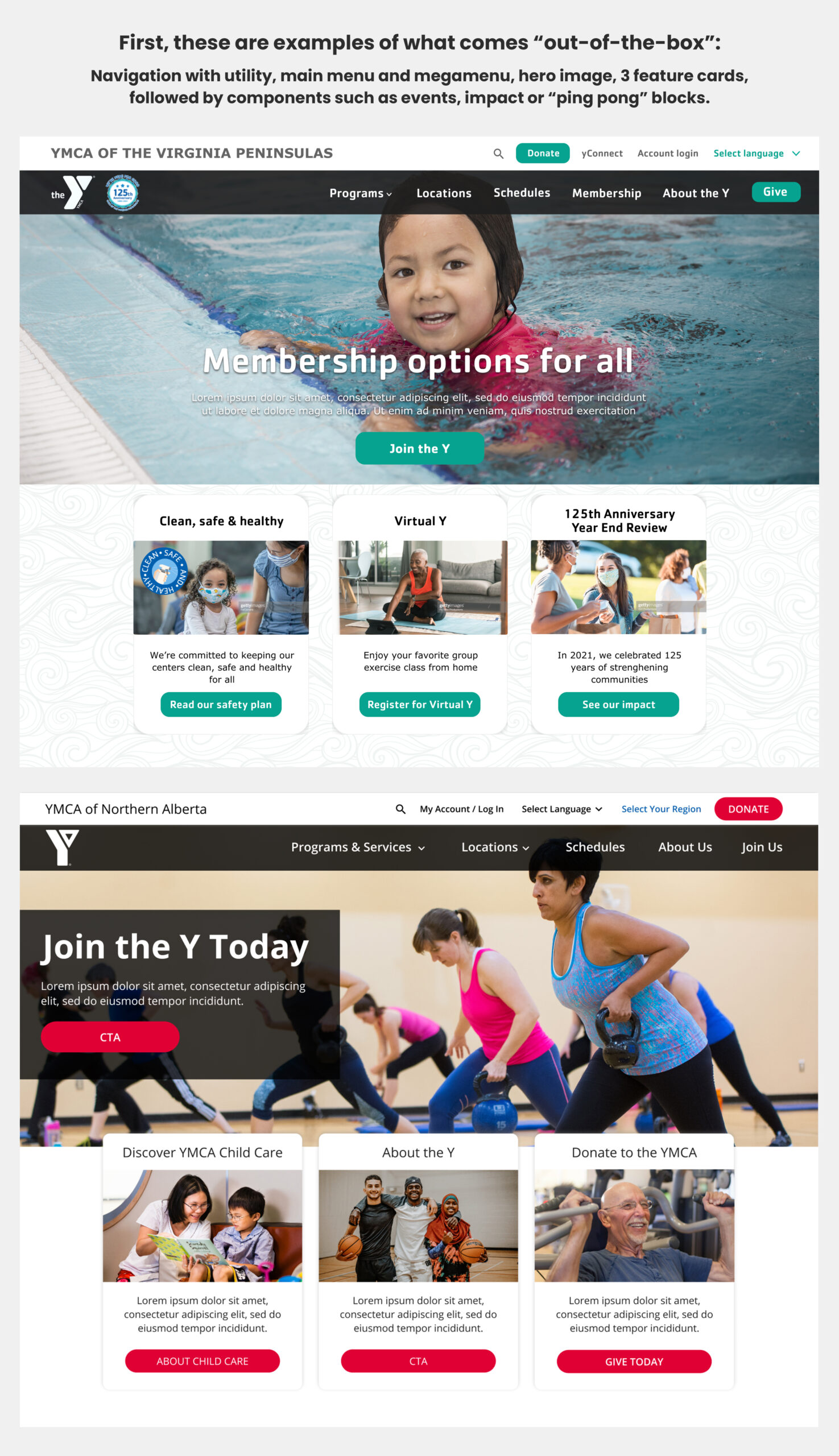
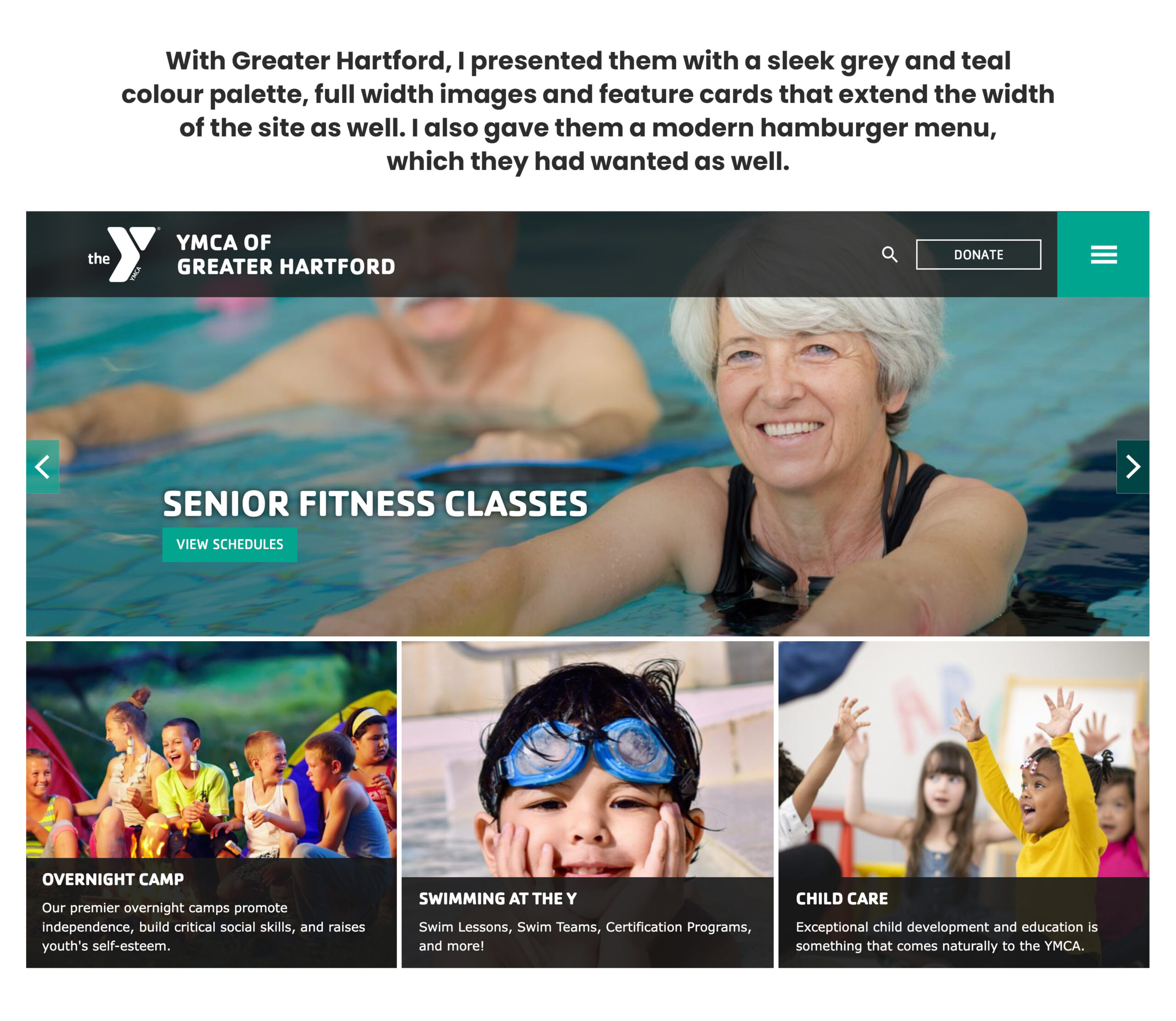
So, we managed to do it!
Working closely with the lead dev on the project, I asked him what was feasible to emulate from Greater Houston and Boston, but that wasn’t too far outside the box that it would all be completely custom. Some elements were too far outside the scope, but this is what we went with that was different:
- Full width imagery and components such as feature cards, which was one of the primary wants
- Simplification of the colour palette to dark grey and teal. Many of the Ys have very bright, colourful palettes, and Hartford just wanted something very simple and sleek.
- Hamburger menu on desktop
- These styles applied to many other components, as we’ll see below!
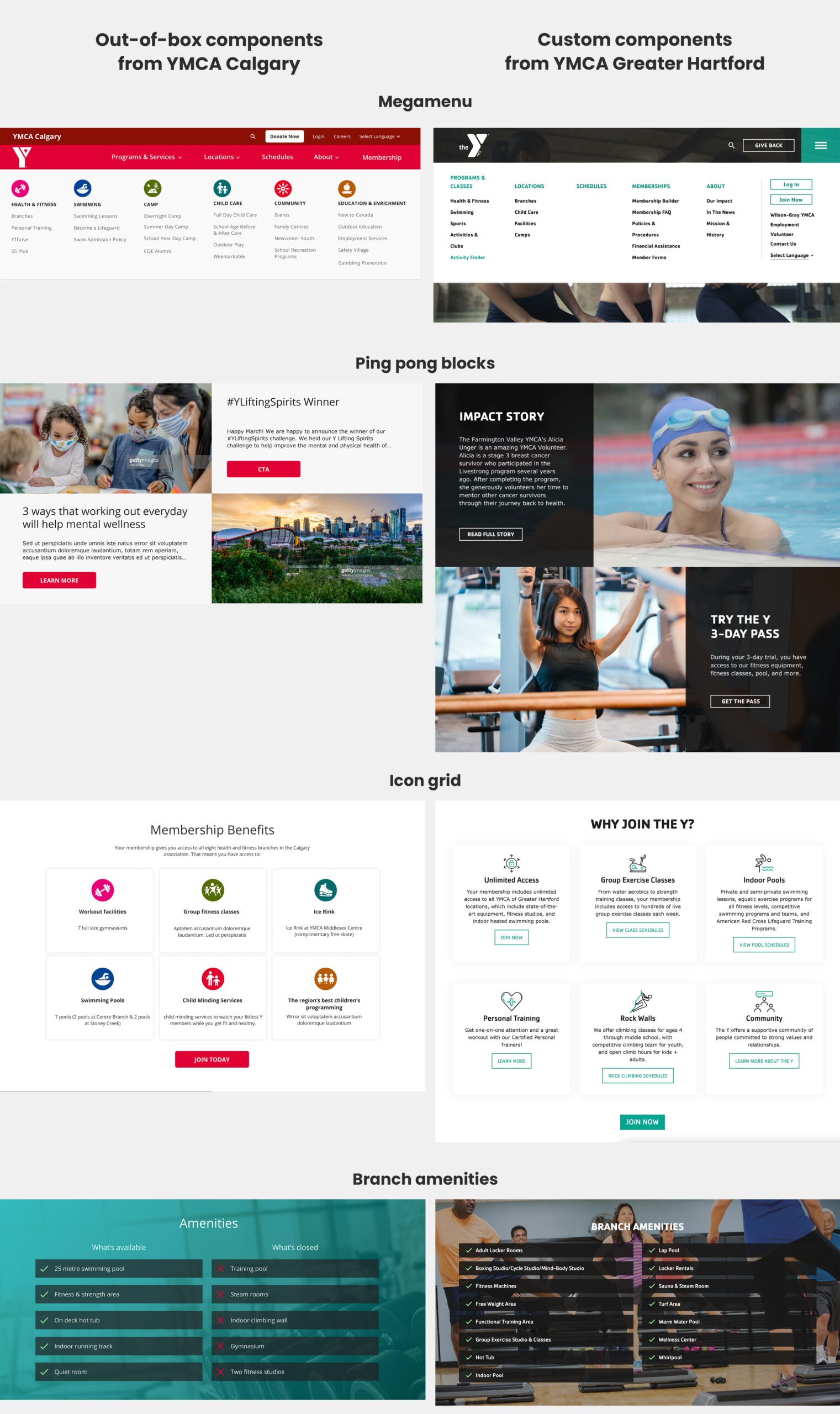
The word got out about Greater Hartford and other Ys wanted in!
I heard that after Greater Hartford launched, the word got out about what we did and how we pushed the boundaries of the Carnation theme (while remaining compliant), and other Ys wanted to see what we could do for them, too!
I took on my first YMCA project within months of starting at ImageX, and received this feedback:
"[Laura] also took on her first Y, and crushed the work for Y Calgary out of the park. Client was very, very happy throughout the design process and we all know how this pays us back further down the road - Great work here Laura."
– Director of Design at ImageX
New YMCAs on a totally new platform, and positive feedback
I can’t share much detail about the new YMCA projects, but at ImageX we’ve entered a new era with the Ys where they have a totally new platform, more autonomy and new modern styles. With vague detail only, I have taken on two YMCAs in the last 6 months, one Canadian and one from USA. Working with BA and dev closely, I have been helping redefine what design’s role is in helping the Ys these days.
With the two that I have taken on, I have received some great feedback on the value that I have provided to the clients!