
Search Tweaking System
OVERVIEW
The Search Tweaking System was an internally developed software to allow the Left Travel PPC (Pay Per Click) team experiment and manage audience segments to improve conversion rates for our accommodation booking product.
Though an incredibly sophisticated, but complicated tool, it was built without any usability testing or UX methods. It was very difficult to use and only a couple on the PPC team felt comfortable using it because it was also very easy to break, which obviously caused some very real risks for losing revenue.
MY ROLE
Lead Product Designer, Left Travel
I was asked to take on a redesign of the STS in order to make it easier to navigate, more usable and less complicated.
Project scope & details: the redesign of the STS took 6 weeks, in late 2019 and was done alongside other Left Travel product tasks. I used Sketch for mid- and high-fidelity designs, with InVision prototyping for usability testing at both fidelity levels.
Important note: Due to the confidential nature of the STS tool and a lack of easy access to it, I am providing snapshots from the tool when I worked on it, with Ratio sets blacked out in order to hide private information. However, I have kept some examples to demonstrate how it works, and all of the Ratio sets in my redesign are shown because they are mock examples only.
First and foremost: understanding how it works
In order to be able to design a better experience for my team, I first needed to fully understand and immerse myself in the STS. This was no simple feat, and in order to do this, I completed:
- Walk throughs and interviews with senior PPC team members
- Interview with engineers and video tutorials and put together by Bangladesh team members on how to use the STS
- Analysis of existing STS
- I requested and was given access to the STS to make mock changes so that I could play around in a zero-risk environment
- Research of data-heavy dashboards and best practices
I did that for a couple of weeks and finally understood how it worked. And what I found what it was just as confusing to use as I had been told!
But, this is what I learned:
The main purpose of the STS was to set Ratios for accommodation listings (eg: 30% Airbnb, 40% Booking.com, 30% HomeAway). In order to set a Ratio, a PPC specialist would base the Ratio on several other factors:
- User location (i.e. someone searching for accommodation from Canada)
- Device (i.e. desktop or mobile)
- Property type being searched for (i.e. hotel or vacation rental)
- Left Travel brand (i.e. RentByOwner.com, Oahu.com, etc.)
There were different sections to the STS, but my main focus was what would immediately provide value to my team: the Ratio sets section.
Structure, major pain points and usability issues
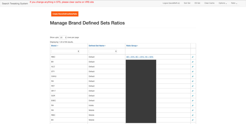
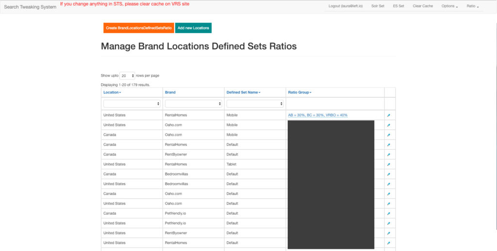
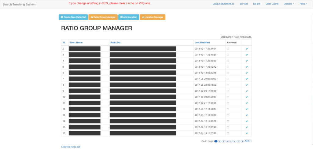
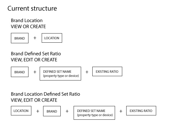
- Three distinct areas to set Ratios, and one for Ratios themselves: some allowed editing, some didn’t, some contained more detailed data sets, and some didn’t.
- Clearing the cache: As seen in the screen shots, anyone using this tool would have to manually clear their browser’s cache for any changes to take effect.
- No feedback on updates: When changes were made, the STS wouldn’t provide any feedback on if the changes were successful.
- New Ratio sets were placed at the end of list and many pages: If you wanted to see if your new Ratio set or update, you would have to very last page of years of Ratio sets and find the new one, or find the edited one in the long list.
- No way to know what Ratios were active vs. old, and no way to delete old ones: In the long list of Ratio sets, there were active sets and old, inactive sets with no way to tell which ones were which, and no way to delete ones that were obsolete.
Low hanging fruit and easy wins first
I found that we could make some very simple changes that would have a huge impact on improving the STS. After some internal testing with the PPC team, these are the first changes I made:
- Automatic cache clearing: This was something I knew needed to happen from the start. I wasn’t clear on the technical implications of needing to clear it manually or not, but I added it to the top of my requested changes.
- User feedback: This was another feature I felt was critical to proper usability of the STS, so that my PPC team could know if their changes were successful or not.
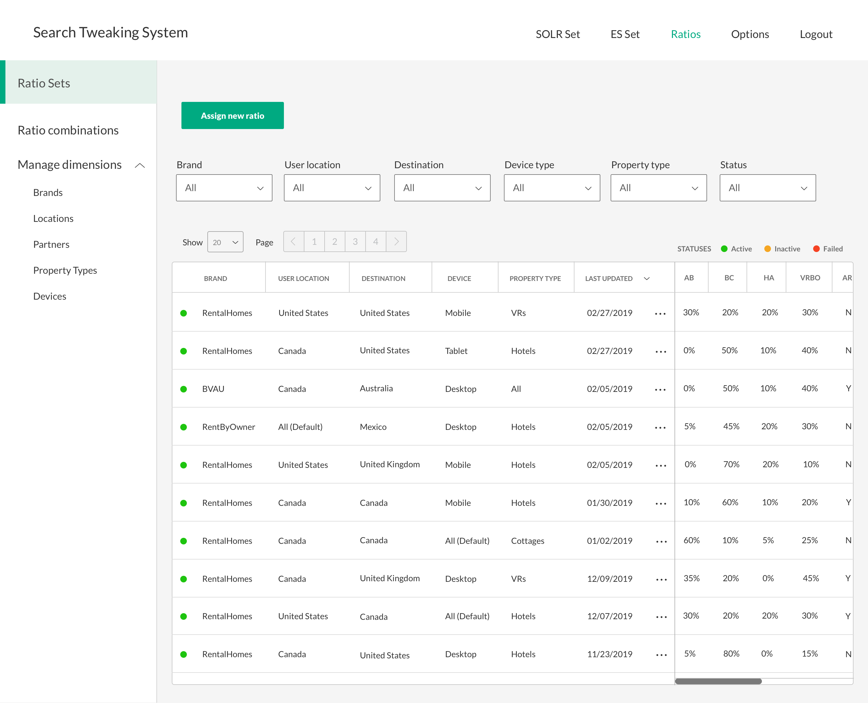
- Statuses for Active, Inactive and Failed: I was told that many of the Ratio sets were old or inactive, but I had no way of knowing just how many were inactive vs. active in the lists. I wanted the ability to not only note which ones were active, but also if there issues had caused any to fail.
- Simplified filter: There was a filter on some of the Ratio pages, but not all. It was clumsy to use, so I took it out of the main data table (as per the screenshot), and moved it above the table so the team could filter by Brand, User Location, Destination Location, Device Type, Property Type, and Status in order to search and find specific Ratio sets.
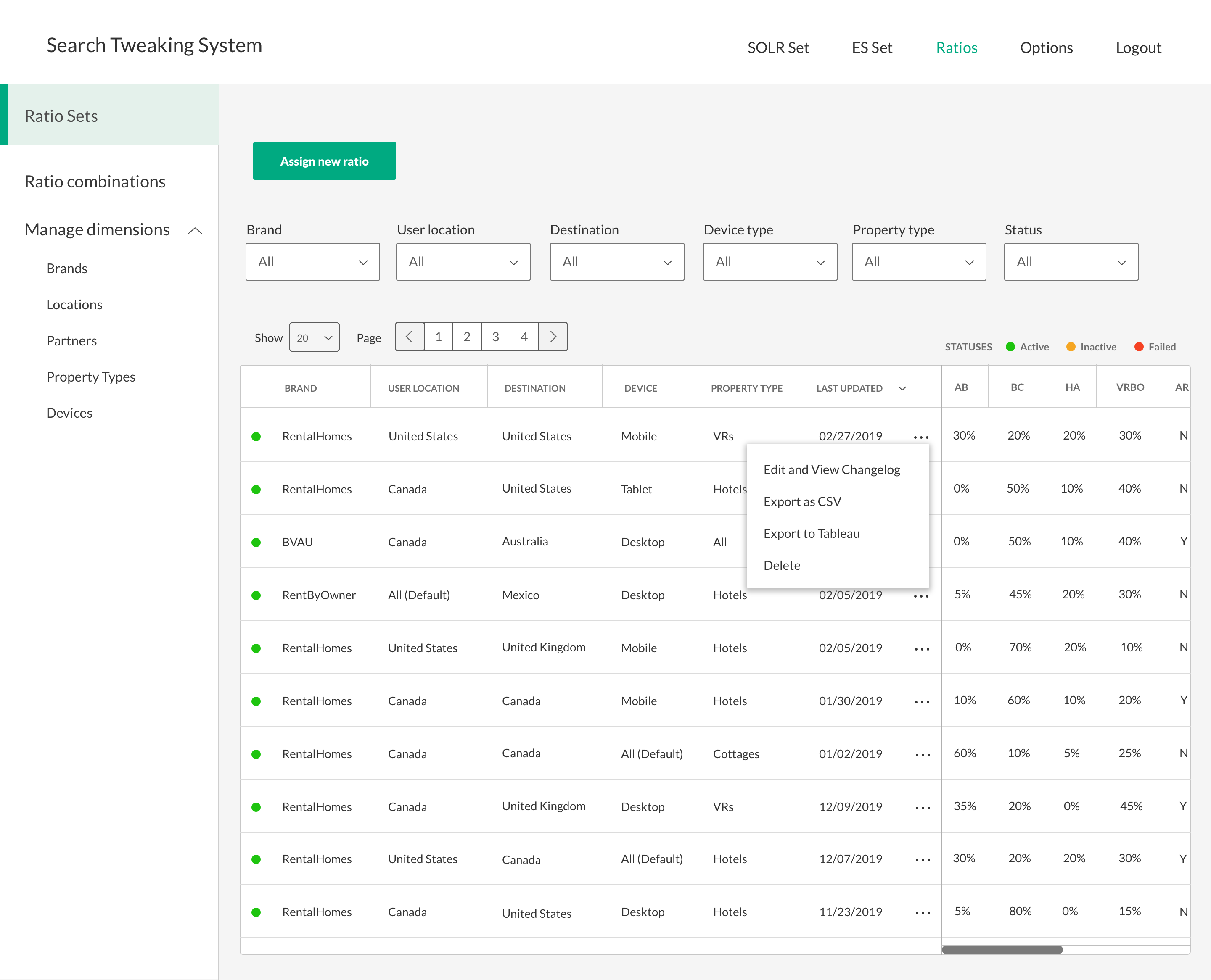
- Ability to delete Ratio sets
Requests from the PPC team
Since we were redesigning the STS, the PPC team requested some feature improvements they wanted to see added:
- Scalability: Since Left Travel was an ever growing business, the team wanted the ability to scale for when Left Travel added new partners (such as Expedia or Kayak), add them to the Ratio sets and UI.
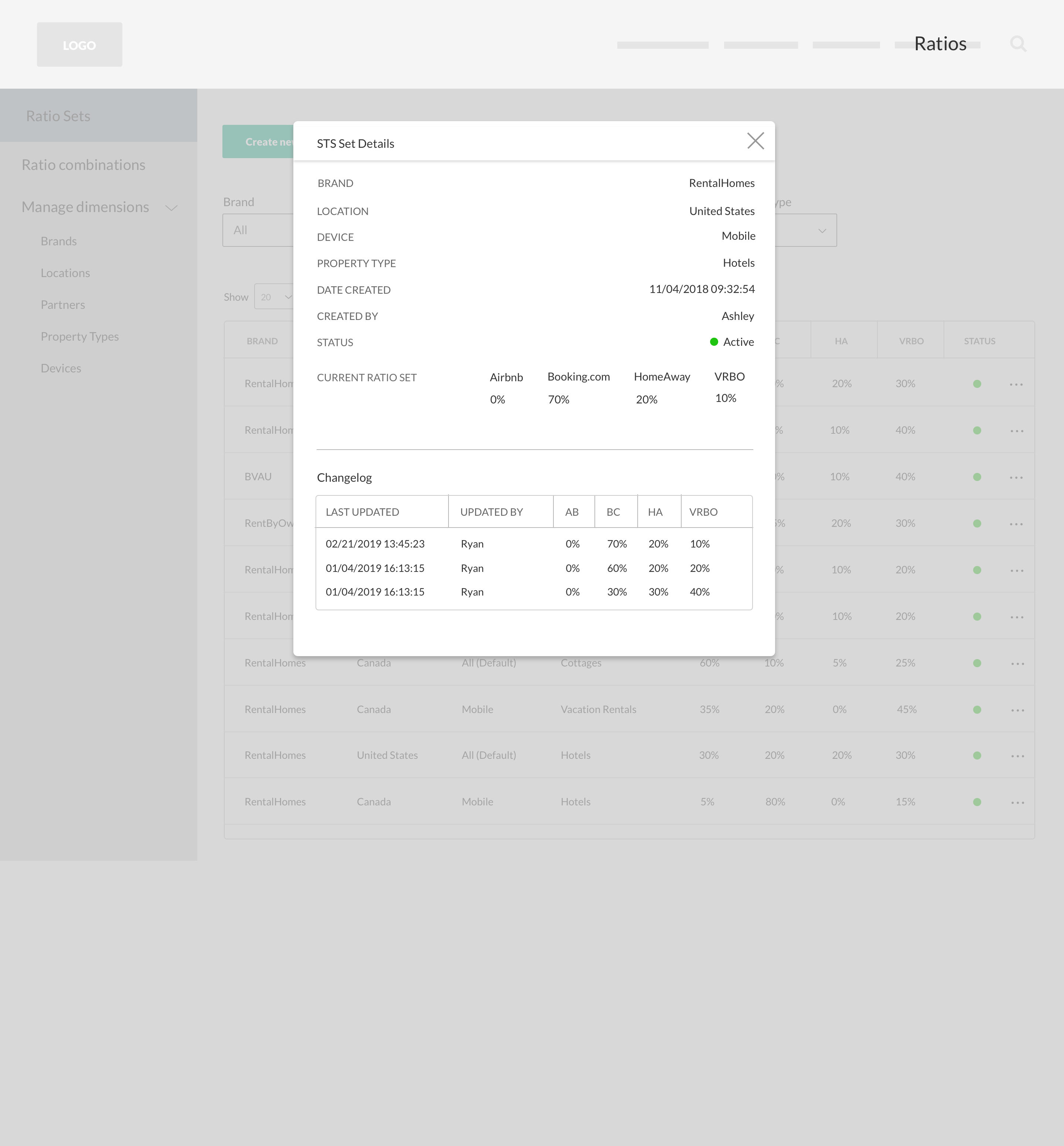
- History and changelog: With dozens and dozens of existing or old Ratio sets, there was no way to know who had created what or when. So the team wanted the ability to view who created the Ratio, when it was created and view a changelog of what had been altered over time.
- User destination: The STS included user location already, but the team wanted to add the destination that a user searched for
- Ability to export as CSV and Tableau
Restructuring in order to simplify
I verified with the engineers that there was actually no need to have 4 different Ratio pages, all showing slightly different Ratio sets, so I decided to eliminate so much complexity by streamlining the 4 Ratio pages into one, simplified interface. The new Ratio sets page contains all of the same information and abilities to view and edit Ratios, but is much more concise, clear and easy to navigate.
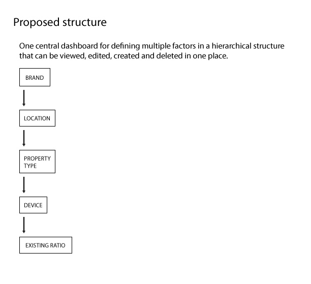
Improved layout and UI
The new Ratio sets page contains all of the same information and abilities to view and edit Ratios, but is much more concise, clear and easy to navigate.
See all the changes I’ve mentioned in the revised UI below.
I also added a left sidebar menu for future pages that the team wanted to tackle, as well as pages to manage individual dimensions (These pages aren’t included in this project scope).
I added ellipses to each row to export data, view/edit changelog and delete the sets.
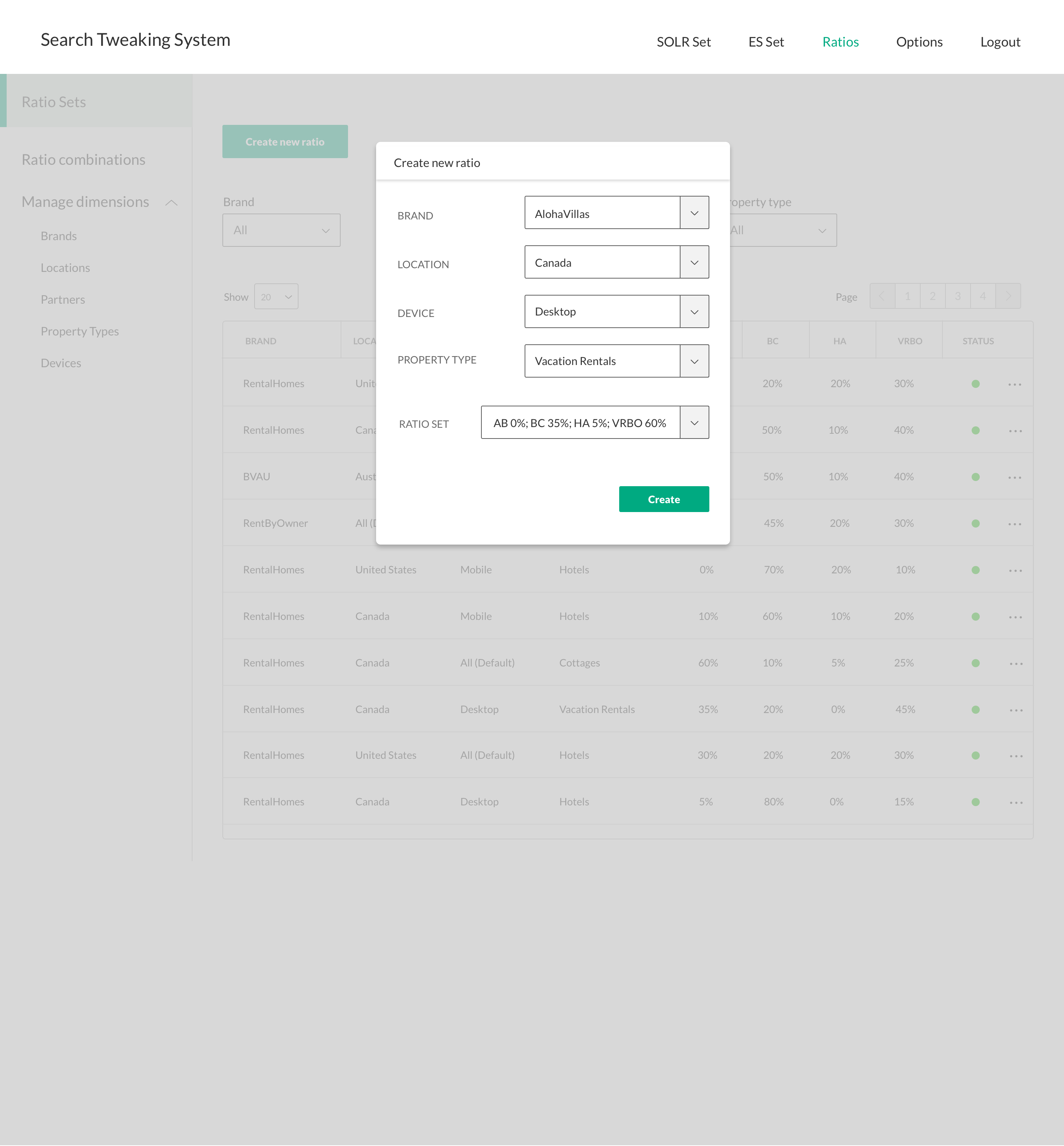
The old STS required leaving any of the Ratio pages in order to create new Ratio sets, so I designed a lightbox to make this user flow more simplistic. When a new Ratio is created, it would be added to the top of the list and feedback for confirmation would be added.
The changelog is also a lightbox and displays not only the historical changes to the set, but also all of its details and when it was first created.
Making PPC jobs easier and providing huge value
Redesigning the STS was a great experience and one that had a positive effect on Left Travel’s revenue. My PPC colleagues were very happy with the changes and felt it would make the STS much more usable, less complex and much safer to use.
The engineers were able to implement all of the changes, ultimately making the work of the PPC team much easier!