KIPP: Public Schools
OVERVIEW
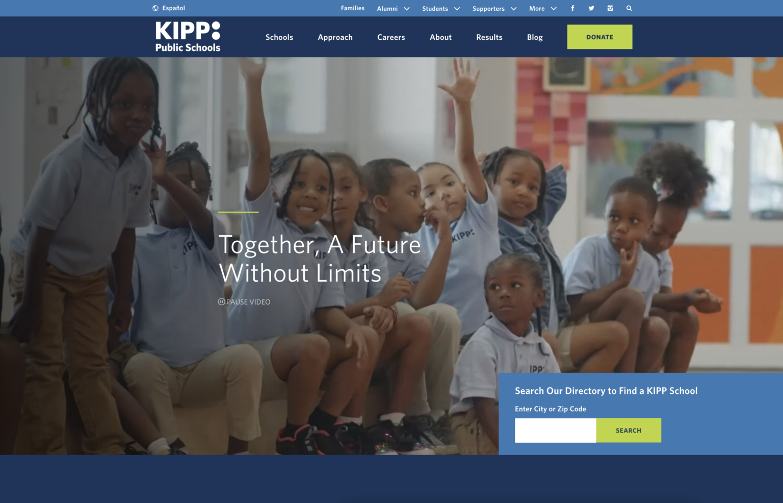
KIPP is the parent organization that oversees hundreds of public charter schools across the USA. This website redesign was taken on by Briteweb, a Vancouver-based, B Corp certified agency that focuses on social good and non-profit projects.
UX project timeline: May – August, 2016
Website launch: December, 2016
MY ROLE
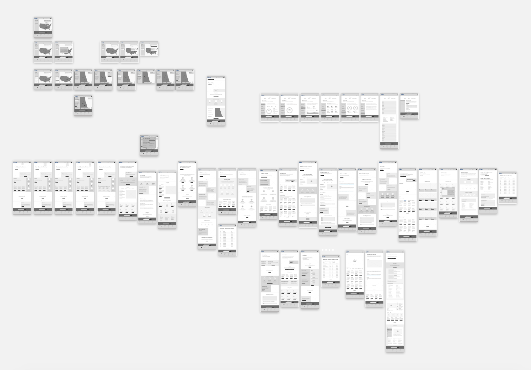
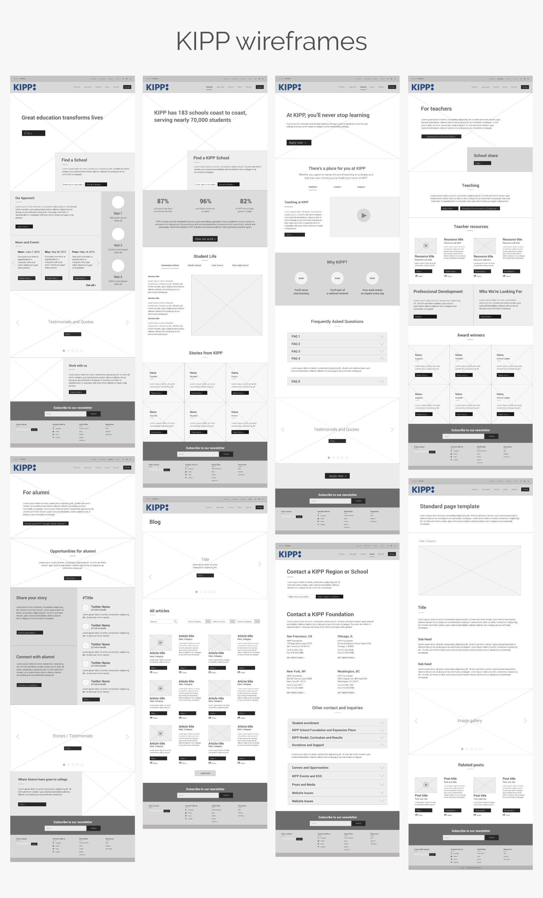
In 2016, I was hired as a UX contractor by Briteweb to undertake the KIPP wireframe designs for over 50 pages. I worked with a UX Strategist, who had done a great deal of user research, and handed off wireframes to the UI designer and developers. to It was my first professional UX project!
Deliverables: Wireframe designs in Sketch, prototype and client presentations in InVision.
The first challenge was getting caught up
I was hired by Briteweb when the KIPP project was well into the UX research phase, so I had to familiarize myself with what KIPP was, what charter schools were known for, as well as the research and IA work that had been done by the Briteweb team up until that point.
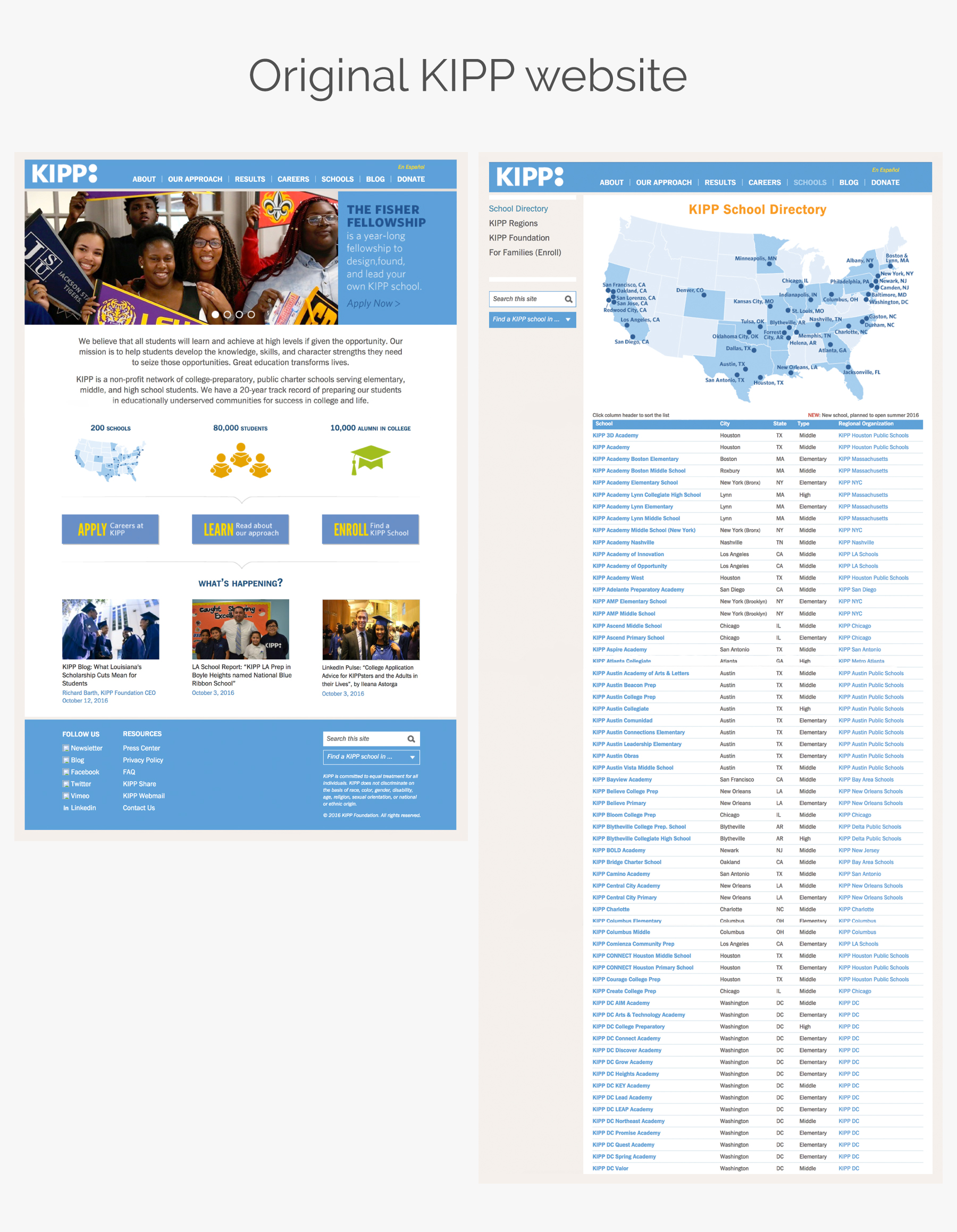
Apart from being a large site, it was a fairly straight forward website. The exception was a School Directory that was a pain point for the client and users, as it was awkward and difficult to use. So I knew this would be a bigger piece of the redesign and would involve user flows and testing in order to be done well.
Taking everything into account: bridging UX strategy and UI goals
I had most of the info I needed about user and business goals from the UX strategist on the project, and the UI designer and developers shared inspiration websites and development constraints with me. I bridged the two and began to sketch out the homepage and top landing pages.
Based on the research that had been done by the UX Strategists, I began to layout the top level landing pages of what would be the new website. We chose consciously not to design mobile first, because data showed that the majority of KIPP’s users were not very tech savvy, and far more likely to browse the website via desktop.
Before I designed a wireframe for each page, I would write a list of the most important content to be included on that page, and design accordingly, all the while recycling content blocks where possible, to reduce the workload for the developers.
Taking everything into account: bridging UX strategy and UI goals
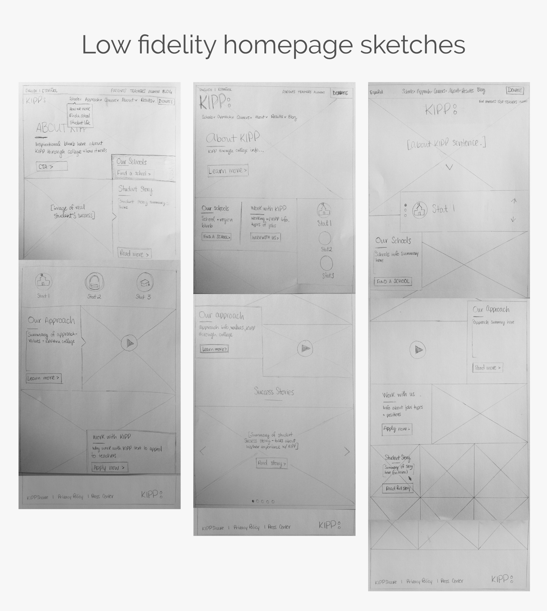
I had most of the info I needed about user and business goals from the UX strategist on the project, and the UI designer and developers shared inspiration websites and development constraints with me. I bridged the two and began to sketch out three variations of the homepage .
Based on the research that had been done by the UX Strategists, I began to layout the top level landing pages of what would be the new website. We chose consciously not to design mobile first, because data showed that the majority of KIPP’s users were not very tech savvy, and far more likely to browse the website via desktop.
Before I designed a wireframe for each page, I would write a list of the most important content to be included on that page, and design accordingly, all the while recycling content blocks where possible, to reduce the workload for the developers.

Setting the stage for the rest of the wireframes
The feedback I received from my low fidelity sketches was that there were elements from all three versions that resonated with client and the internal team. I combined said feedback into a wireframe of the homepage, and from there, set the stage for the feel and layout of the rest of the wireframes.
The next priority was each landing page (i.e. Schools, Approach, Careers and About), which underwent a client demo and round of feedback and revisions. Throughout the project, we were focused on a component-based design system, as to reduce developer workload.
My UX process of designing an interactive map
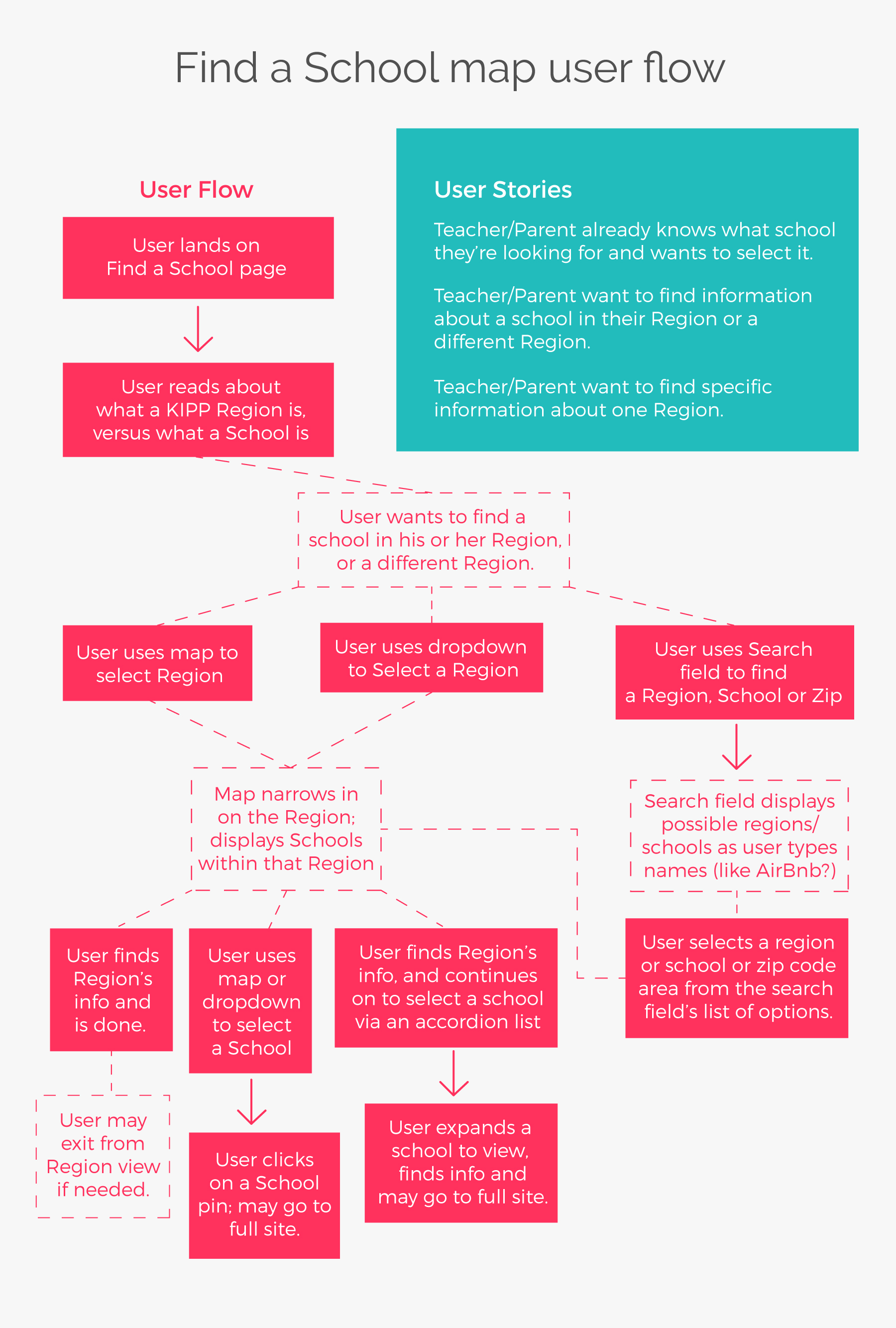
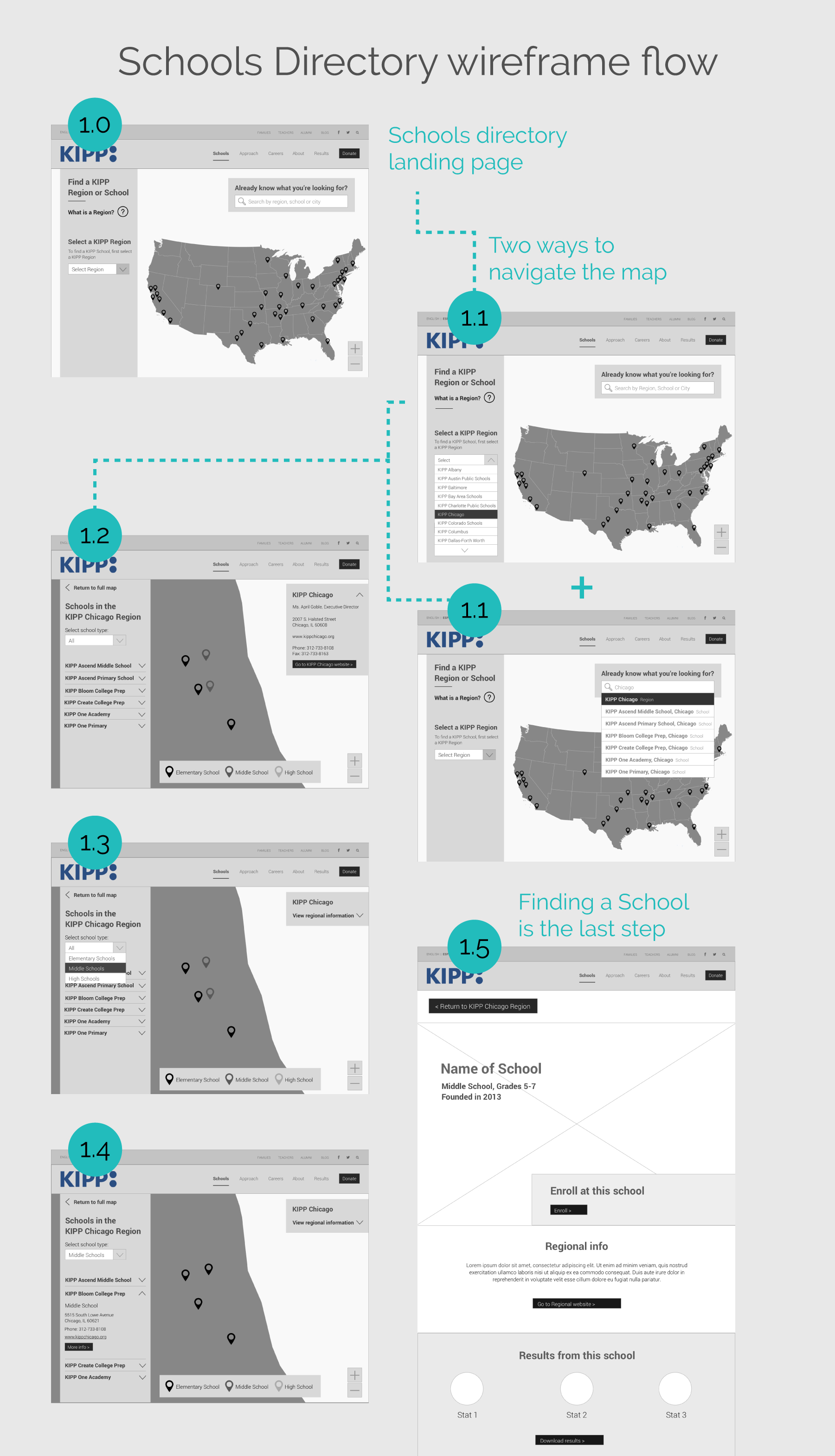
The map for the Schools Directory proved to be a challenging portion of the website, and I am proud of the outcome of the user flow I devised. The School Directory map was not at all user friendly. It lacked interactivity, any filtration, and the user flow was confusing. With 32 “Regions” nearly 200 Schools, and users who didn’t understand what exactly differentiated a region from a school, my task of designing a new and much more interactive map was certainly a challenge.
Wireframe hand-off and project wrap
Once all wireframes were approved by client, I wrote up an Interactivity Document that detailed how interactive elements should be developed. (This was before helpful interactive design software like Figma!)
The new KIPP website launched officially in December 2016. It’s a great improvement from what KIPP had previously, and I know it will help KIPP grow. By the end of my portion of the project, I had produced over 50 wireframes and an InVision prototype. I loved working with Briteweb, because working with them means contributing positively to the world by working on projects that do good!
