Project Case Study
Project: KIPP.org website redesign, client of Briteweb
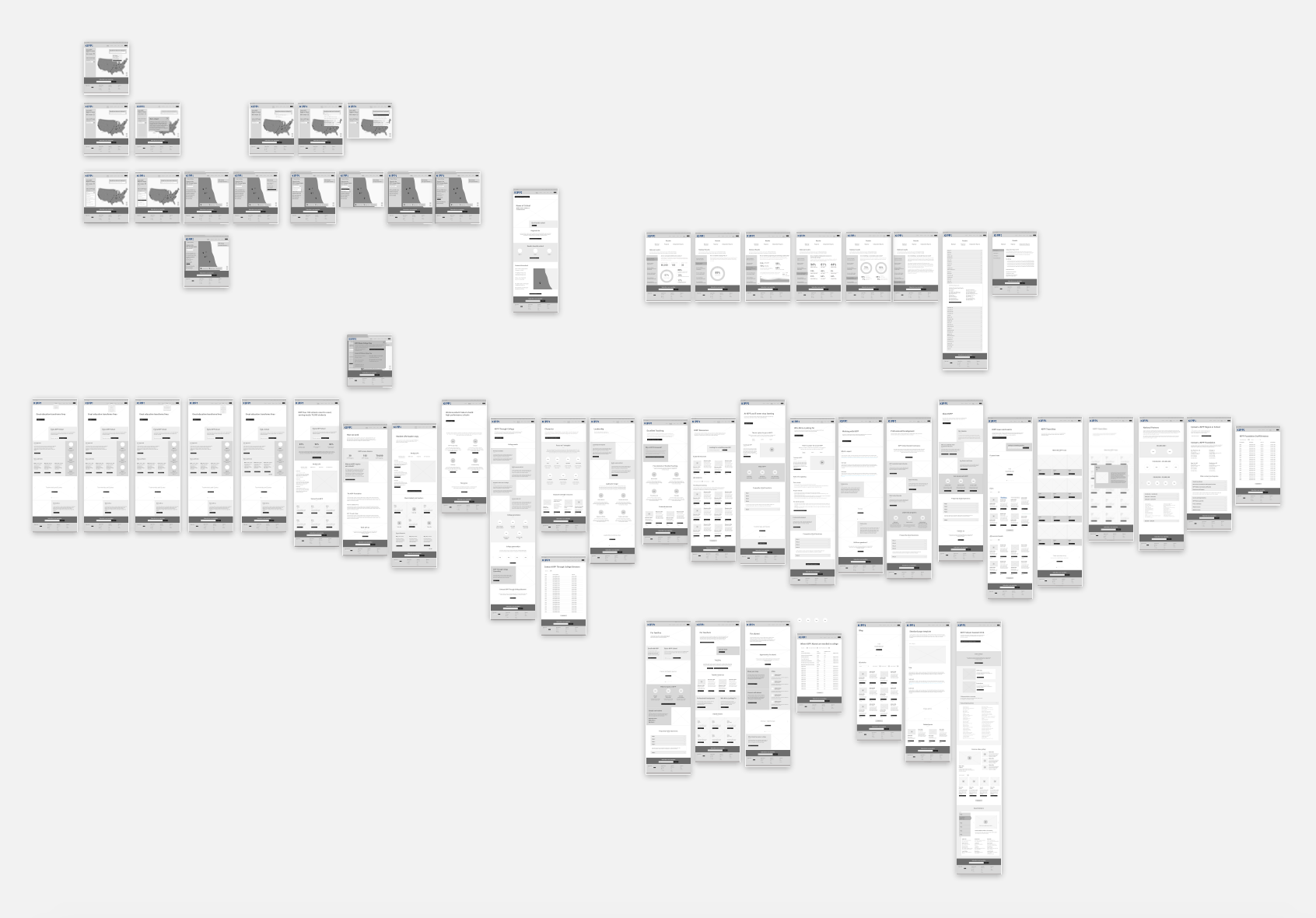
Deliverables: Wireframes for 50+ page website redesign built in Sketch, interactive prototype in InVision
I was hired by Briteweb as a freelance UX Designer. Over a span of 3 months, I became part of the Briteweb team of Project Managers, UX Strategists, UI Designers and Developers to lead the UX Design for the KIPP website. My role was to build out wireframes and an InVision prototype for the full website redesign of KIPP. When I came on board, the UX Strategists had done extensive user and competitive research, as well as had built out a new IA.
The Challenge
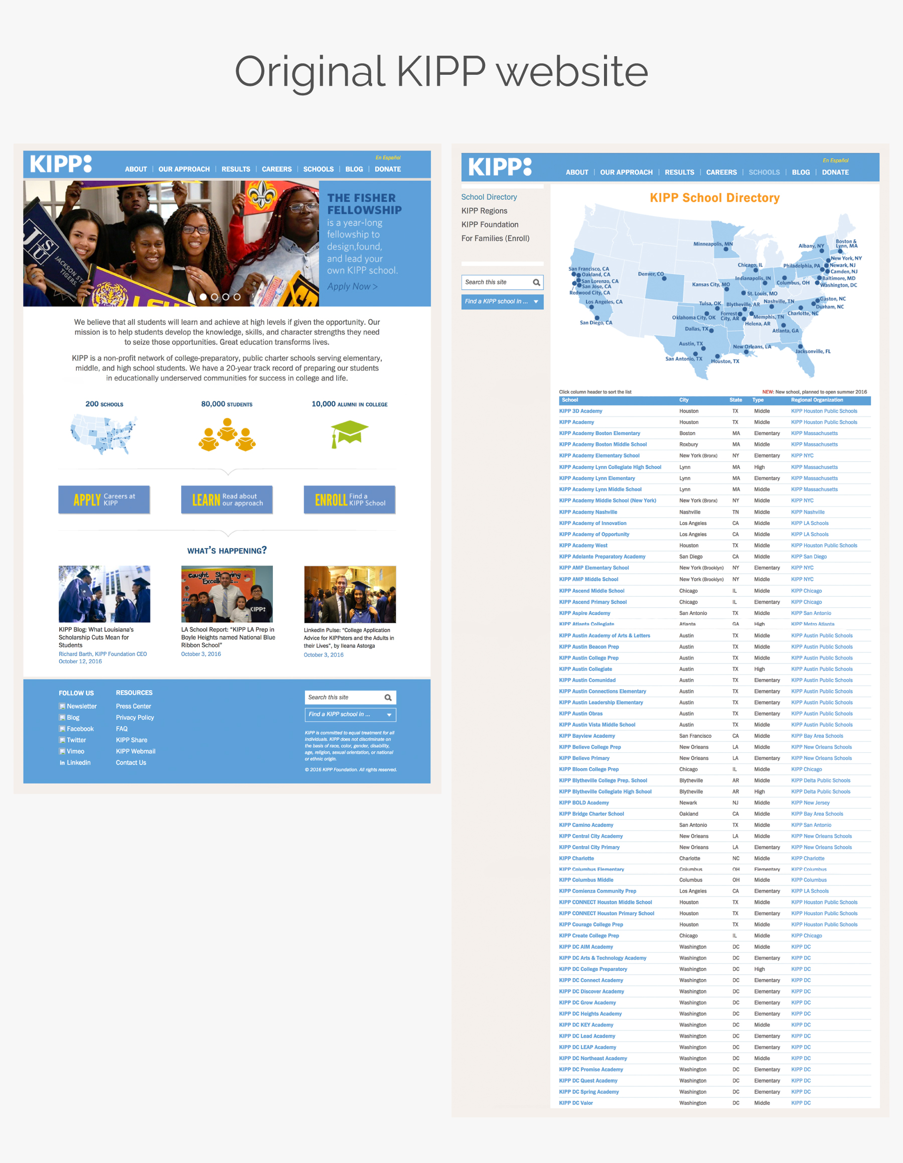
When I began this project, I spent time familiarizing myself with the KIPP website. I explored all of its pages and contents, got to know the user flow of the schools directory map, and began to think of how it could all be improved.
The structure of the IA was fairly well done, and it needed only some changes and minor improvements. But overall, the website was old, static and was riddled with areas that had far too much content, much of which the clients wanted to hold on to for the new website.
The Solution
Based on the research that had been done by the UX Strategists, I began to layout the top level landing pages of what would be the new website. We chose consciously not to design mobile first, because data showed that the majority of KIPP’s users were not very tech savvy, and far more likely to browse the website via desktop.
As I mentioned above, the IA remained fairly similar, but the hierarchy and layout changed dramatically. Before I built out a wireframe for each page, I would write a list of the most important content to be included on that page, and design accordingly, all the while recycling content blocks where possible, to reduce the workload for the developers.
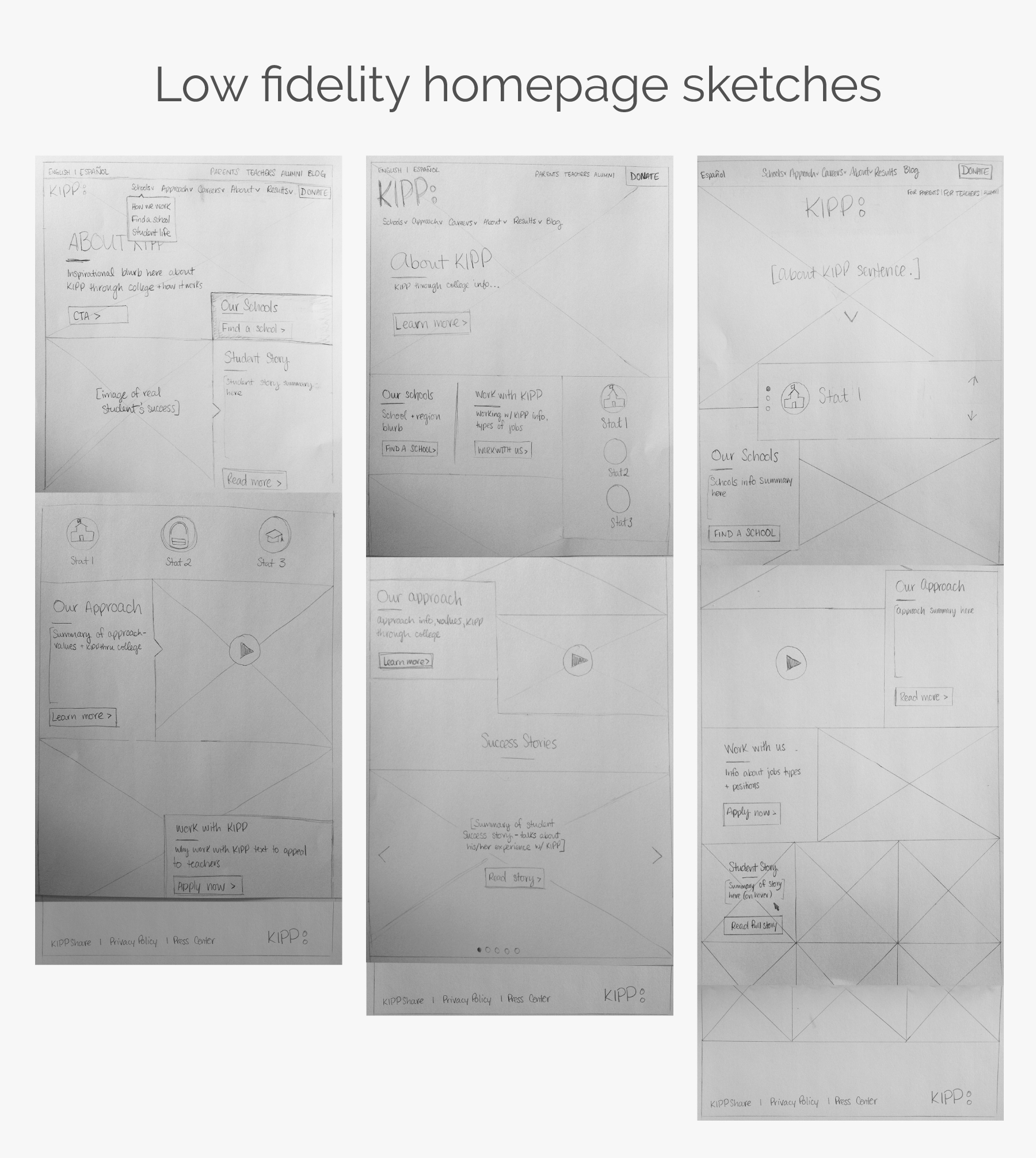
I began with some sketches of the homepage and some of the landing pages.
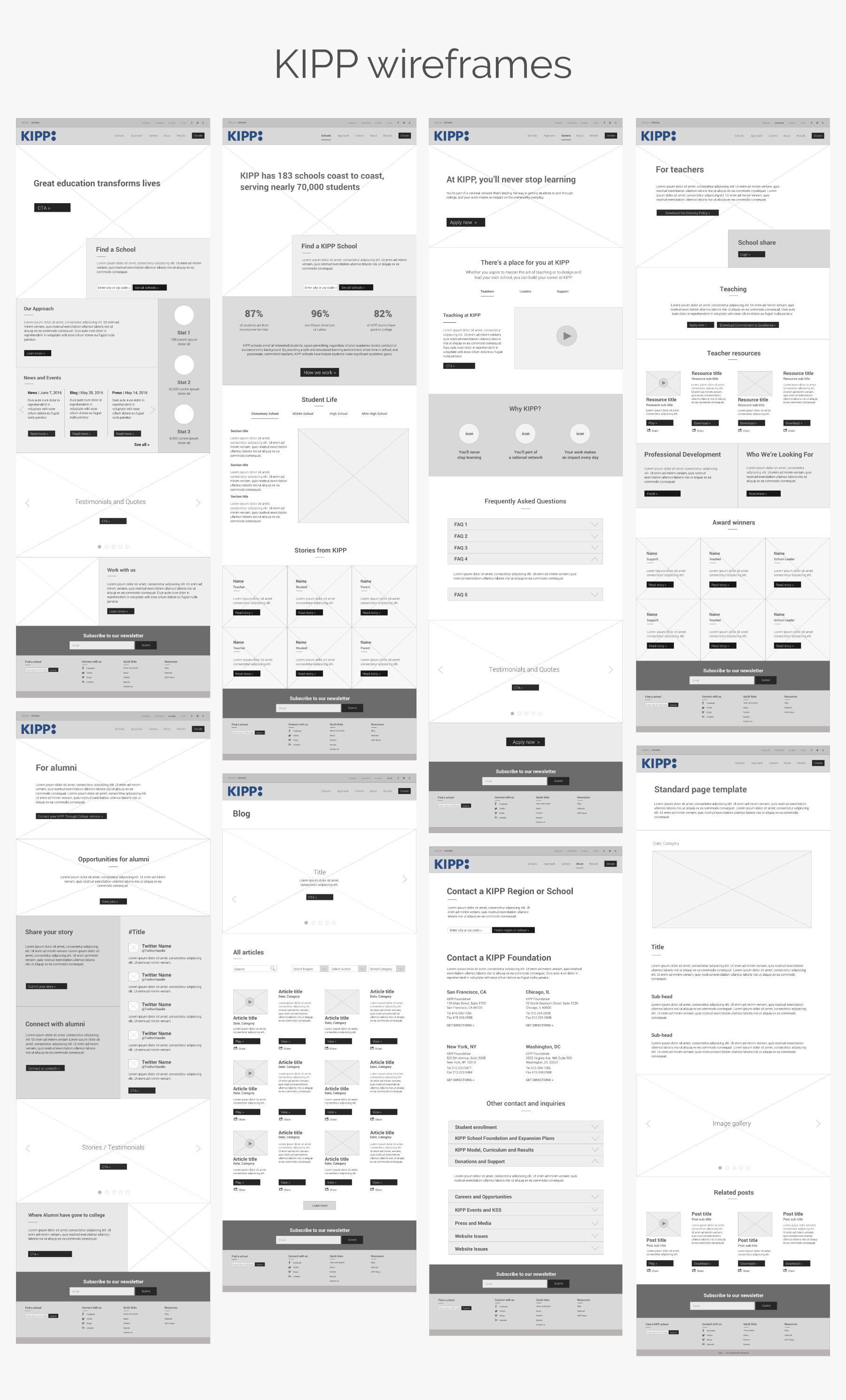
Mid-fidelity wireframes
I built out a wireframe for the homepage first, combining elements from all three of my low-fidelity sketches. The homepage then set the stage for the feel and layout of the rest of the website.
Throughout multiple presentations to the client and iterations, I gradually designed out wireframes for top level landing pages (i.e. Schools, Approach, Careers, About), and then moved onto secondary pages that were either unique or had high audience traffic on the current website.
Interactive map
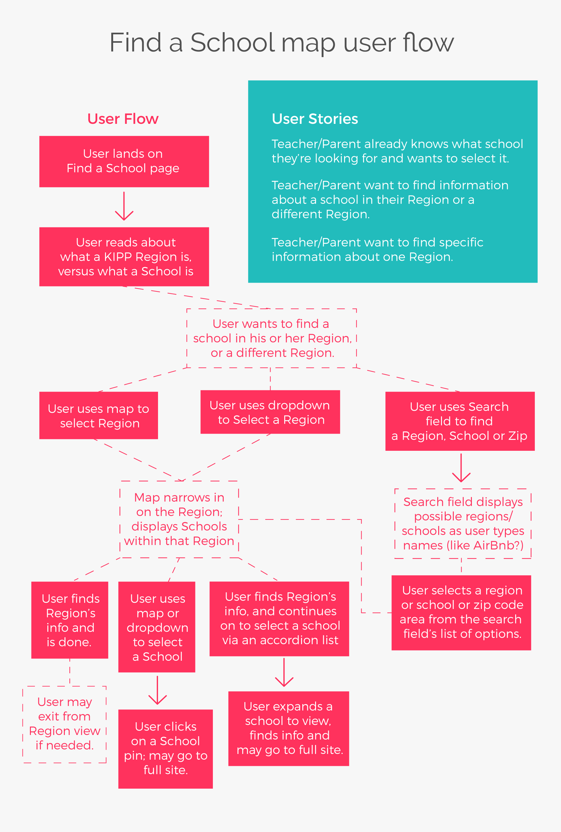
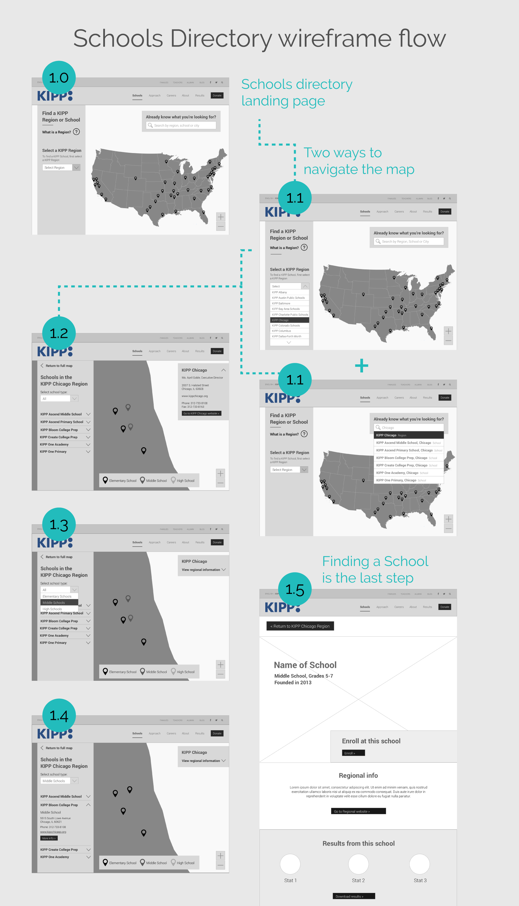
The map for the Schools Directory proved to be a challenging portion of the website, and I am proud of the outcome of the user flow I devised. The School Directory map was not at all user friendly. It lacked interactivity, any filtration, and the user flow was confusing. With 32 “Regions” nearly 200 Schools, and users who didn’t understand what exactly differentiated a region from a school, my task of designing a new and much more interactive map was certainly a challenge.
With so many different types of users – from prospective or current teachers, to prospective or current parents, donors and alumni, there had to be different ways of navigating the flow of the map. They had to be able to search by Region as well as by School, and I wanted to provide a smart search for users who knew what they were looking for.
Interactivity Document
After the wireframes and prototypes had been approved by both Briteweb and the client, I wrote an Interactivity Document. The document covered details for each page of the website and interactions of the map user flows.
Conclusion
The new KIPP website launched officially in December 2016. It’s a great improvement from what KIPP had previously, and I know it will help KIPP grow. By the end of my portion of the project, I had produced over 50 wireframes and an InVision prototype. I loved working with Briteweb, because working with them means contributing positively to the world by working on projects that do good!