Project: Brand Identity & Printed Materials for Talent Collective
Deliverables: Custom hand-lettered logo, brand package, business cards
The Talent Collective ladies, Crystal Henrickson and Annika Reinhardt, hired me to give them a fresh new brand to reflect their awesome company. I had met them at RED Academy, and later on brought me on board to design their brand and website for the Up Conference. For the Up Conference, I had designed a custom hand-lettered logo with a bright palette of colours, so they wanted to do something just as fresh for Talent Collective. And so the process began!
The Process
I began by sending them a Creative Brief to fill out, as well as a shared Pinterest board to post visual inspiration and to help inspire art direction for the brand. The Pinterest board soon filled up with a lot of soft yet bright colours, inspirational quotes to inspire look and feel, and script and hand-lettered typography. Already having been familiar with their style, I began to plan out their new brand look and feel.
Because they knew it was one of my specialties, they asked for a hand-lettered logo. I began by sketching out a ton of lettering for their logo in a lot of different styles in pencil and brush pens.
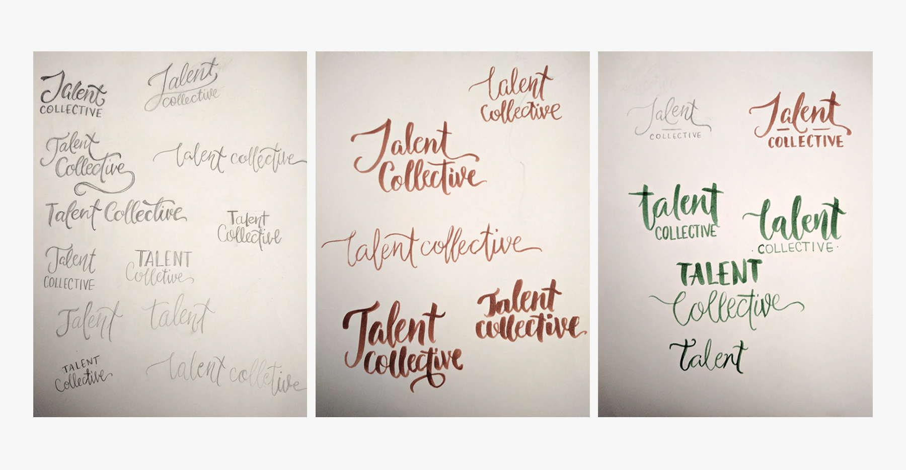
Digitizing the top choices
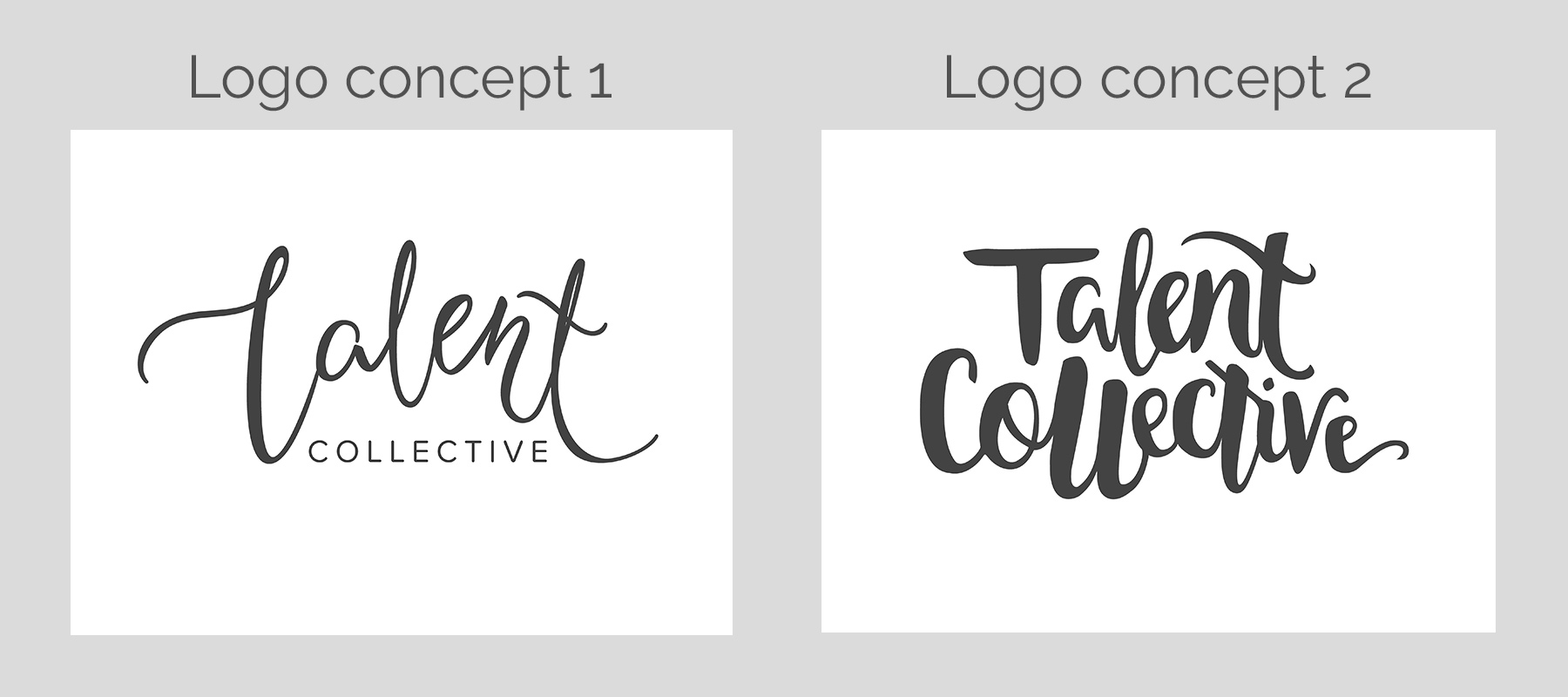
In Illustrator, I digitized the top choices using pen tool. I presented two very different concepts from my hand-lettered sketches. In the mood board, they had posted examples of peacock feathers, not so much to use as a design element, but as inspiration. So the first concept is light and feathery, whereas the second is more of a thick brush stroke. They decided to go with the first concept, and I agreed that it was the better of the two.
Putting together the brand identity
Crystal and Annika felt that the first T looked like an L and asked me to remove the loop. So after making those changes, I began to flesh out the look and feel of the brand. I first pitched a concept of watermelon pink and turquoise, and also a pale yellow and turquoise, but they wanted me to explore a colour palette of turquoise with yellow, and a shade of plum. And here you have it! The finalized brand, with a watercolour design element for the logo. I chose Proxima Nova Soft as the header and Proxima Nova for body copy.
