Project Case Study
Project: Canadian Adventure Company website redesign, RED Academy student project
Client: Canadian Adventure Company
Team: Adan Uribe, Erika Pliniussen, Steven Ho, Laura Lefurgey-Smith
Deliverables: User research & competitive analysis, content audit, IA & sitemap, mid-fidelity responsive wireframes,
high-fidelity responsive mockups, exported assets and style guideline for web developer hand-off
The Business & Challenge
For our forth project at Red Academy, my team and I took on the website redesign for the Canadian Adventure Company (CAC). CAC is owned by the McManus family, who are life-long outdoors people and host getaways in one of the most remote regions of the Rockies. Getting to the CAC’s Mallard Mountain Lodge by 30-minute helicopter ride, guests can spend a week or more in the remote wilderness, with expert guides and catered stays.
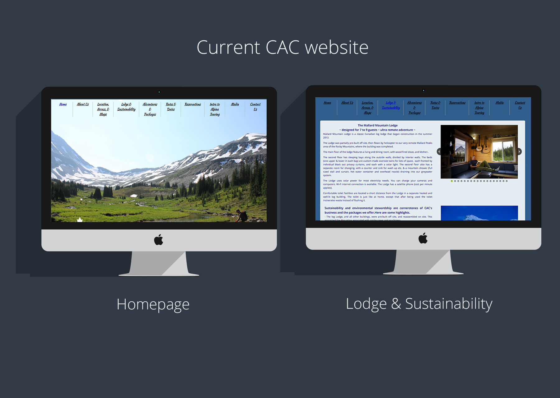
The challenge that we were presented with was to redesign their existing website in three weeks. The current site had a lot of text, no progressive disclosure, no visual hierarchy, but they did have beautiful imagery from the Rockies and the lodge.
User Research & Competitive Analysis
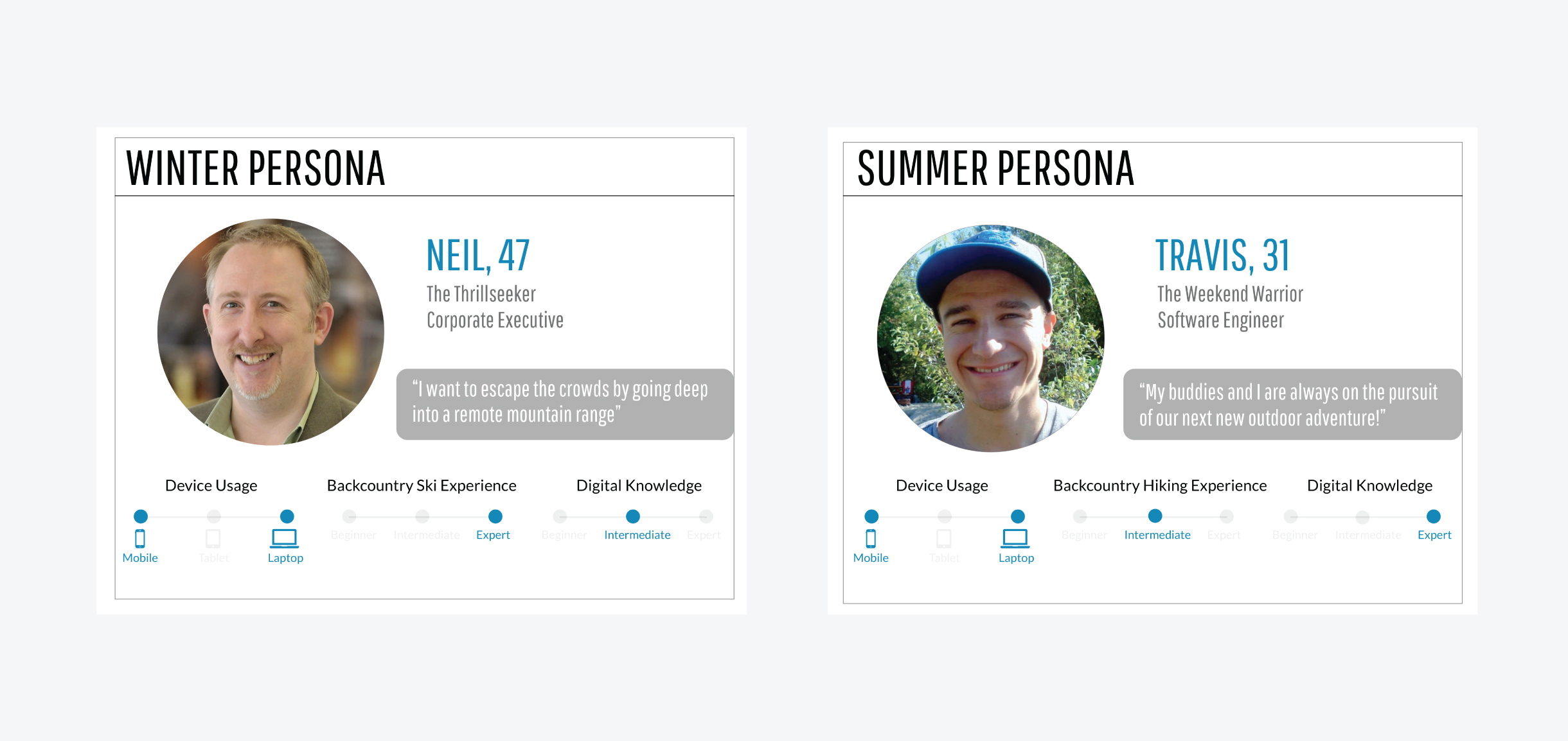
From our meetings with the client Jason, he told us that their current average user was about 50 years old, primarily male, financially stable and skilled in winter and outdoor sports. However, we conducted user research to gauge for ourselves who was out there that also would be interested in booking a getaway with CAC.
We interviewed 5 users and received 99 survey responses. Our research proved our original hypothesis – that the types of users that responded to us were far more varied than the client’s typical user:
- Average age between 25-34
- 60% male; 40% female
- 84% would prefer summer activities
- 72% prefer to be unguided
- 90% haven’t booked anything like CAC before
We looked at a number of competitors, including Sol Mountain & Powder Creek Lodge, and discovered that the Rockies are filled with these types of helicopter-access resorts and lodges. We did an extensive competitive/comparative analysis to see what others were doing.
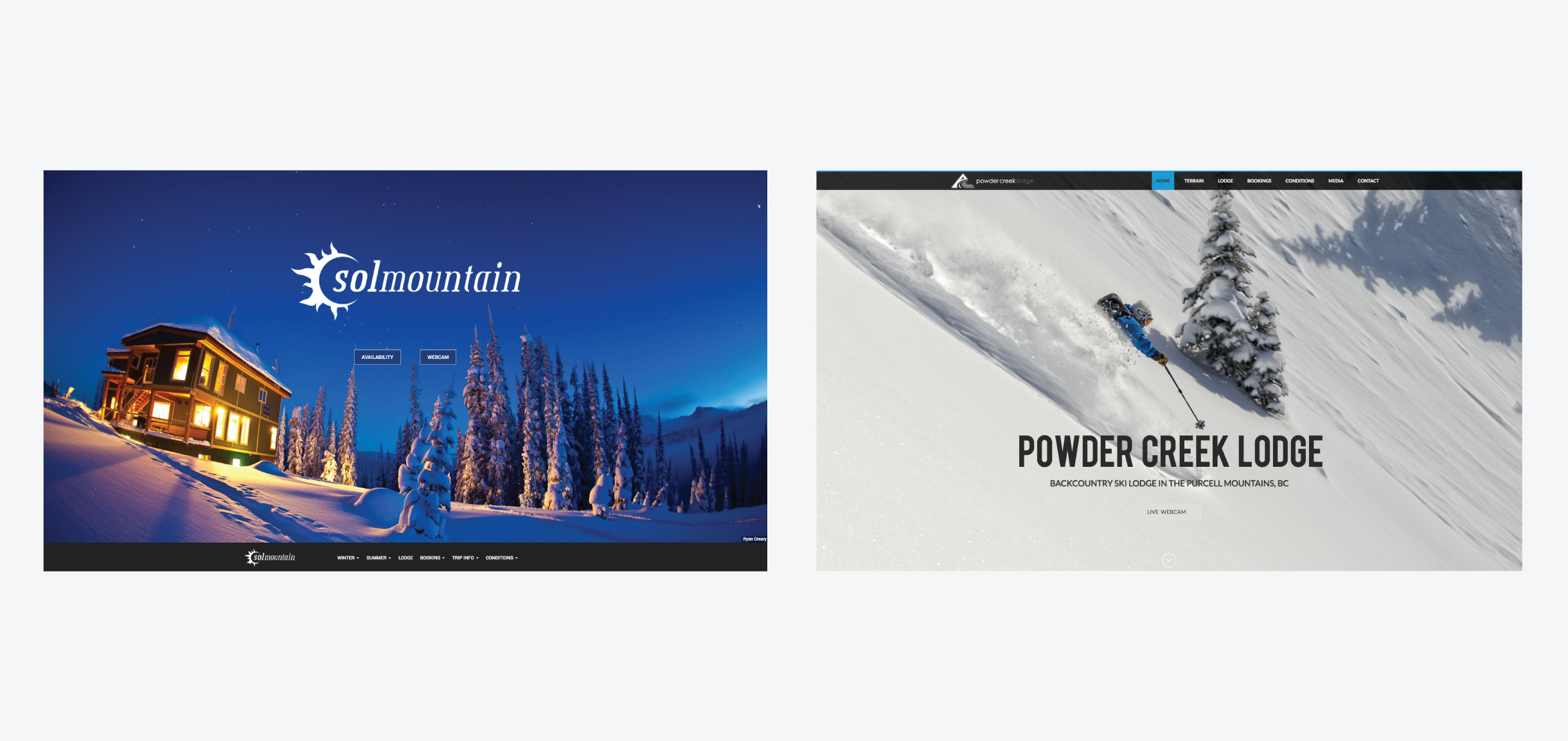
All of them had beautiful imagery, many of them broke down packages and bookings into Winter and Summer categories, as well as information about the resort/lodge itself. None of the sites we looked at allowed for online bookings, which told us that a “Request to Book” option was industry standard.
Personas
Based on our conversation with the client as mentioned above, we created a persona for the existing average user – which is the 50 year old, well-established, winter sports expert – and we named him Neil. We took our research findings and created a “Summer” persona as well, and named him Travis.
Strategy & Planning
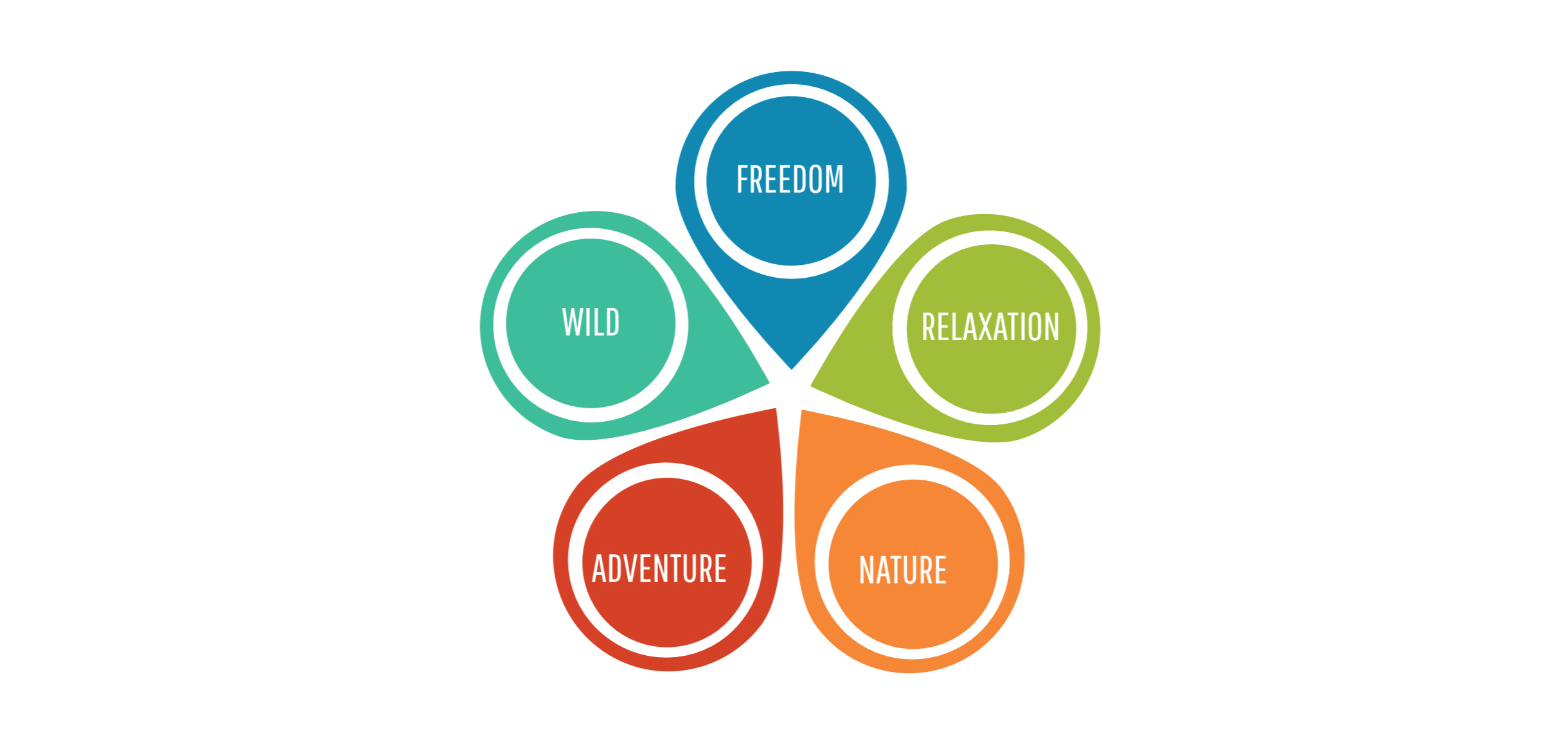
Keywords
In order for us to begin to develop a look and feel for the new website, we determined what the major keywords of CAC are. It was these 5 keywords that we kept in mind as we began to develop the UI and visual design for the redesign.
Content Audit & Information Architecture
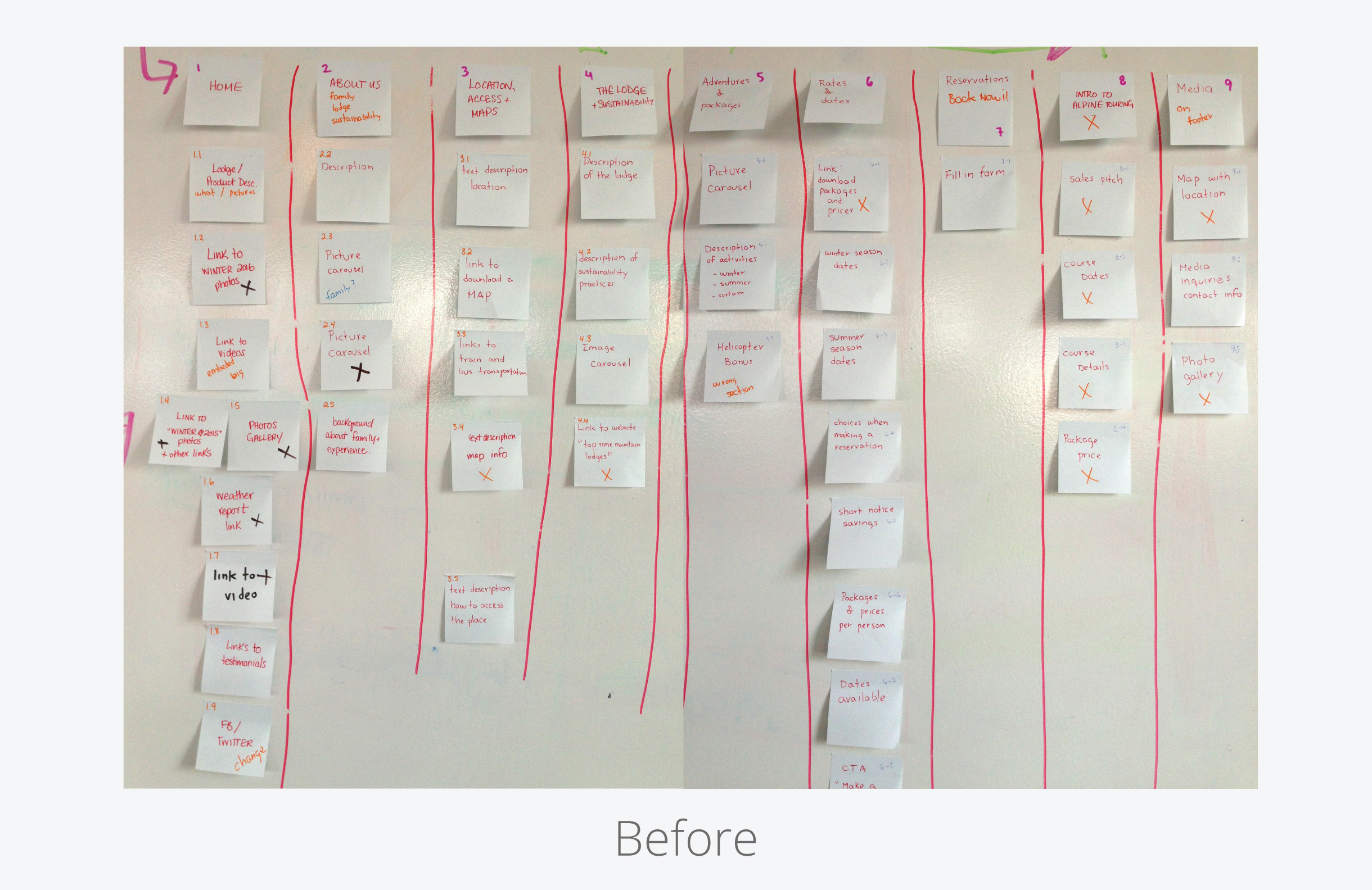
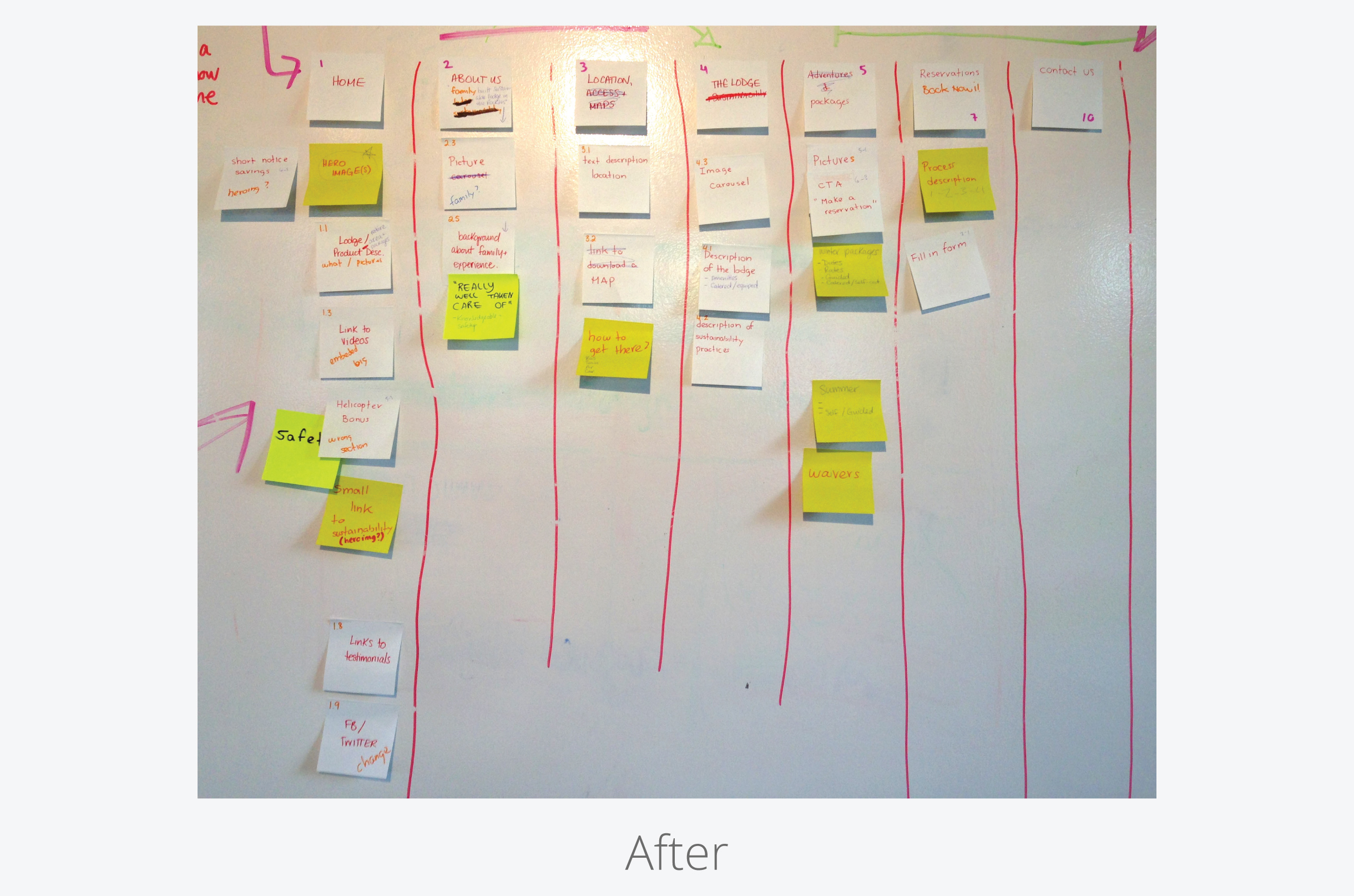
A crucial part of this project was to do a content audit of the existing website, and restructure it in a way that was more seamless and user-friendly. Based on our research, the company’s business goals and our keywords, we were able to cut the content of the site by more than half and still keep all of the important information. We renamed Location, Access & Maps to Getting Here, renamed The Lodge & Sustainability to simply The Lodge, and amalgamated Adventures & Packages with Rates & Dates to just Packages. We removed the Intro to Alpine Touring page, because it’s a service that the company offers infrequently, and we moved Contact Us to the footer of every page.
Design
Design Studio and Paper Prototyping
We began with a design studio. It helped us gain insight into different approaches and the mental models of the rest of the team. We then time-blocked the rest of the page designs and eventually came up with a low-fidelity wireframe.
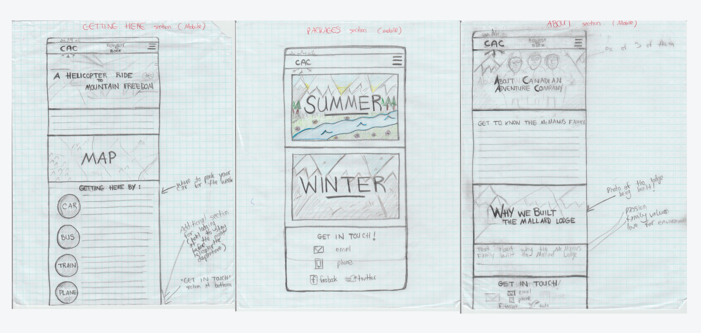
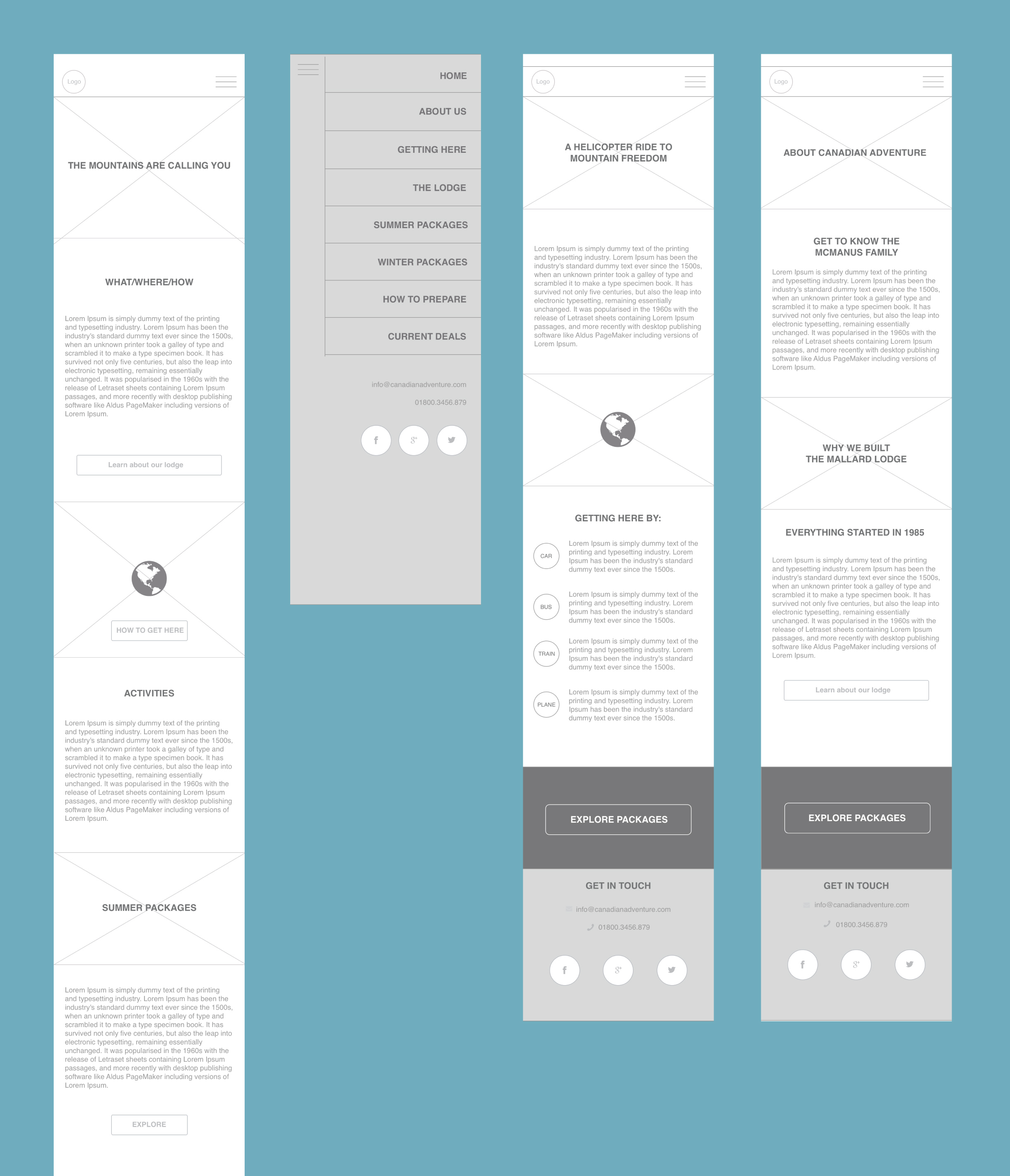
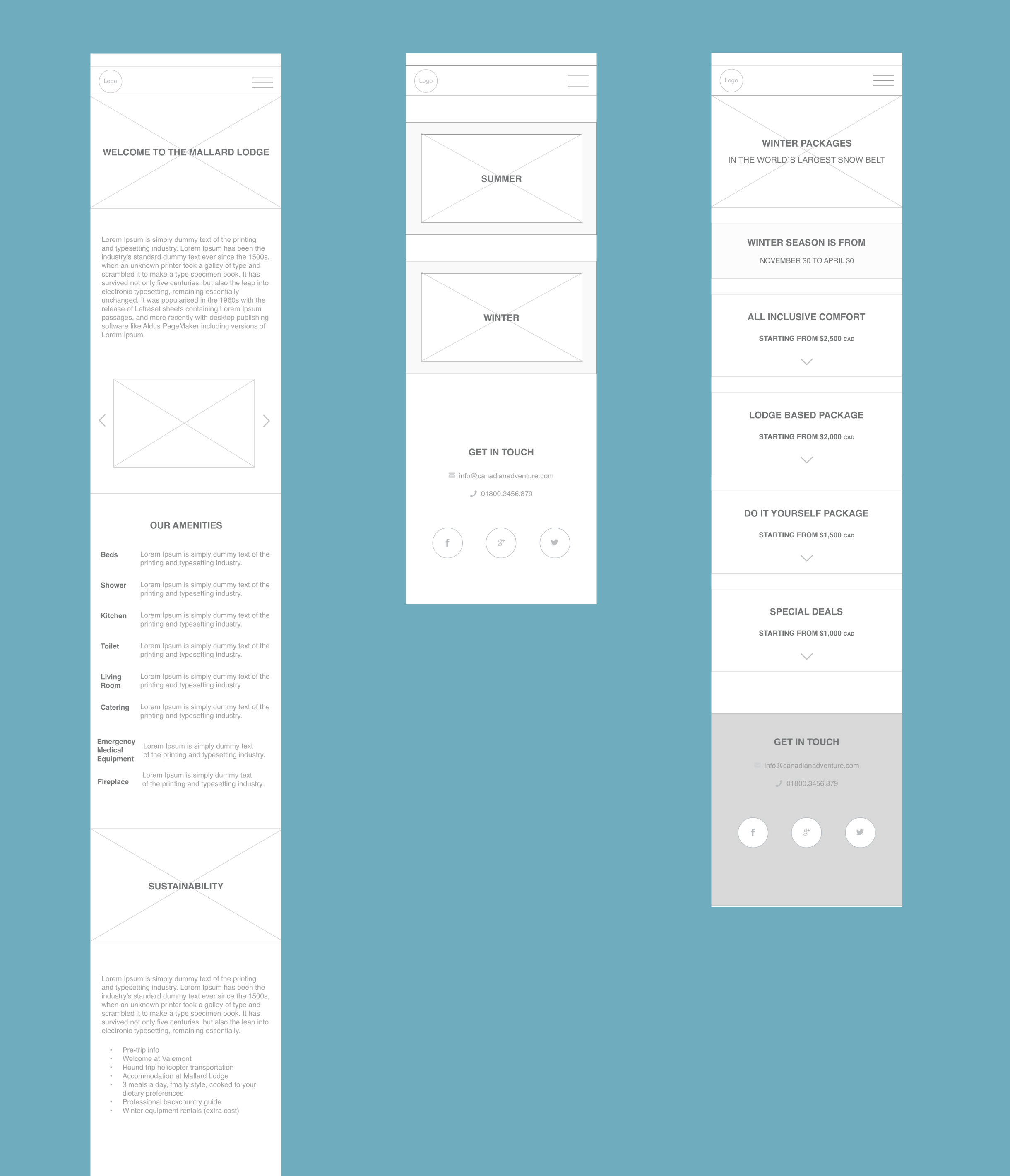
Mid-fidelity wireframes
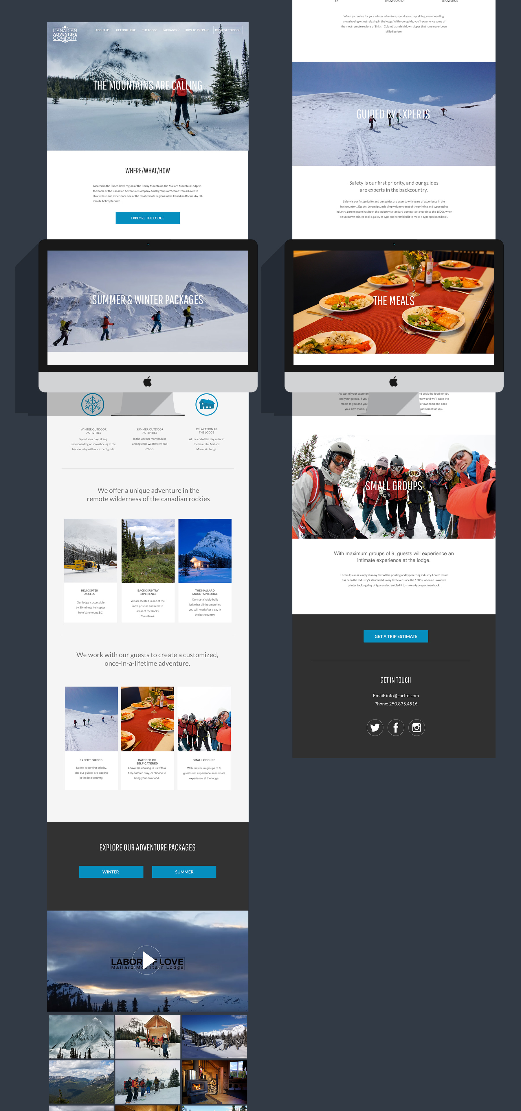
We created mid-fidelity wireframes, and began user testing Travis’ user flow. We began with mobile-first design, as we knew it would be easier to adapt our design to desktop later on this way. Below you can see a number of our pages, which have a consistency in design, image placement and copy.
The homepage for CAC was a challenging page to do, and we had to go back through our research to determine what information should be the most prominently displayed, as well as how we were going to show progressive disclosure.
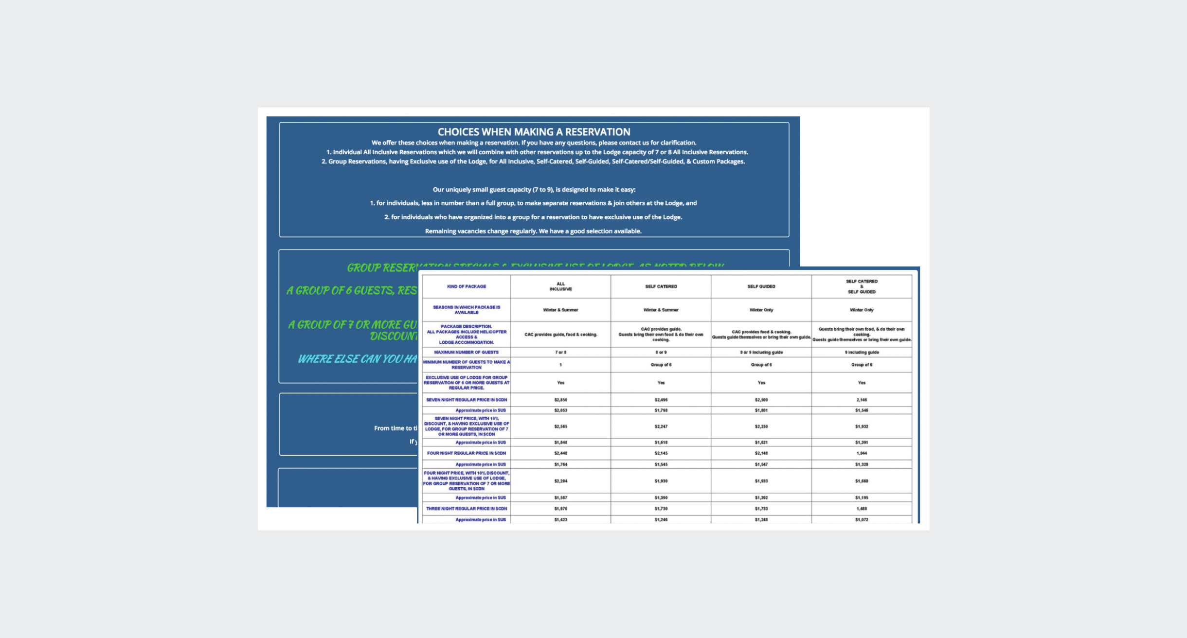
The challenge of the booking process
The current website has these JPG spreadsheets, filled with all variables of possible rates, which is overwhelming to the user to go through and understand, as seen below:
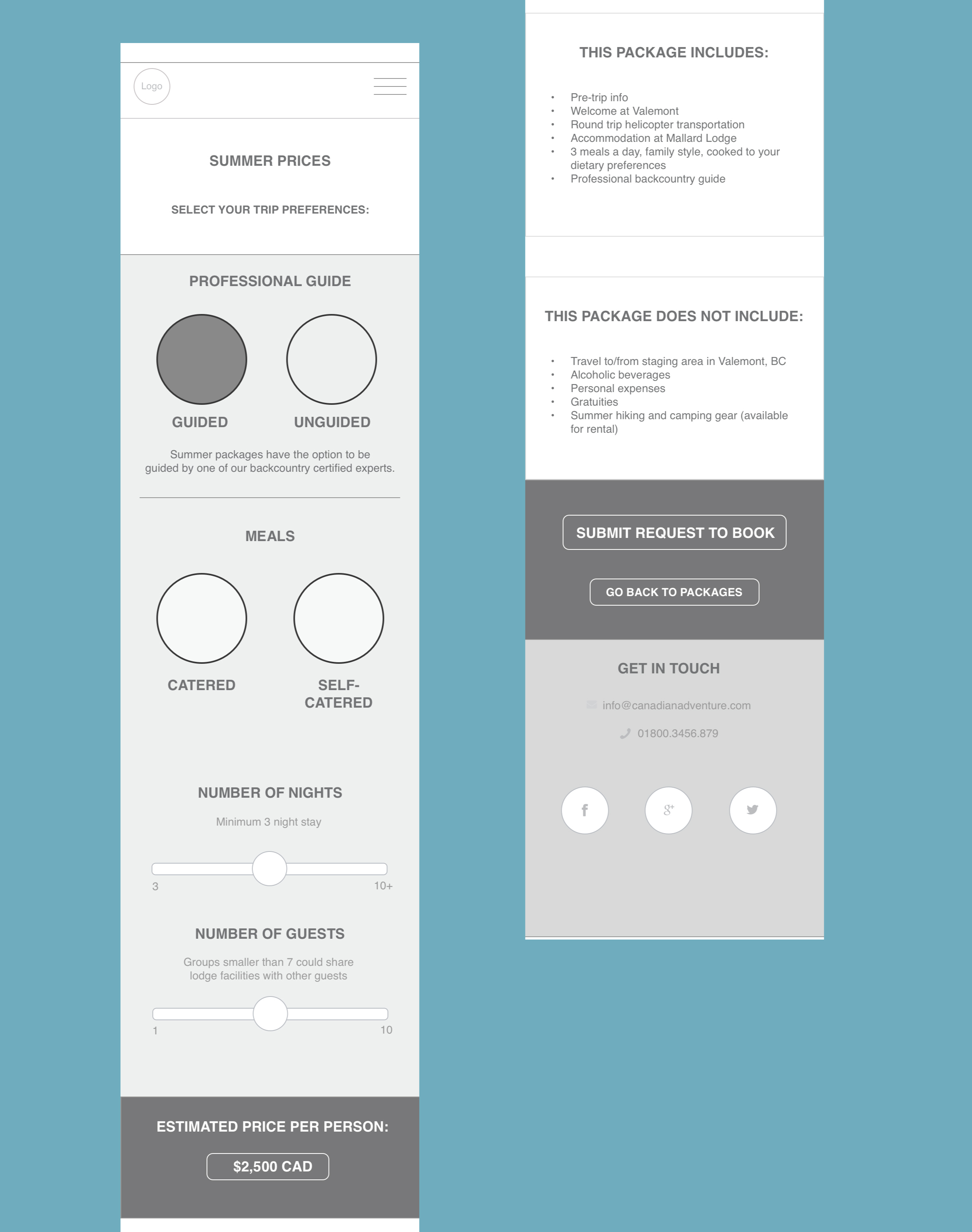
Our solution
The solution we came up with was to allow the user to select their trip preferences, receive a cost estimate, while hiding all of those price variables in the code. We user tested this method with a number of people, and felt it was a good way to move forward.
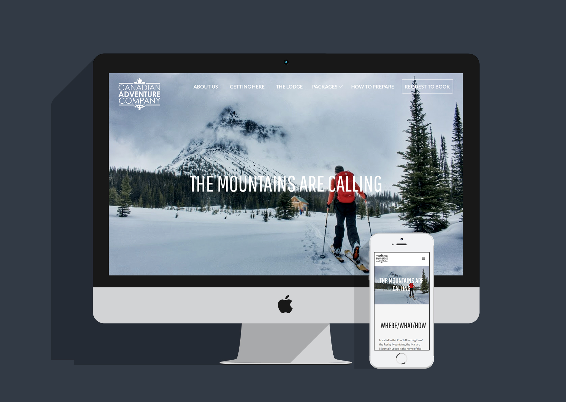
High-fidelity prototype
The stage and nearly final stage of our project with the Canadian Adventure Company was to create a high-fidelity prototype. To do this, we used InVision for both desktop and mobile. We used the imagery that the clients provided to us as the website’s focal point, and used text chunking and iconography to make the copy more digestible to the user. We had the opportunity to work with our fellow web development students and hand off this project to them, as their final project. They did an amazing job and it was a pleasure working with them. View the full website here.
Conclusion
Canadian Adventure Company was an ideal client for us to take on as our forth project in the UX Design program. The clients, web development students and our team were all thrilled and so proud of the outcome.